
B2B Institutional Portal Design
Institutional portal redesign driving user engagement and client growth
Time Frame
About 50 hours from project scoping to launch (08/22 to 06/23)
Our Team
1 Lead UX Designer (me) | 1 UX Researcher | 2 Product Managers | 3 Engineers
My Contribution
Scoping | Concept creating | Design | Usability testing
Project Overview
What’s this product:
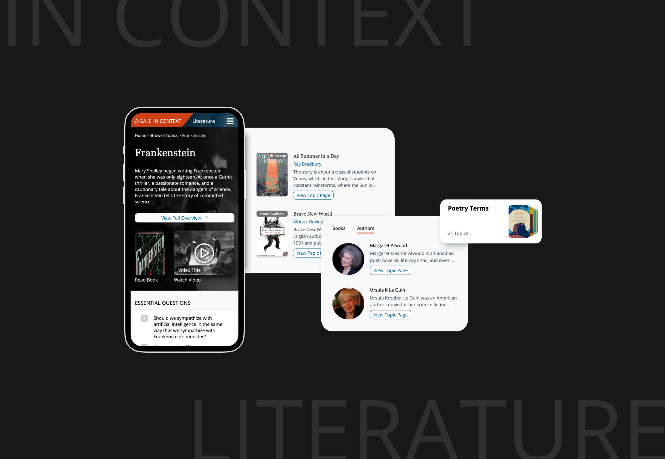
The Online Learning Portal is a partnership platform that helps libraries offer free premium learning resources to their communities. Through partnerships with companies like Udemy and Peterson’s, Gale curates courses and resources that libraries can provide to their patrons at no cost.
The Business Challenge:
Libraries wanted to offer premium learning resources but couldn't afford individual subscriptions to platforms like Udemy. Gale's partnership model solved this by providing free access to curated content, but libraries needed an institutional solution that would help their staff assist patrons while also enabling self-service browsing.
How I solved the challenge:
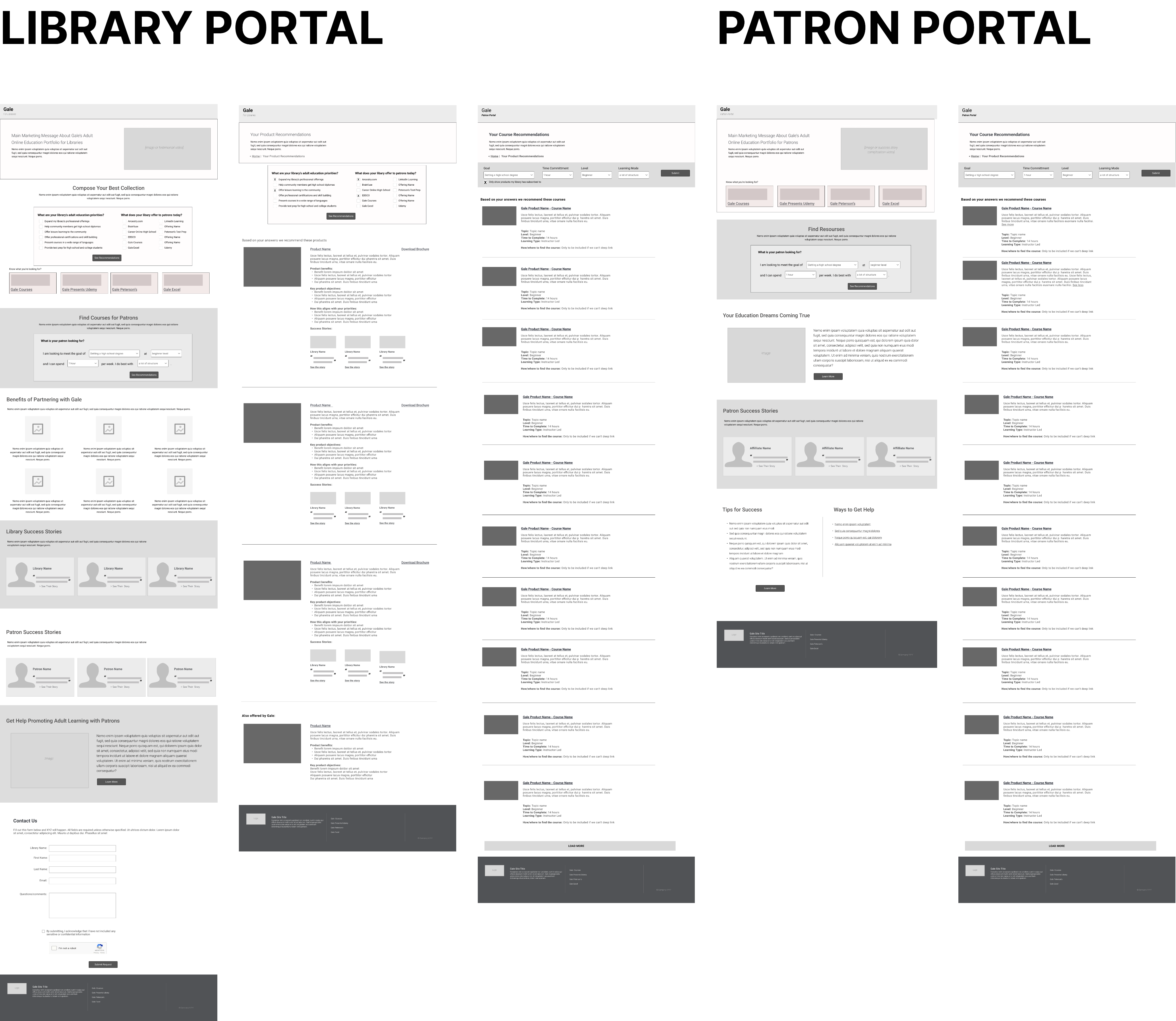
I designed the portal to showcase diverse learning content from multiple education partners, balancing the needs of library staff and patrons while accommodating various institutional websites with different partnership packages and technical setups. I led UX work that reframed the initial stakeholder requirements, simplified the navigation, and clarified the product’s purpose based on what users actually needed.
Business Impact & User Impact
Product usage within 2 months of launch
+66%
Customer adoptions in 6 months
+100
Online learning market share after 1 year
+20%
Reframing Concepts
Stakeholders initially requested two separate user flows. One for library staff helping patrons, and another for patrons browsing on their own.
Through interviews with library staff and end users (patrons), we found both groups had similar needs. They wanted quick, direct access to content and used the portal in similar ways. This insight enabled us to propose a unified solution that reduced implementation complexity for institutional clients while maintaining operational efficiency. Stakeholders accepted the recommendation.
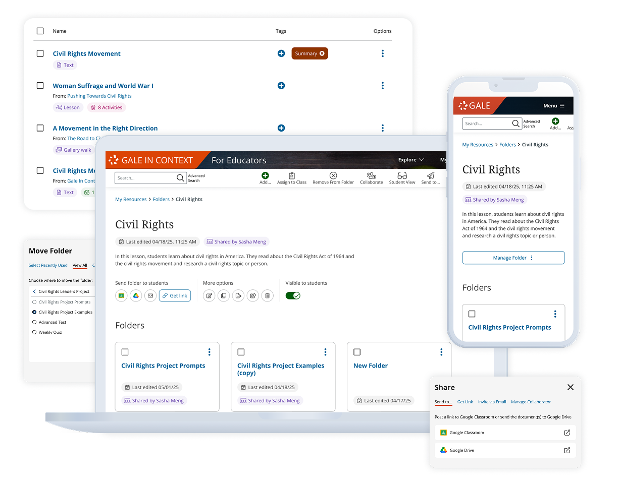
Combine two user flows into a single experience
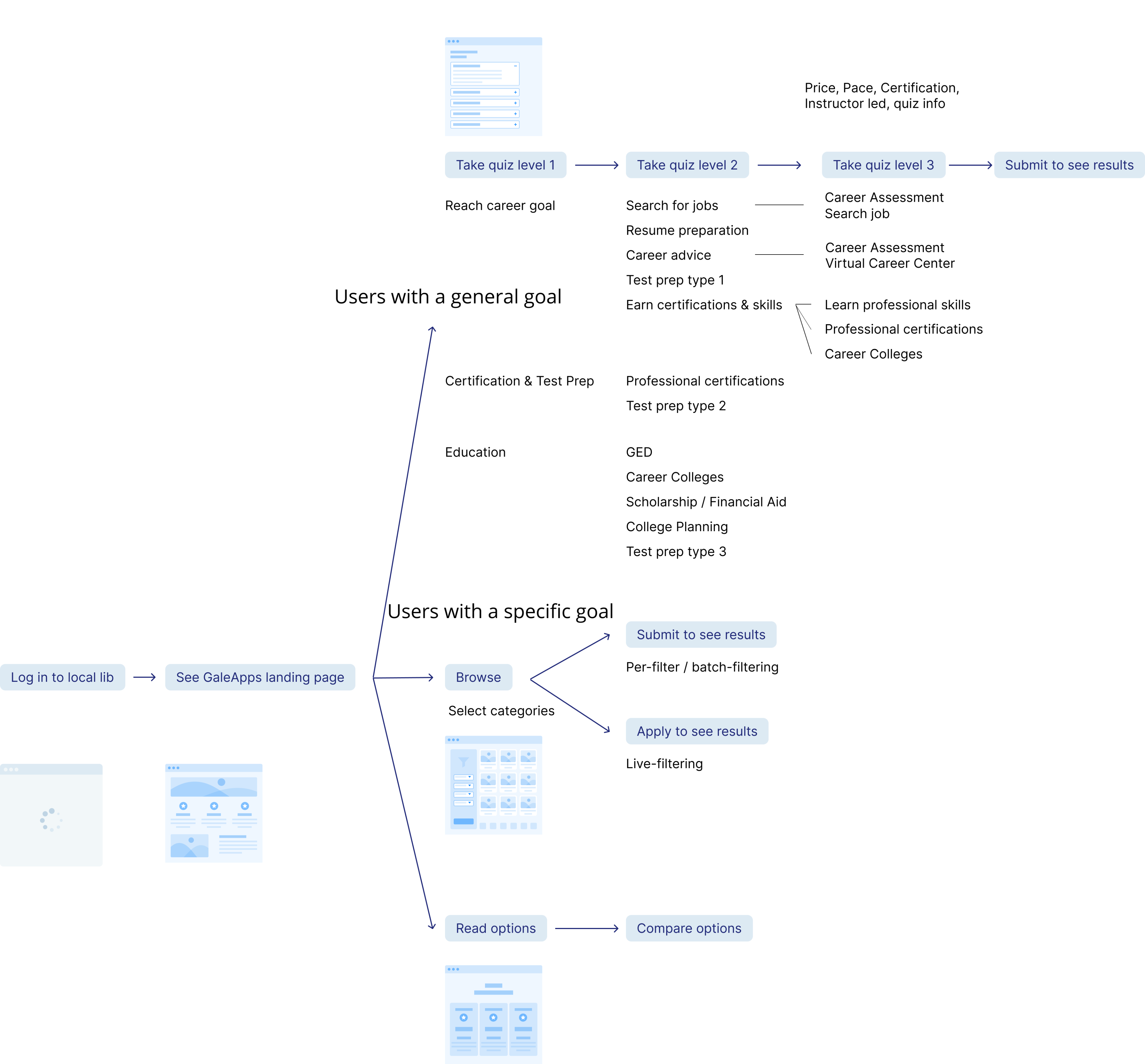
Library experience
Shared goal:
Find content fast
Patron experience
Single experience


Design Scoping
Midway through the project, I learned that a course platform architecture would soon change. I proactively rescoped from a complex integration to a lightweight, standalone portal. This approach reduced client deployment risks and future maintenance costs while maintaining platform flexibility.
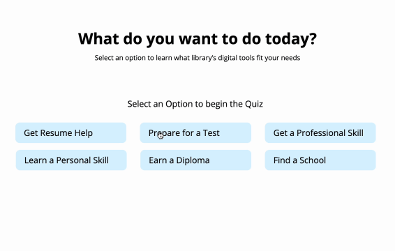
Both the quiz and subject browsing design were removed to fit the updated scope
Concept Validating
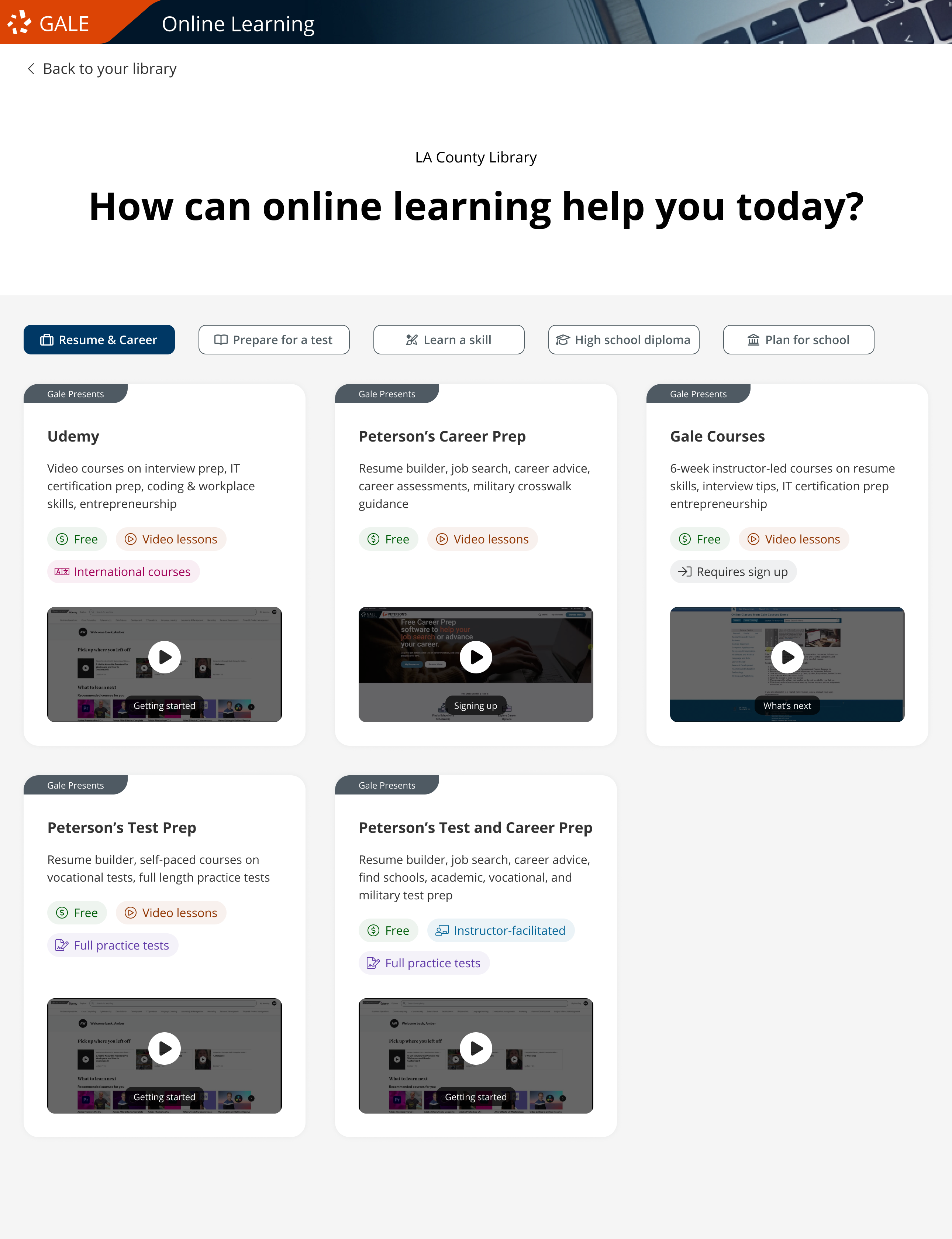
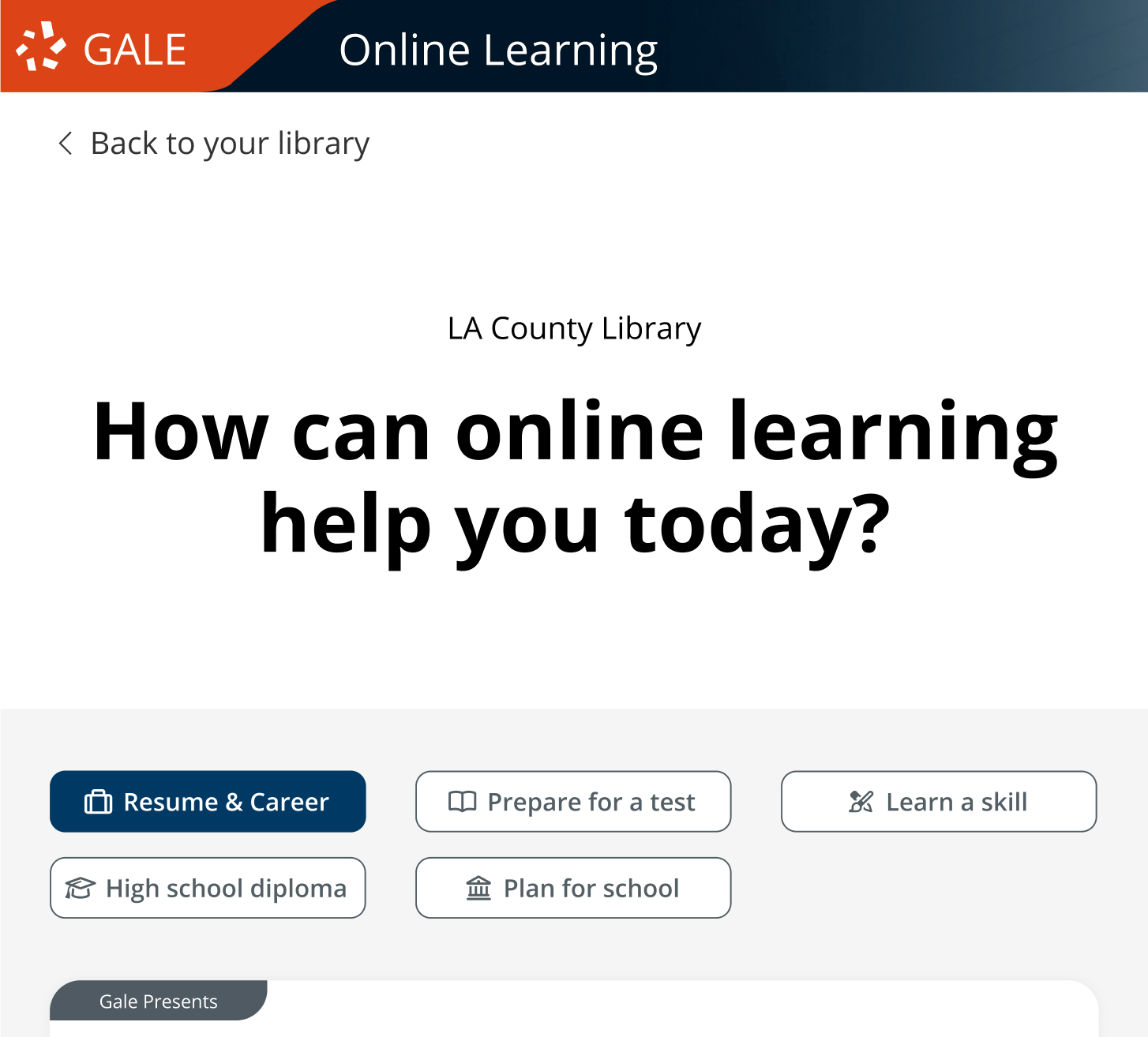
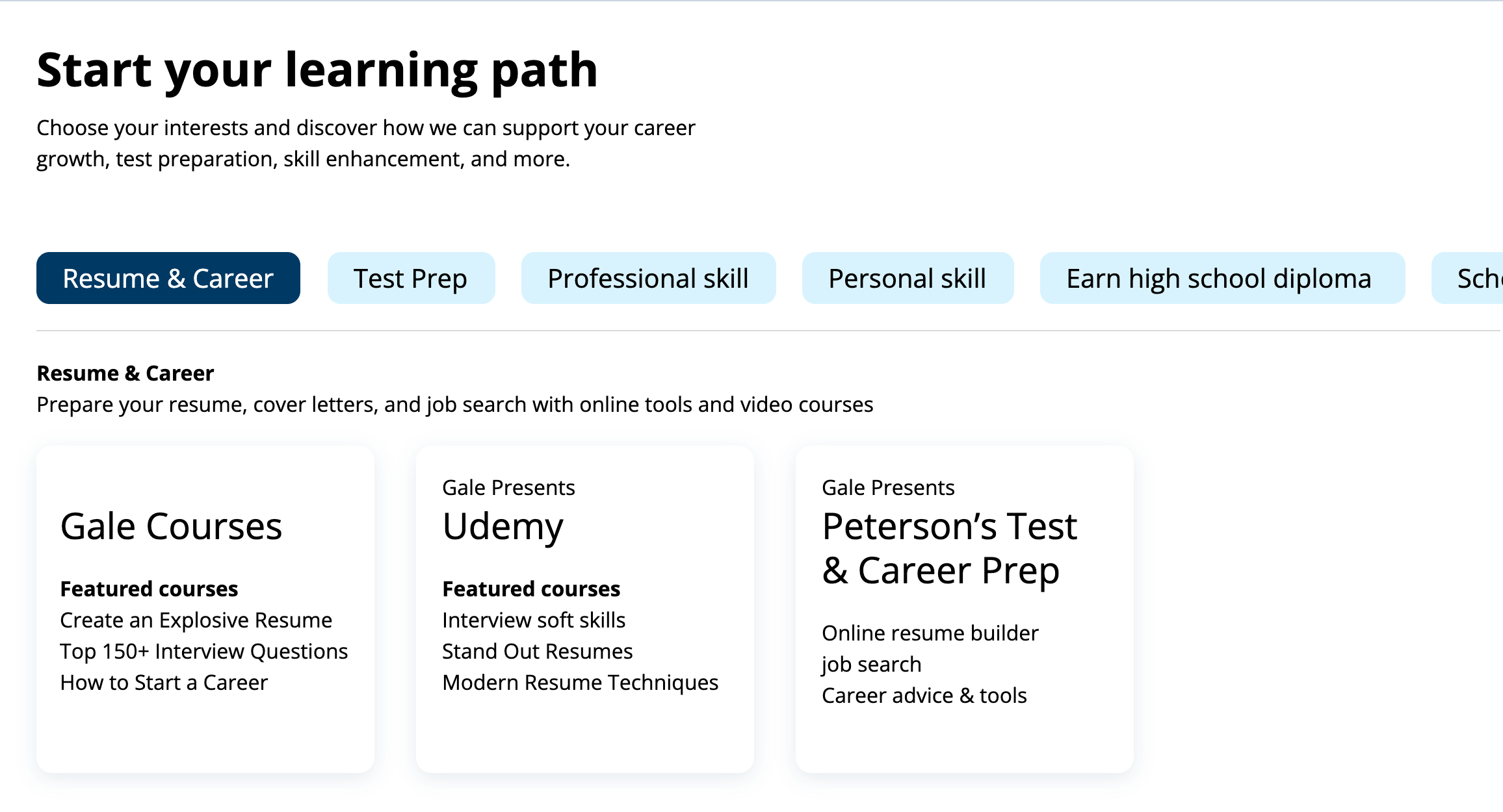
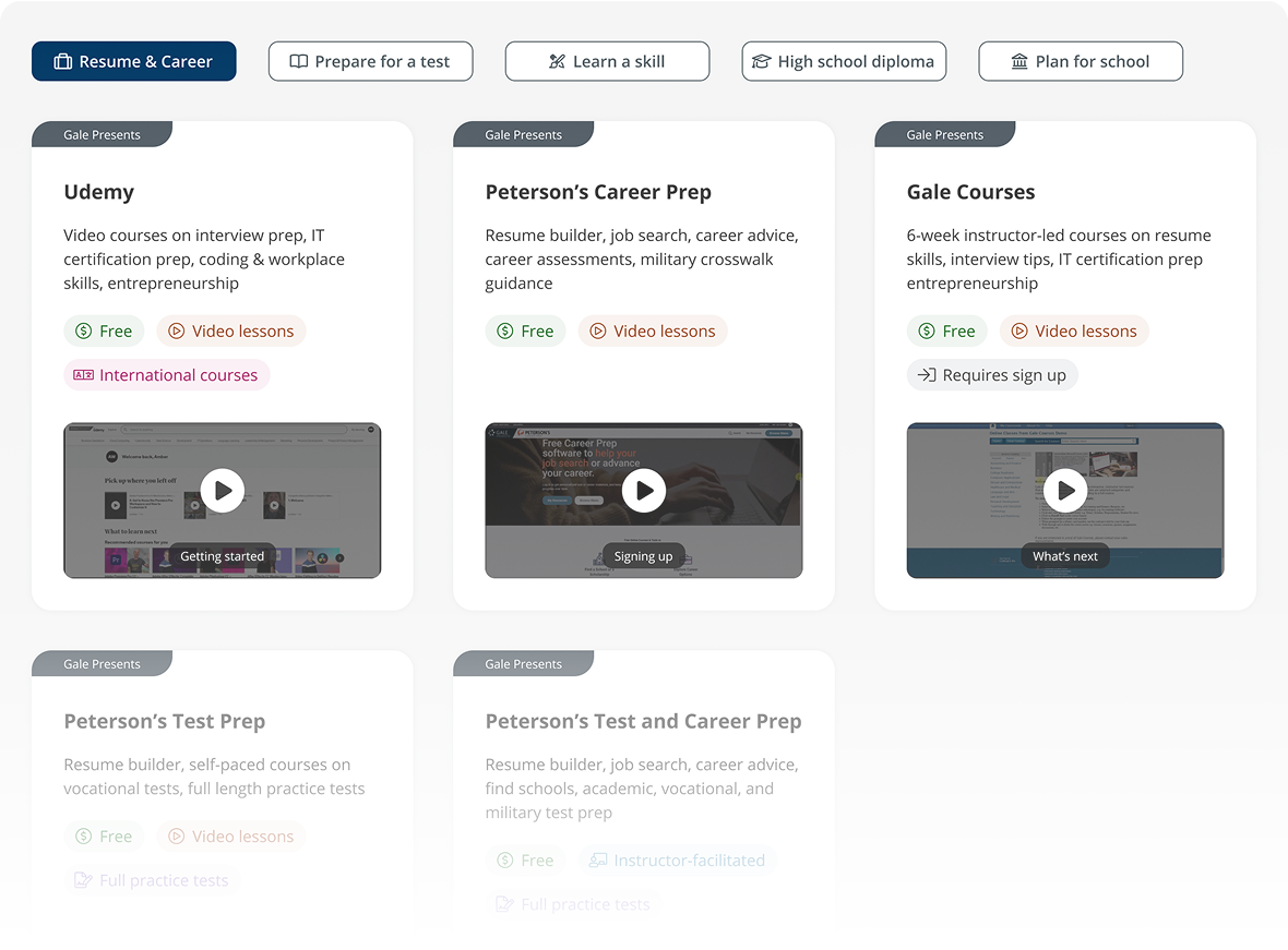
Users struggled with subject browse. I explored 3 navigation approaches and moved forward with goal-based categories like Resume & Career, Learn a Skill, etc.
I eliminated the typical "All" tab structure since we couldn't detect subscription counts. Traditional "All" tabs would look awkward for single-subscription libraries. This design works identically regardless of subscription level.
Usability testing validated that users preferred browsing by learning goals over other models.
Before: 3 concepts of product browsing
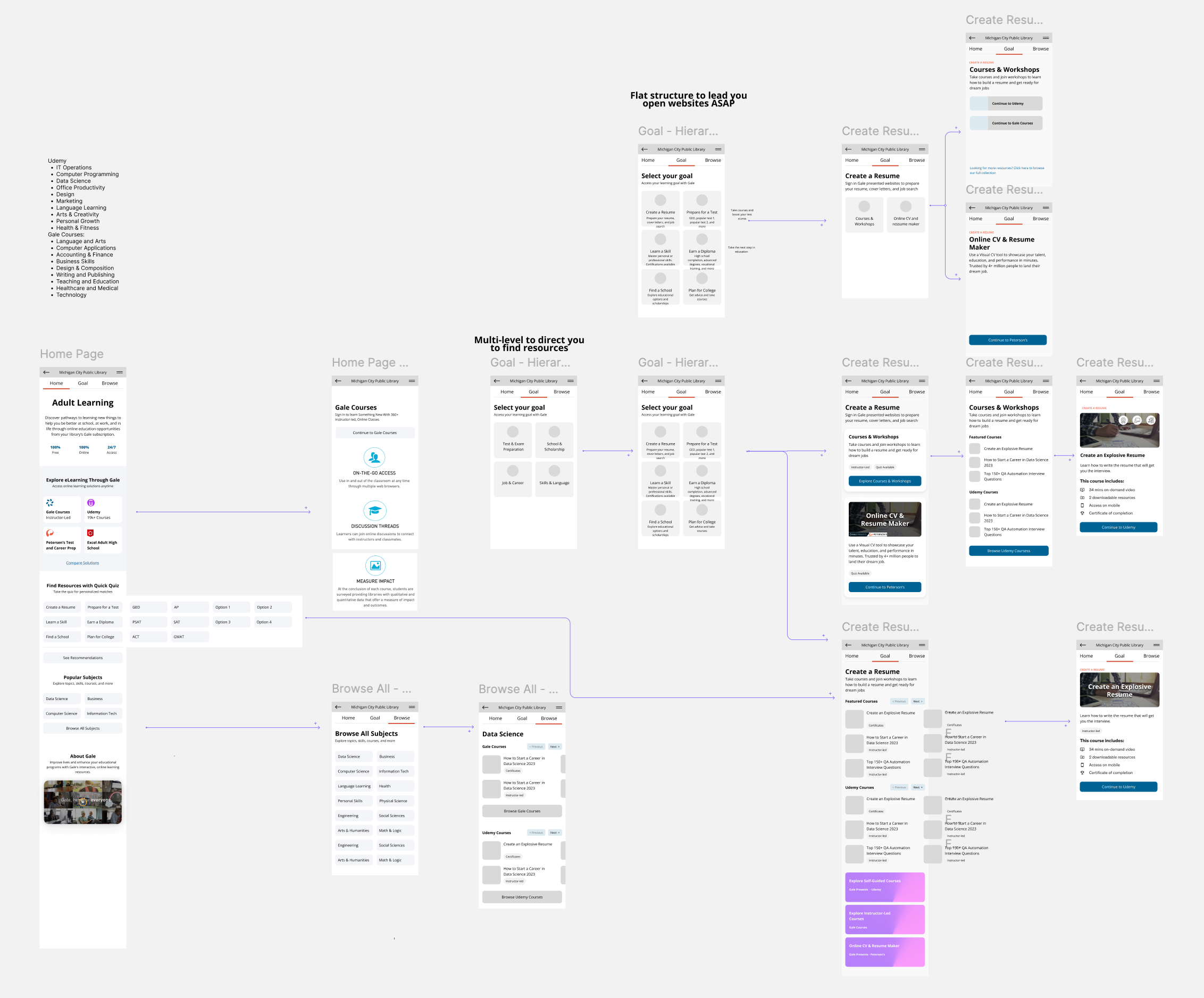
After: Goal-based category browsing
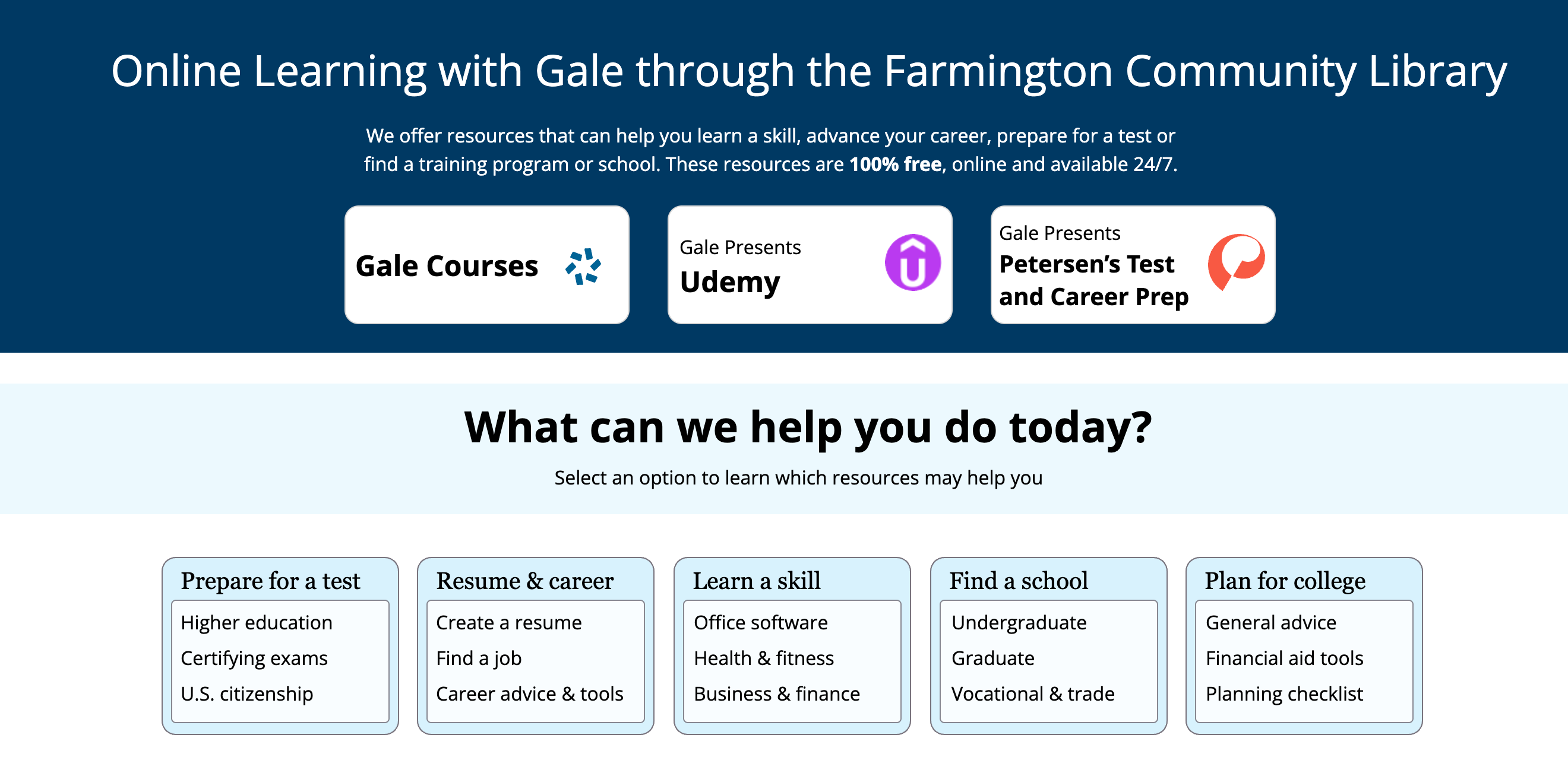
Usability testing revealed that product requirements, the Gale marketing banner and top product links, added little value and distracted users from their main goal. I presented my findings to the product stakeholders, successfully making the case that my design should keep focus on the learning tools.
Before: Full banner with marketing content
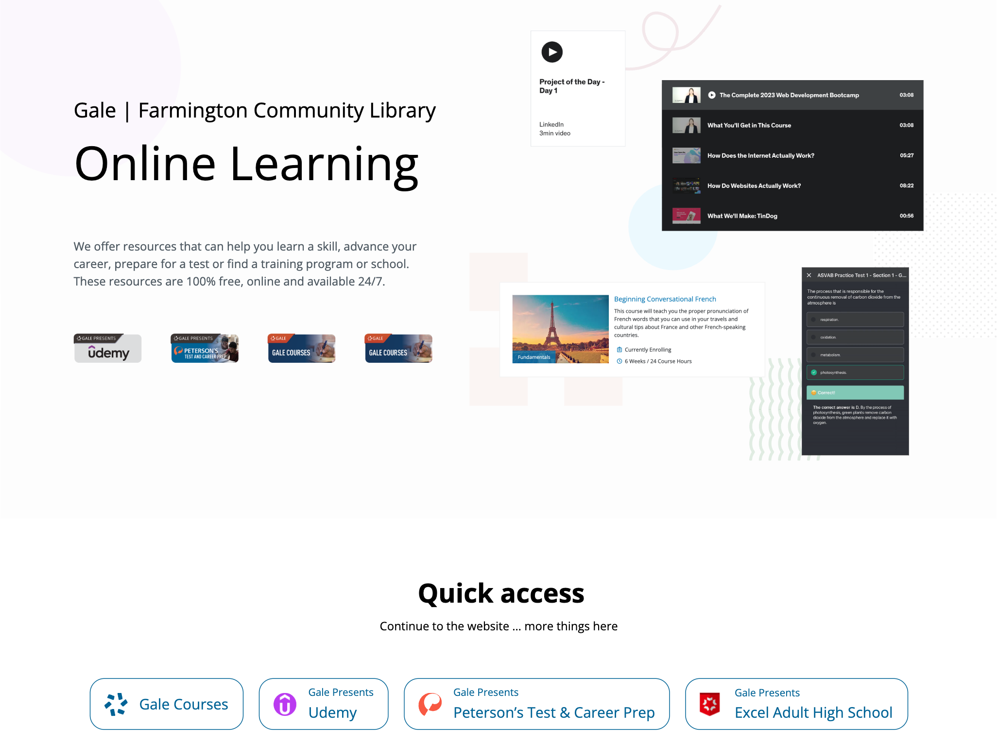
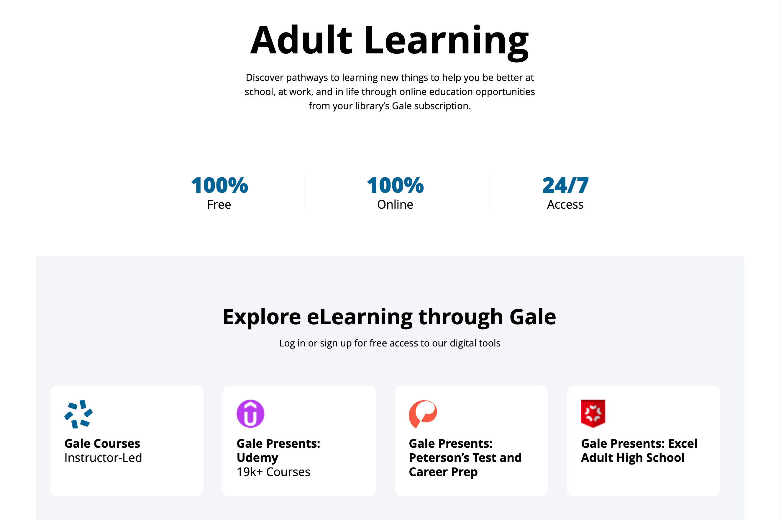
After: Minimal banner for compatibility
Component Design
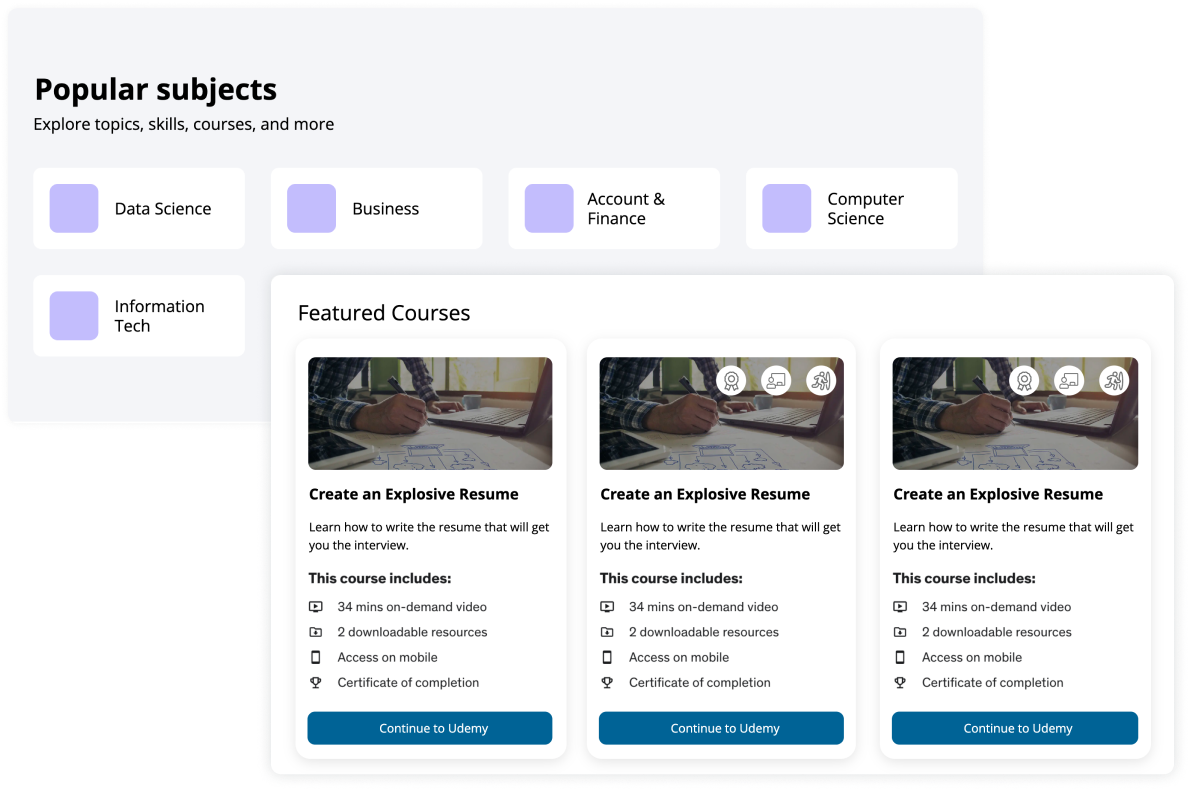
Card component:
I designed cards to work across varied institutional sites. To ensure broad compatibility across different institutional website environments and legacy browser systems, I fixed the card width to maintain text visibility and layout consistency across breakpoints. This made it easier to scale and support content changes over time.
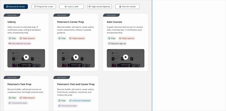
Pill component:
To help institutional staff quickly guide patrons to appropriate content, I designed pill-style metadata indicators that clarify whether resources are free or require an account. This improved visual scanning and helped users understand access requirements quickly
Before: Users had trouble understanding key details about each resources at a glance
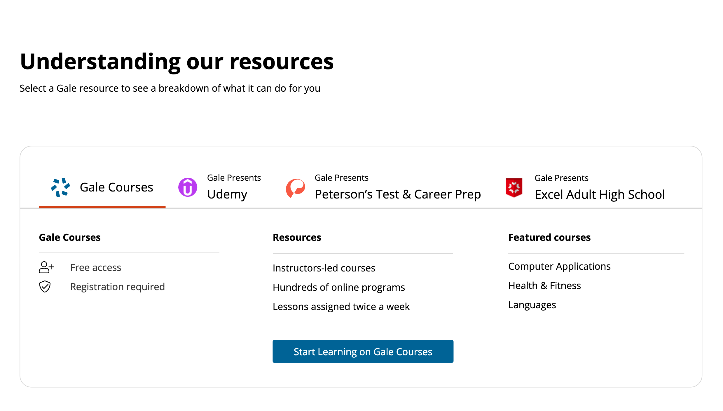
After: The pill component improved scannability and reduced uncertainty during decision-making.
More projects
UX Design
A Design System from Scratch
Explore
UX Design
B2B Folder Enhancement
Explore
UX Design
Online Learning Portal
Explore
UX Design
E-commerce Websites Migration
Explore
UX Design
Dashboard and Progress Management
Coming Soon
UX Design
New Product on a Mature Platform
Explore
© Sasha Meng 2025 All Rights Reserved
B2B Institutional Portal Design
Institutional portal redesign driving user engagement and client growth
Time Frame
About 50 hours from project scoping to launch (08/22 to 06/23)
Our Team
1 Lead UX Designer (me) | 1 UX Researcher | 2 Product Managers | 3 Engineers
My Contribution
Scoping | Concept creating | Design | Usability testing
Project Overview
What’s this product:
The Online Learning Portal is a partnership platform that helps libraries offer free premium learning resources to their communities. Through partnerships with companies like Udemy and Peterson’s, Gale curates courses and resources that libraries can provide to their patrons at no cost.
The Business Challenge:
Libraries wanted to offer premium learning resources but couldn't afford individual subscriptions to platforms like Udemy. Gale's partnership model solved this by providing free access to curated content, but libraries needed an institutional solution that would help their staff assist patrons while also enabling self-service browsing.
How I solved the challenge:
I designed the portal to showcase diverse learning content from multiple education partners, balancing the needs of library staff and patrons while accommodating various institutional websites with different partnership packages and technical setups. I led UX work that reframed the initial stakeholder requirements, simplified the navigation, and clarified the product’s purpose based on what users actually needed.
Business Impact & User Impact
Product usage within 2 months of launch
+66%
Customer adoptions in 6 months
+100
Online learning market share after 1 year
+20%
Reframing Concepts
Stakeholders initially requested two separate user flows. One for library staff helping patrons, and another for patrons browsing on their own.
Through interviews with library staff and end users (patrons), we found both groups had similar needs. They wanted quick, direct access to content and used the portal in similar ways. This insight enabled us to propose a unified solution that reduced implementation complexity for institutional clients while maintaining operational efficiency. Stakeholders accepted the recommendation.
Combine two user flows into a single experience
Library experience
Shared goal:
Find content fast
Patron experience
Single experience


Design Scoping
Midway through the project, I learned that a course platform architecture would soon change. I proactively rescoped from a complex integration to a lightweight, standalone portal. This approach reduced client deployment risks and future maintenance costs while maintaining platform flexibility.
Both the quiz and subject browsing design were removed to fit the updated scope
Concept Validating
Users struggled with subject browse. I explored 3 navigation approaches and moved forward with goal-based categories like Resume & Career, Learn a Skill, etc.
I eliminated the typical "All" tab structure since we couldn't detect subscription counts. Traditional "All" tabs would look awkward for single-subscription libraries. This design works identically regardless of subscription level.
Usability testing validated that users preferred browsing by learning goals over other models.
Before: 3 concepts of product browsing
After: Goal-based category browsing
Usability testing revealed that product requirements, the Gale marketing banner and top product links, added little value and distracted users from their main goal. I presented my findings to the product stakeholders, successfully making the case that my design should keep focus on the learning tools.
Before: Full banner with marketing content
After: Minimal banner for compatibility
Component Design
Card component:
I designed cards to work across varied institutional sites. To ensure broad compatibility across different institutional website environments and legacy browser systems, I fixed the card width to maintain text visibility and layout consistency across breakpoints. This made it easier to scale and support content changes over time.
Pill component:
To help institutional staff quickly guide patrons to appropriate content, I designed pill-style metadata indicators that clarify whether resources are free or require an account. This improved visual scanning and helped users understand access requirements quickly
Before: Users had trouble understanding key details about each resources at a glance
After: The pill component improved scannability and reduced uncertainty during decision-making.
More projects
UX Design
A Design System from Scratch
Explore
UX Design
B2B Folder Enhancement
Explore
UX Design
Online Learning Portal
Explore
UX Design
E-commerce Websites Migration
Explore
UX Design
Dashboard and Progress Management
Coming Soon
UX Design
New Product on a Mature Platform
Explore
© Sasha Meng 2025 All Rights Reserved
B2B Institutional Portal Design
Institutional portal redesign driving user engagement and client growth
Time Frame
About 50 hours from project scoping to launch (08/22 to 06/23)
Our Team
1 Lead UX Designer (me) | 1 UX Researcher | 2 Product Managers | 3 Engineers
My Contribution
Scoping | Concept creating | Design | Usability testing
Project Overview
What’s this product:
The Online Learning Portal is a partnership platform that helps libraries offer free premium learning resources to their communities. Through partnerships with companies like Udemy and Peterson’s, Gale curates courses and resources that libraries can provide to their patrons at no cost.
The Business Challenge:
Libraries wanted to offer premium learning resources but couldn't afford individual subscriptions to platforms like Udemy. Gale's partnership model solved this by providing free access to curated content, but libraries needed an institutional solution that would help their staff assist patrons while also enabling self-service browsing.
How I solved the challenge:
I designed the portal to showcase diverse learning content from multiple education partners, balancing the needs of library staff and patrons while accommodating various institutional websites with different partnership packages and technical setups. I led UX work that reframed the initial stakeholder requirements, simplified the navigation, and clarified the product’s purpose based on what users actually needed.
Business Impact & User Impact
Product usage within 2 months of launch
+66%
Customer adoptions in 6 months
+100
Online learning market share after 1 year
+20%
Reframing Concepts
Stakeholders initially requested two separate user flows. One for library staff helping patrons, and another for patrons browsing on their own.
Through interviews with library staff and end users (patrons), we found both groups had similar needs. They wanted quick, direct access to content and used the portal in similar ways. This insight enabled us to propose a unified solution that reduced implementation complexity for institutional clients while maintaining operational efficiency. Stakeholders accepted the recommendation.
Combine two user flows into a single experience
Library experience
Shared goal:
Find content fast
Patron experience
Single experience

Design Scoping
Midway through the project, I learned that a course platform architecture would soon change. I proactively rescoped from a complex integration to a lightweight, standalone portal. This approach reduced client deployment risks and future maintenance costs while maintaining platform flexibility.
Both the quiz and subject browsing design were removed to fit the updated scope
Concept Validating
Users struggled with subject browse. I explored 3 navigation approaches and moved forward with goal-based categories like Resume & Career, Learn a Skill, etc.
I eliminated the typical "All" tab structure since we couldn't detect subscription counts. Traditional "All" tabs would look awkward for single-subscription libraries. This design works identically regardless of subscription level.
Usability testing validated that users preferred browsing by learning goals over other models.
Before: 3 concepts of product browsing
After: Goal-based category browsing
Usability testing revealed that product requirements, the Gale marketing banner and top product links, added little value and distracted users from their main goal. I presented my findings to the product stakeholders, successfully making the case that my design should keep focus on the learning tools.
Before: Full banner with marketing content
After: Minimal banner for compatibility
Component Design
Card component:
I designed cards to work across varied institutional sites. To ensure broad compatibility across different institutional website environments and legacy browser systems, I fixed the card width to maintain text visibility and layout consistency across breakpoints. This made it easier to scale and support content changes over time.
Pill component:
To help institutional staff quickly guide patrons to appropriate content, I designed pill-style metadata indicators that clarify whether resources are free or require an account. This improved visual scanning and helped users understand access requirements quickly
Before: Users had trouble understanding key details about each resources at a glance
After: The pill component improved scannability and reduced uncertainty during decision-making.
More projects
UX Design
A Design System from Scratch
Explore
UX Design
B2B Folder Enhancement
Explore
UX Design
Online Learning Portal
Explore
UX Design
E-commerce Websites Migration
Explore
UX Design
Dashboard and Progress Management
Coming Soon
UX Design
New Product on a Mature Platform
Explore
© Sasha Meng 2025 All Rights Reserved