
New Product on a Mature Platform
A systemic approach to browsing workflows

Time Frame
11 months from requirement gathering to implementation (07/22 - 05/23)
Our Team
1 UX Design Lead (me) |1 UX Designer | 1 UX Researcher | 4 Product Managers | 8 Engineers
My Contribution
Requirement gathering | Concept creating | Usability testing | Design |Documentation
Project Overview
I led the end-to-end design of In Context Literature, a new product for teachers and students in grades 9-12. My central task was to integrate rich learning resources into the established 'In Context' product family to improve student engagement and educator effectiveness.
A foundational constraint was the mature, hard-to-change platform; this demanded practical, iterative design solutions to overcome existing UX hurdles where students found resources "too dense" and difficult to navigate. My strategic role involved navigating these complexities, always aiming to balance comprehensive, informative content with a visually pleasant, uncluttered user experience.
Business Impact & User Impact
User total sessions in 11 months
140k+
User total document views in 11 months
172k+
Product family market share in 12 months
+20%
Project Highlights
My design leadership delivered a significantly improved user experience, focused on intuitive discovery and effortless engagement with rich content. We moved users from information overwhelm to empowered exploration.
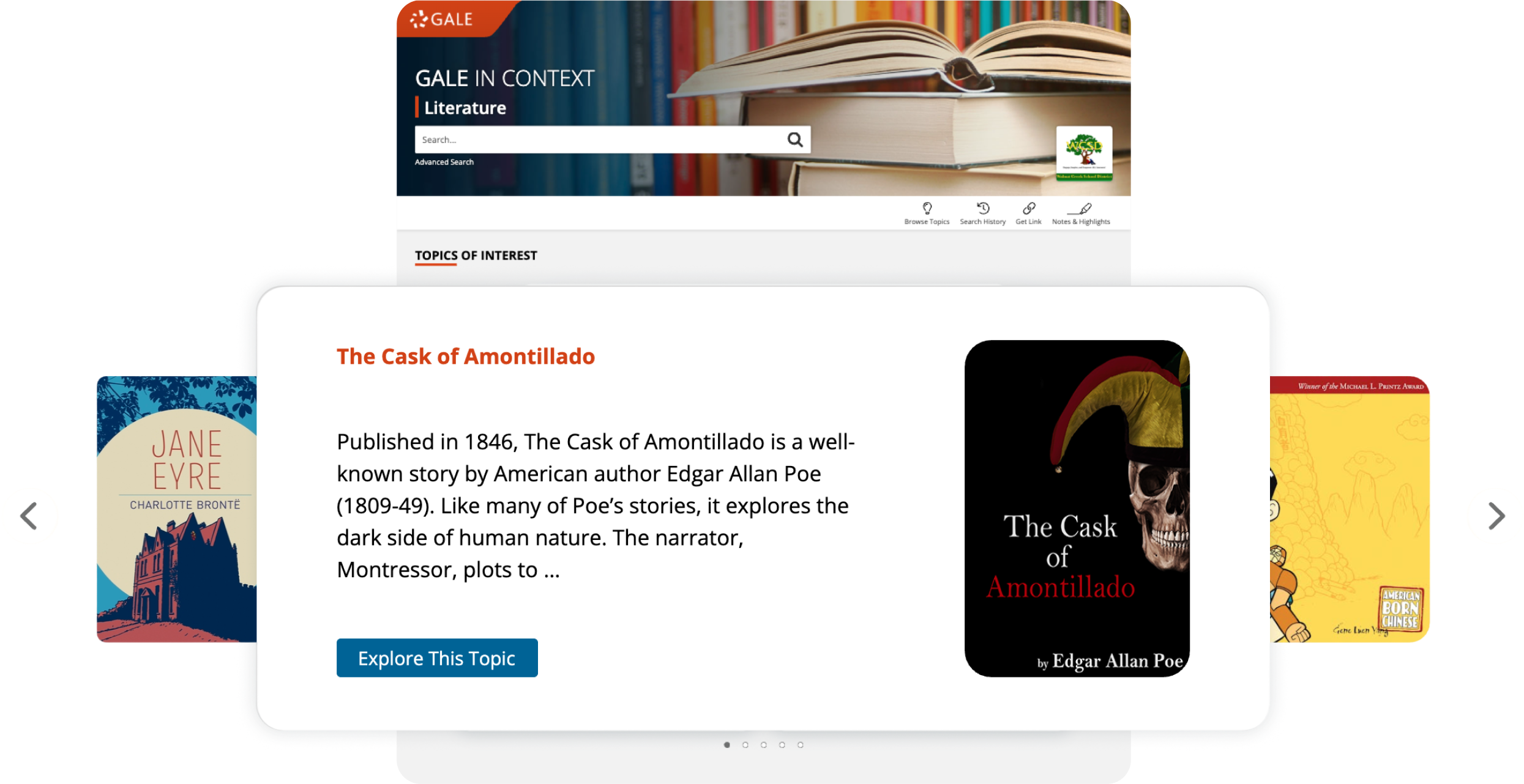
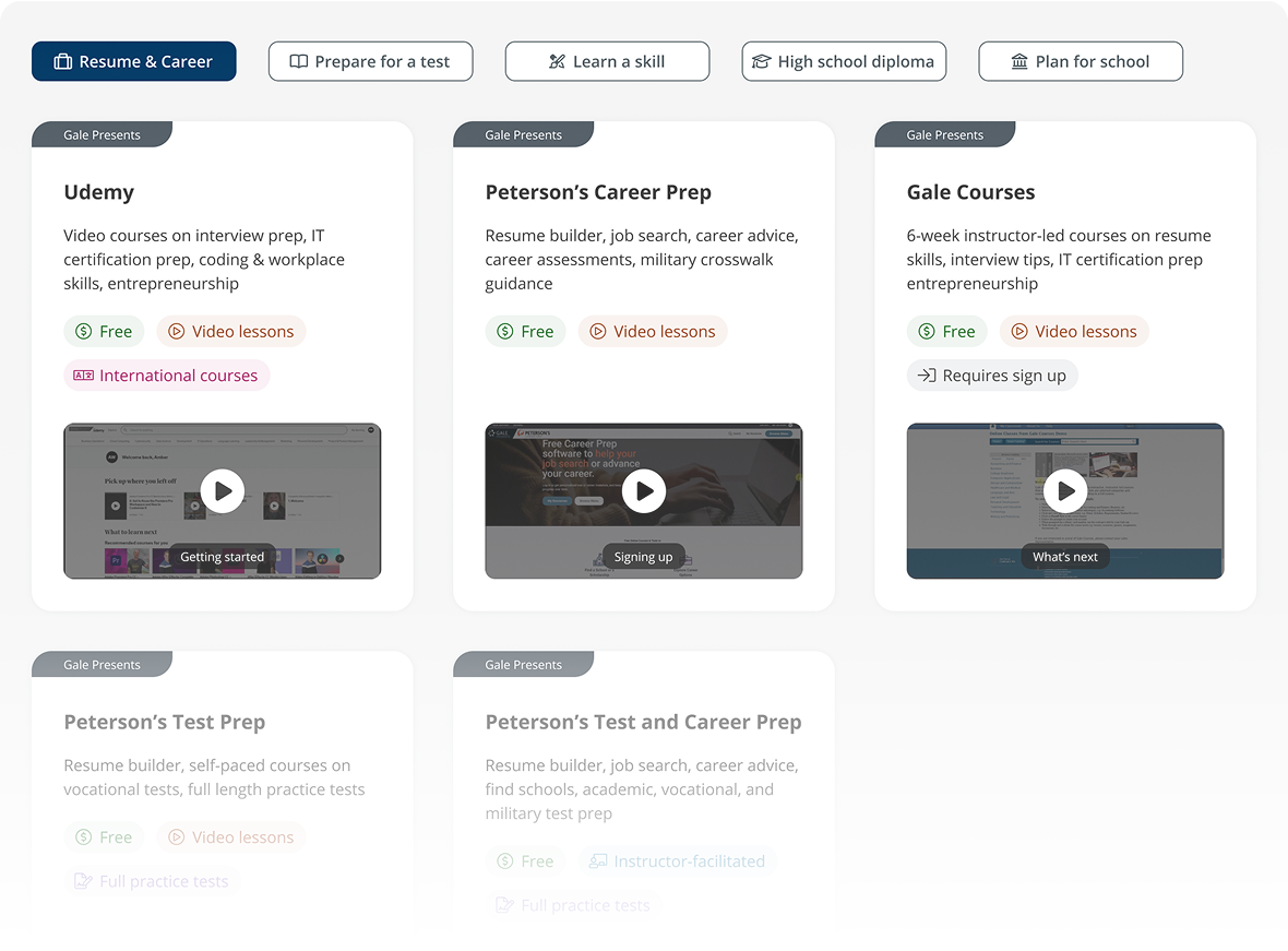
Effortless Starting Points: Users are now welcomed with a streamlined homepage featuring prominent, clear search functionality and intelligently curated "Topics of Interest." The redesigned carousel component offers a more inviting and readable entry into diverse topics.
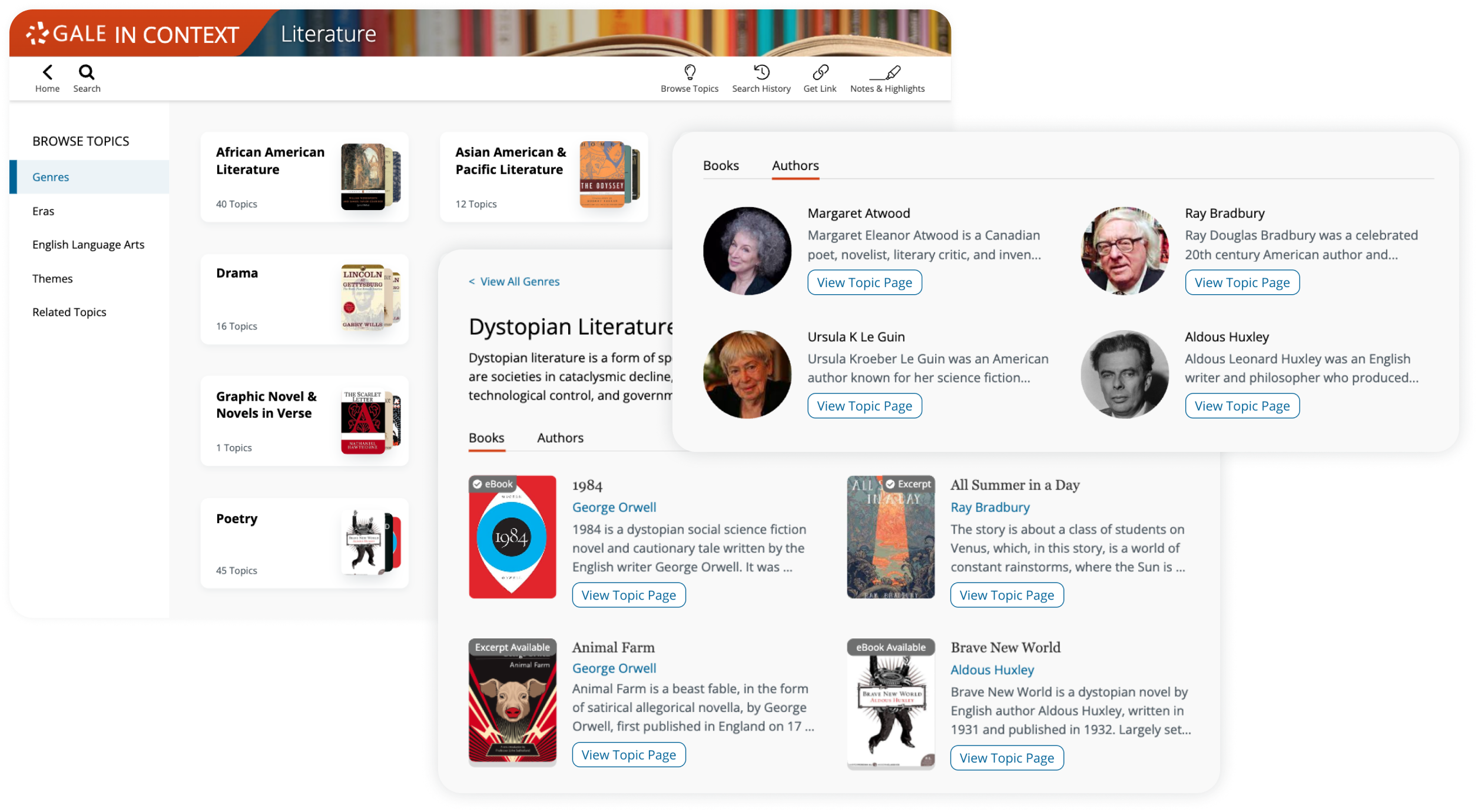
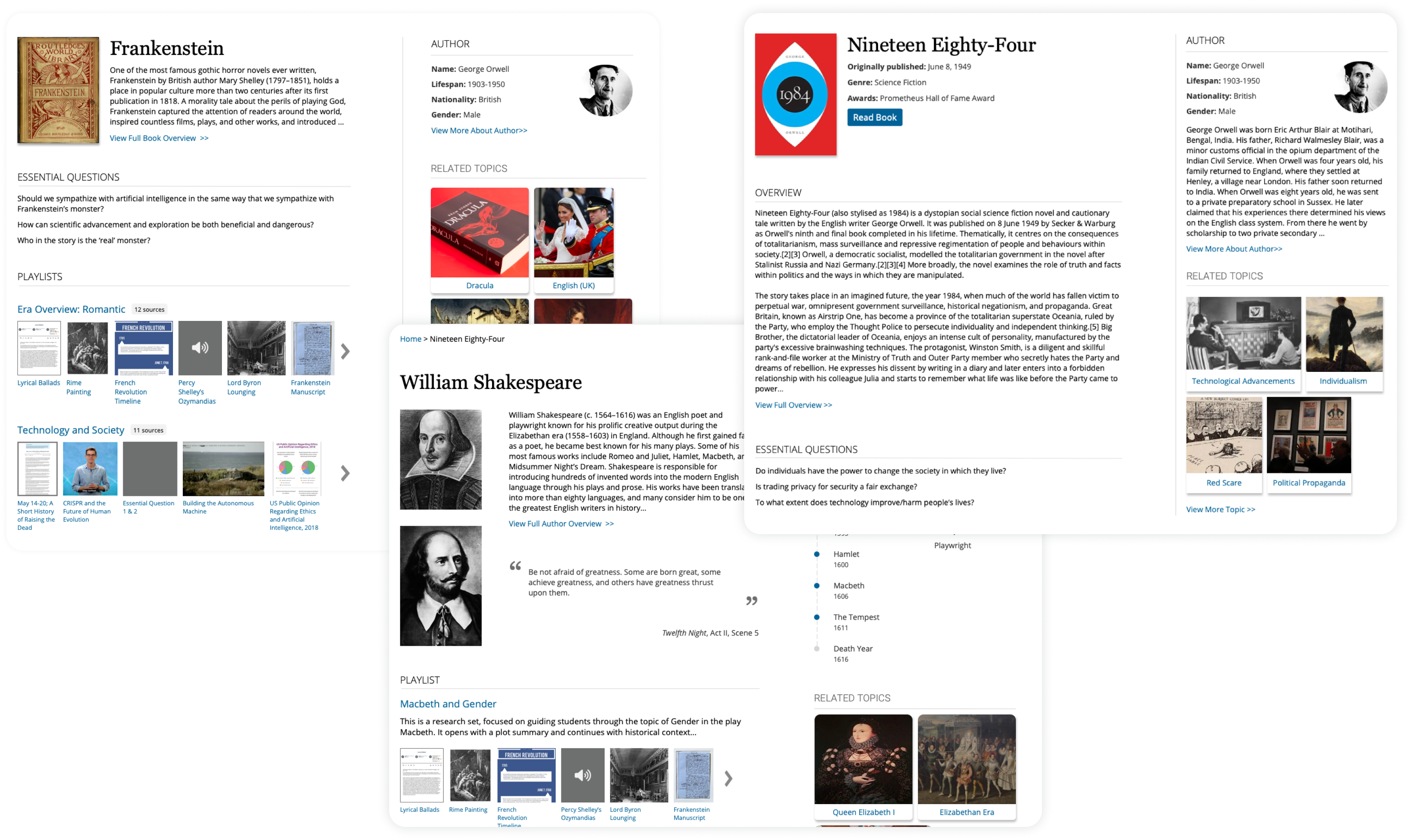
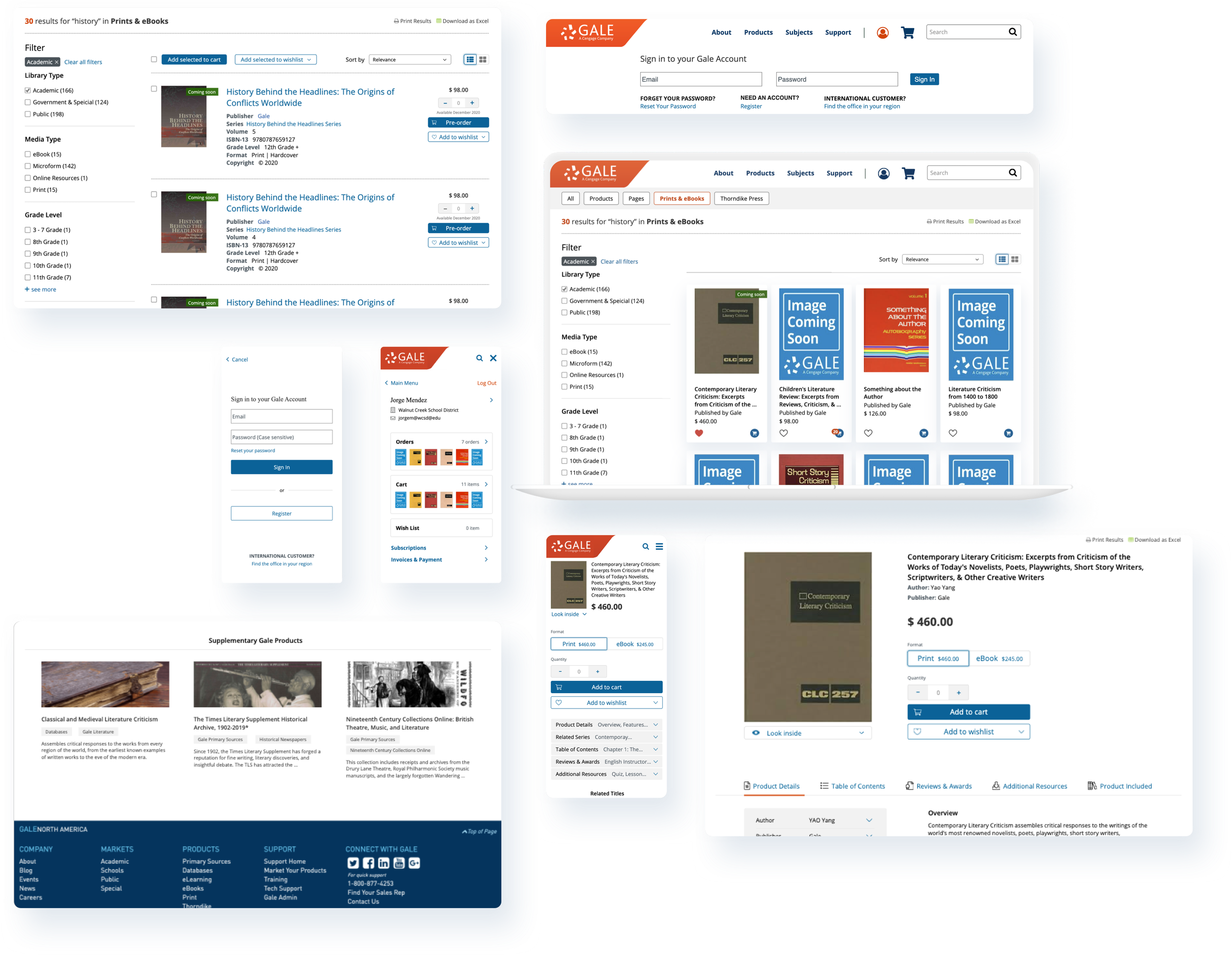
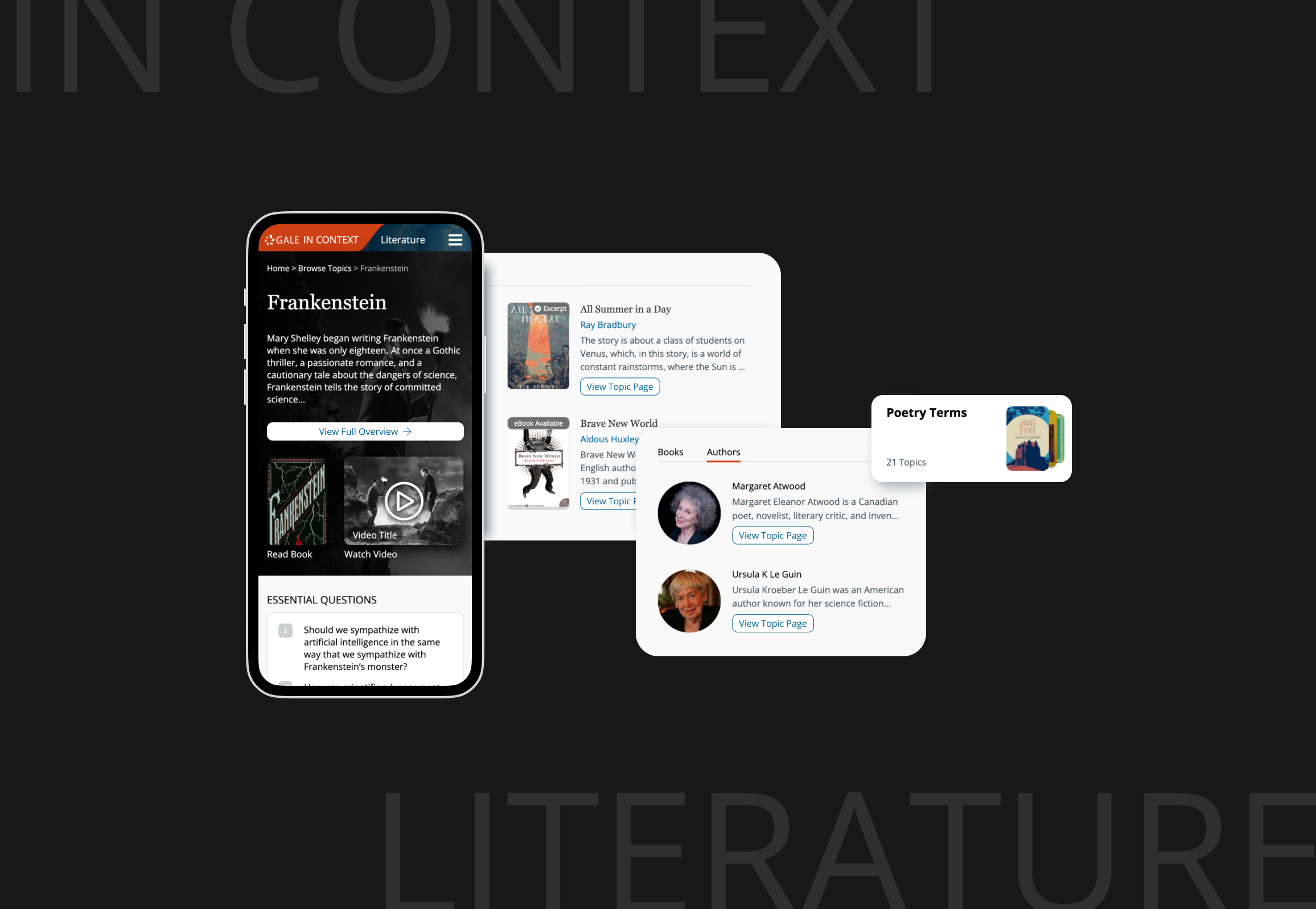
Seamless Content Discovery: Browse Topics Page made finding relevant information intuitive. Consistent, redesigned topic preview components feature standardized height text blocks, ensuring quickly scan and understand content at a glance, dramatically reducing cognitive load.
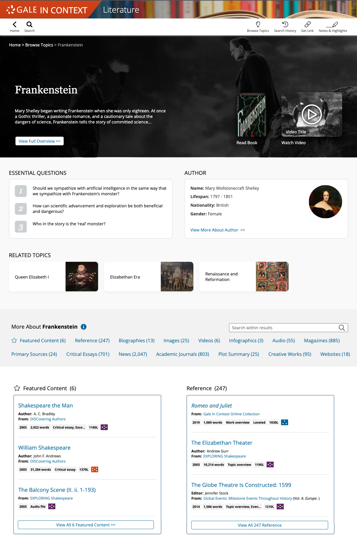
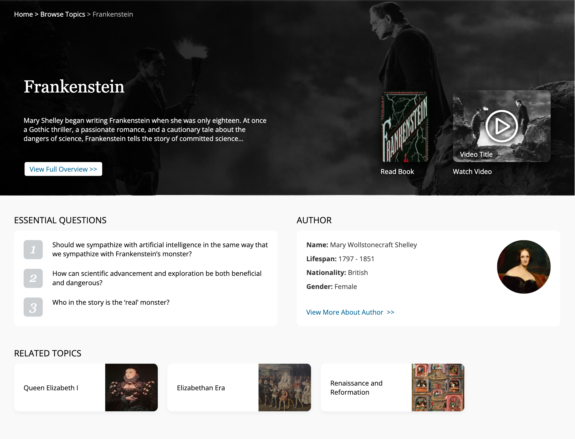
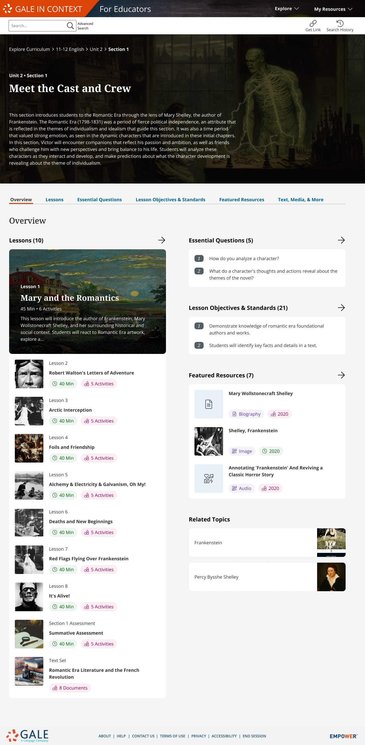
Clarity in Complexity: Topic View Page introduced a clear sectional hierarchy, balancing comprehensive overviews with scannable information chunks. This user-centered structure, validated in testing, demonstrably improved users' ability to efficiently locate specific information.
Early Concepts & User Insights
My process began with collaborative vision setting and rapid prototyping to address initial ambiguity, particularly around optimal information density.
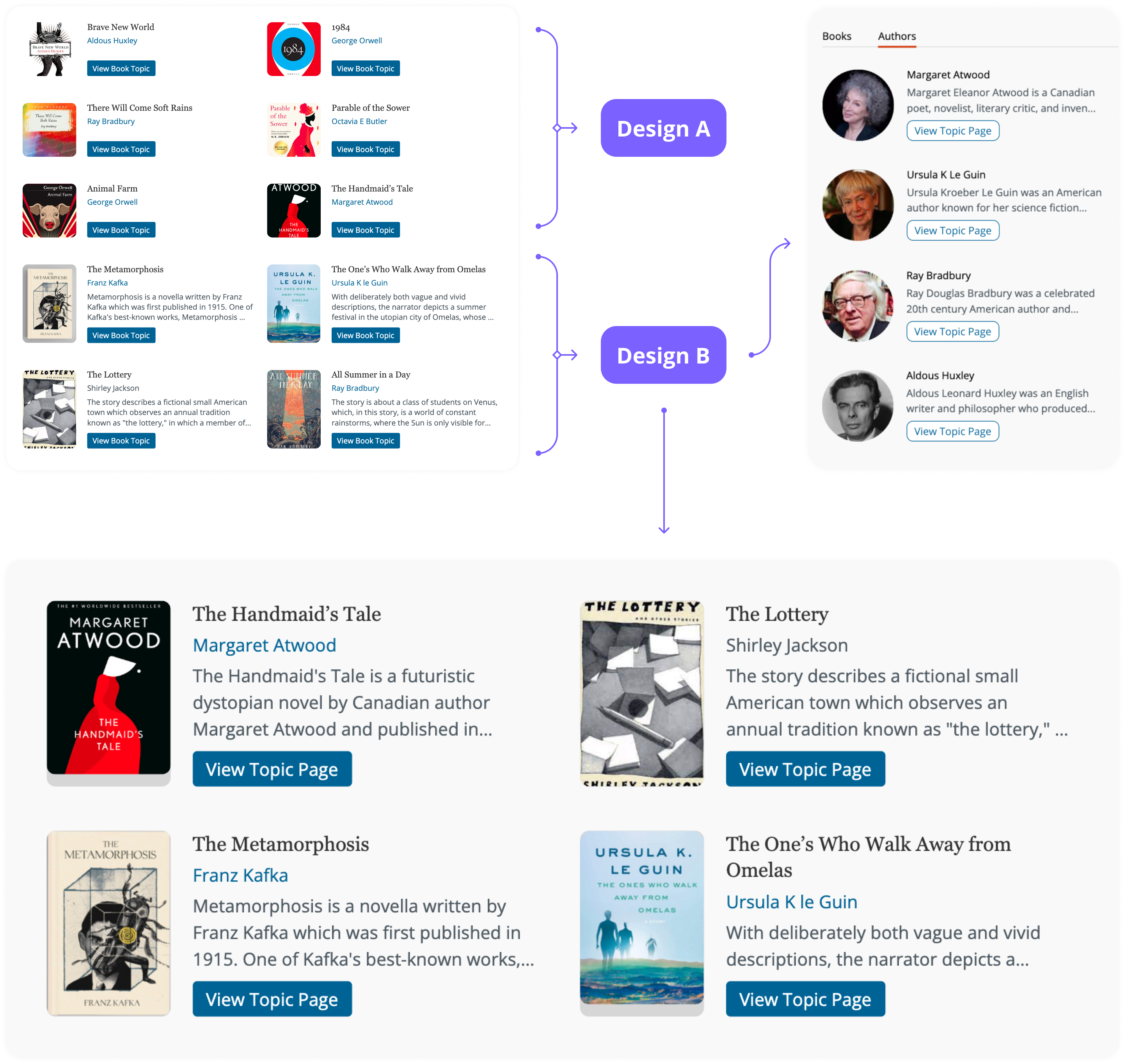
Wireframe & initial draft on Topic View Page
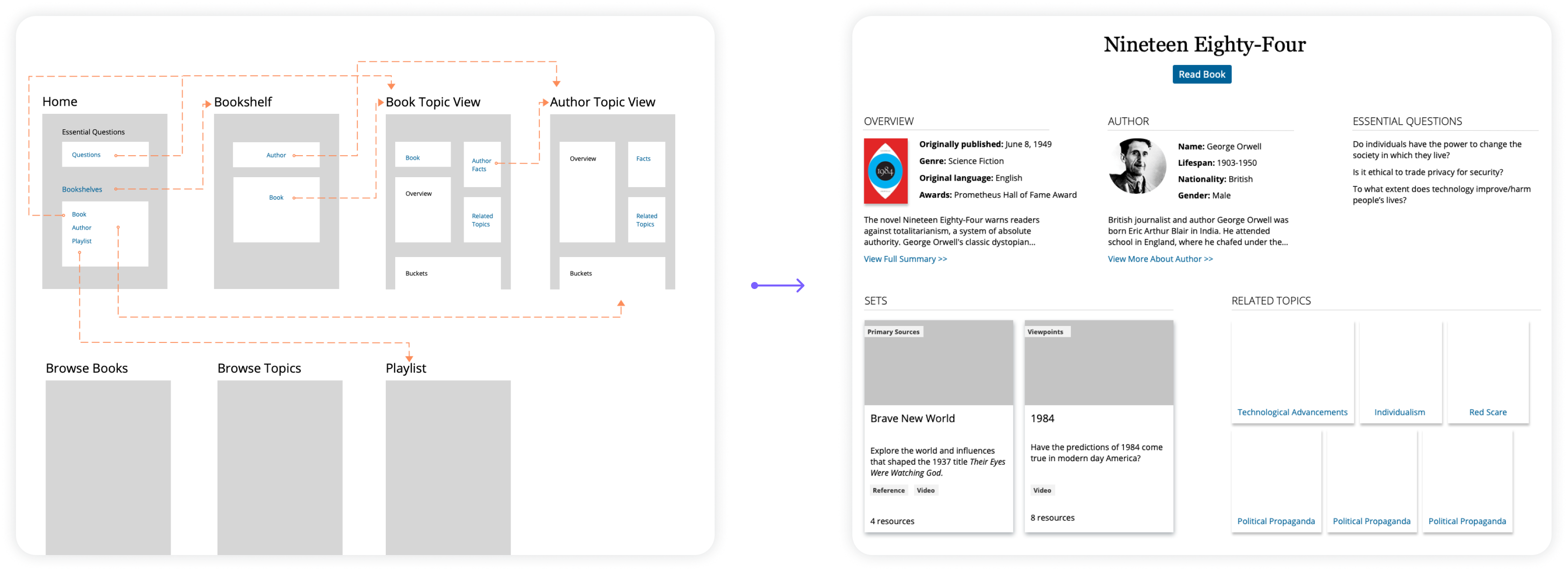
Topic View Page concepts to test how much information to present upfront: minimalist or context-rich?
User testing provided clear direction: students preferred scannable topic cards and brief context. Educator insights confirmed the need for both 'short, accessible texts' and tools for students to analyze complex material. Most significantly, the finding that students 'respond better to teaching through themes' became a core principle for my information architecture design.
Iteration: Addressing Key UX Challenges
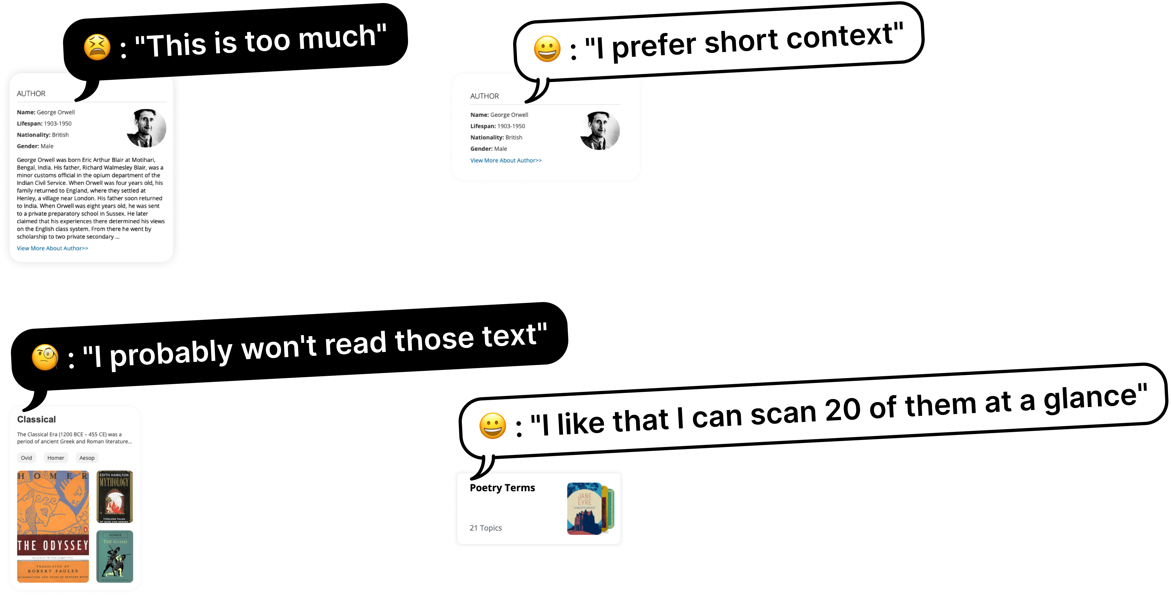
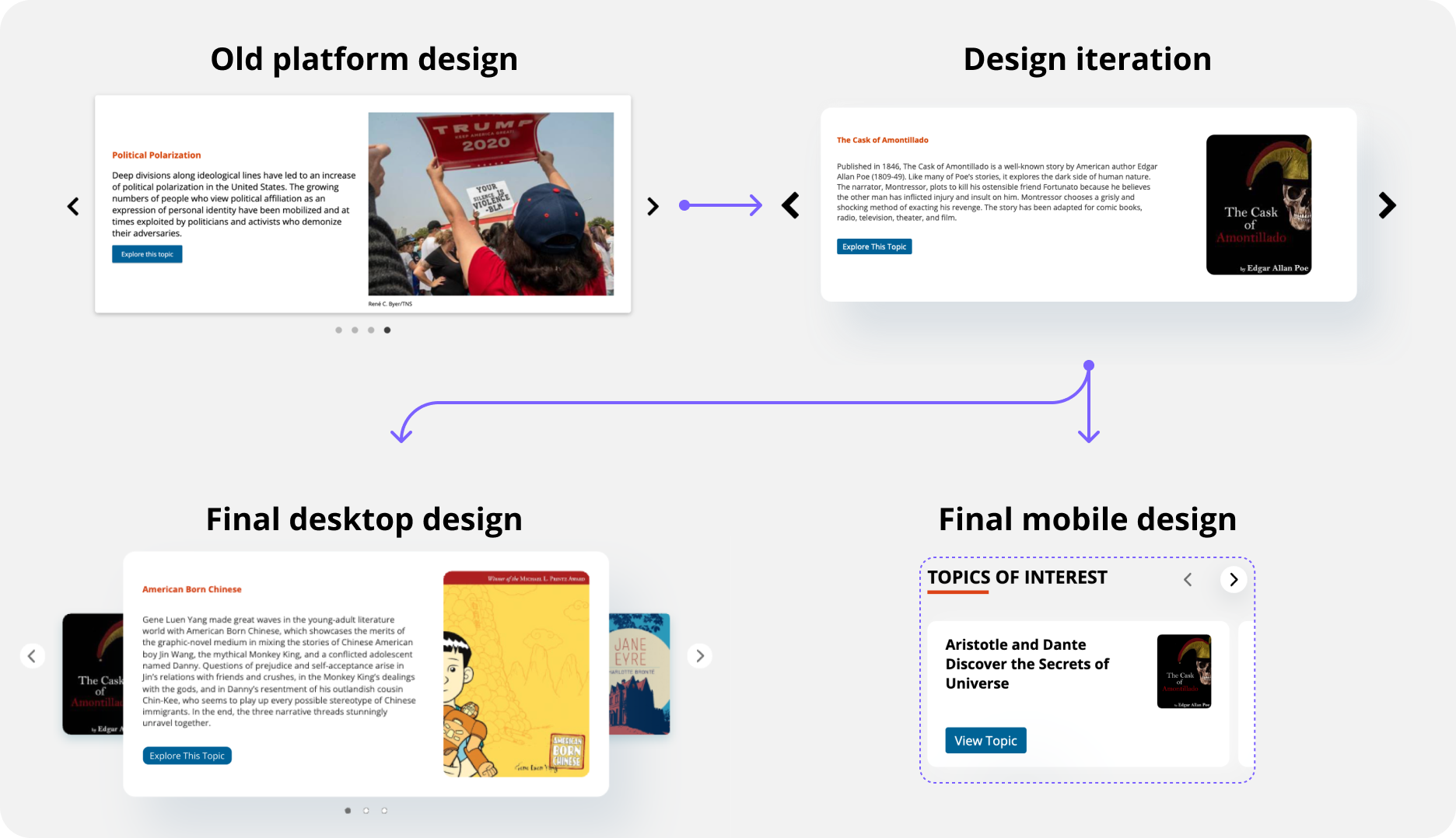
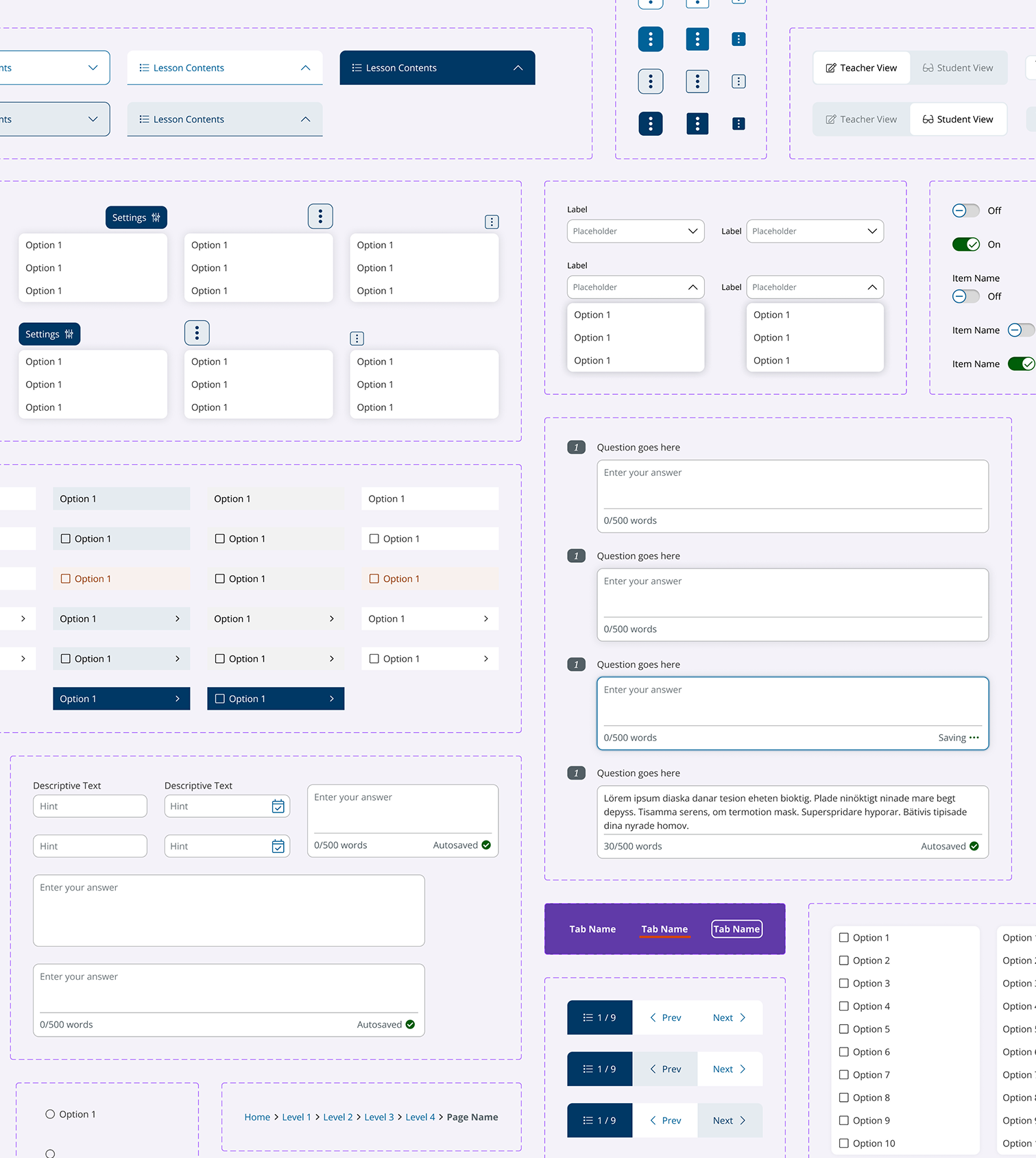
User feedback guided solutions for information overload, discoverability, and engagement. Balancing ideal UX with technical feasibility through practical collaboration was key throughout this iterative phase. To address information overload from the vast content library, especially since students needed "a lot of hand-holding," my solution, based on user testing, refined navigation with clear categories and scannable overviews.
To ensure visual consistency with varied image ratios, I standardized text blocks (5-line title, author, and truncated blurb, or 3-line author and truncated blurb)
Recognizing the homepage's inherited card carousel hindered engagement with poor readability and low CTA clicks, I proactively redesigned it.
The new design: featured narrower, more readable cards and better visual affordance for discovering more items. A practical mobile trade-off made with engineering was to hide card blurbs to improve scannability and reduce scrolling.
Reflections
Navigating this project's constraints and user needs, with its "ups and downs" like initial uncertainties or post-launch fixes, was crucial for delivering robust solutions and embracing the "messy middle" of real-world design. This project honed my skills in leading design strategy through complexity, fostering practical collaboration, and delivering impactful, user-centered educational tools.
More projects
UX Design
A Design System from Scratch
Explore
UX Design
B2B Folder Enhancement
Explore
UX Design
Online Learning Portal
Explore
UX Design
E-commerce Websites Migration
Explore
UX Design
Dashboard and Progress Management
Coming Soon
UX Design
New Product on a Mature Platform
Explore
© Sasha Meng 2025 All Rights Reserved
New Product on a Mature Platform
A systemic approach to browsing workflows
Time Frame
11 months from requirement gathering to implementation (07/22 - 05/23)
Our Team
1 UX Design Lead (me) |1 UX Designer | 1 UX Researcher | 4 Product Managers | 8 Engineers
My Contribution
Requirement gathering | Concept creating | Usability testing | Design |Documentation
Project Overview
I led the end-to-end design of In Context Literature, a new product for teachers and students in grades 9-12. My central task was to integrate rich learning resources into the established 'In Context' product family to improve student engagement and educator effectiveness.
A foundational constraint was the mature, hard-to-change platform; this demanded practical, iterative design solutions to overcome existing UX hurdles where students found resources "too dense" and difficult to navigate. My strategic role involved navigating these complexities, always aiming to balance comprehensive, informative content with a visually pleasant, uncluttered user experience.
Business Impact & User Impact
User total sessions in 11 months
140k+
User total document views in 11 months
172k+
Product family market share in 12 months
+20%
Project Highlights
My design leadership delivered a significantly improved user experience, focused on intuitive discovery and effortless engagement with rich content. We moved users from information overwhelm to empowered exploration.
Effortless Starting Points: Users are now welcomed with a streamlined homepage featuring prominent, clear search functionality and intelligently curated "Topics of Interest." The redesigned carousel component offers a more inviting and readable entry into diverse topics.
Seamless Content Discovery: Browse Topics Page made finding relevant information intuitive. Consistent, redesigned topic preview components feature standardized height text blocks, ensuring quickly scan and understand content at a glance, dramatically reducing cognitive load.
Clarity in Complexity: Topic View Page introduced a clear sectional hierarchy, balancing comprehensive overviews with scannable information chunks. This user-centered structure, validated in testing, demonstrably improved users' ability to efficiently locate specific information.
Early Concepts & User Insights
My process began with collaborative vision setting and rapid prototyping to address initial ambiguity, particularly around optimal information density.
Wireframe & initial draft on Topic View Page
Topic View Page concepts to test how much information to present upfront: minimalist or context-rich?
User testing provided clear direction: students preferred scannable topic cards and brief context. Educator insights confirmed the need for both 'short, accessible texts' and tools for students to analyze complex material. Most significantly, the finding that students 'respond better to teaching through themes' became a core principle for my information architecture design.
Iteration: Addressing Key UX Challenges
User feedback guided solutions for information overload, discoverability, and engagement. Balancing ideal UX with technical feasibility through practical collaboration was key throughout this iterative phase. To address information overload from the vast content library, especially since students needed "a lot of hand-holding," my solution, based on user testing, refined navigation with clear categories and scannable overviews.
To ensure visual consistency with varied image ratios, I standardized text blocks (5-line title, author, and truncated blurb, or 3-line author and truncated blurb)
Recognizing the homepage's inherited card carousel hindered engagement with poor readability and low CTA clicks, I proactively redesigned it.
The new design: featured narrower, more readable cards and better visual affordance for discovering more items. A practical mobile trade-off made with engineering was to hide card blurbs to improve scannability and reduce scrolling.
Reflections
Navigating this project's constraints and user needs, with its "ups and downs" like initial uncertainties or post-launch fixes, was crucial for delivering robust solutions and embracing the "messy middle" of real-world design. This project honed my skills in leading design strategy through complexity, fostering practical collaboration, and delivering impactful, user-centered educational tools.
More projects
UX Design
A Design System from Scratch
Explore
UX Design
B2B Folder Enhancement
Explore
UX Design
Online Learning Portal
Explore
UX Design
E-commerce Websites Migration
Explore
UX Design
Dashboard and Progress Management
Coming Soon
UX Design
New Product on a Mature Platform
Explore
© Sasha Meng 2025 All Rights Reserved