
Constraint Navigation in Product Design
Step-by-step workflows for guided content with dashboards and admin controls
Time Frame
22 months from problem discovery to design-dev delivery (July 2023-May 2025)
Our Team
1 UX Design Lead (me) |1 UX Designer | 1 UX Researcher | 4 Product Managers | 10+ Engineers | 3 Content Strategists
My Contribution
Ideation | Requirement definition | Research | Design | Testing | Documentation | Dev support | Scoping | Vender guideline design
The Challenge & Opportunity
The business goal of this project was to expand by creating a curriculum delivery platform to capture the $9B curriculum market. Cengage, Gale wanted to be a top 10 K-12 core curriculum brand with it’s existing product suite.
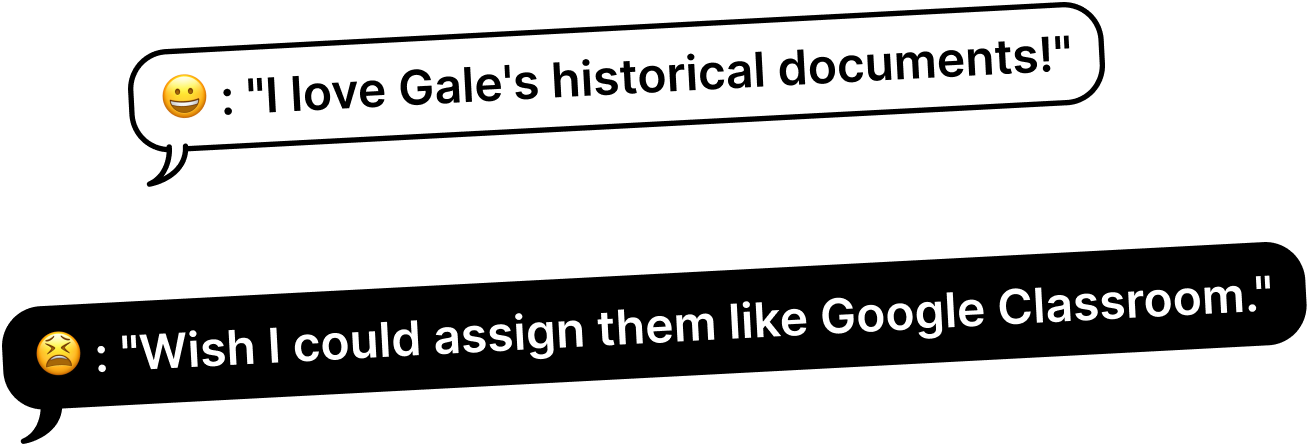
I led end-to-end design of teacher and student dashboards with streamlined workflows for assigning lessons with digital activities and class management. These workflows guided students through structured learning sequences from accessing assigned content to completing activities to receiving feedback, while giving teachers visibility into individual and class-wide progress.
Business Impact & User Impact
User satisfaction in testing
83%
Task completion rates
70%
Project Highlights
60+ responsive web pages, 15 new components compliant across 20+ products. We proved library databases could work in classrooms with the right user experience, and cross-functional collaboration could overcome massive technical constraints.
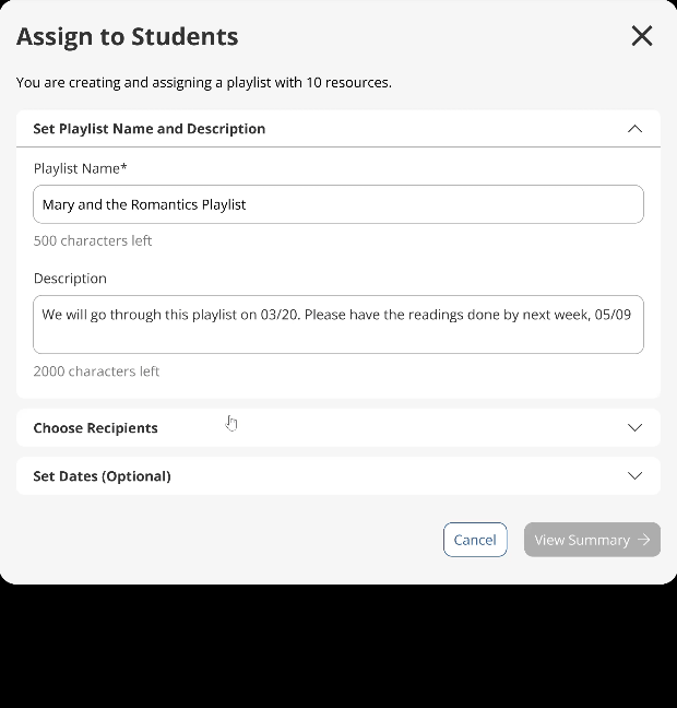
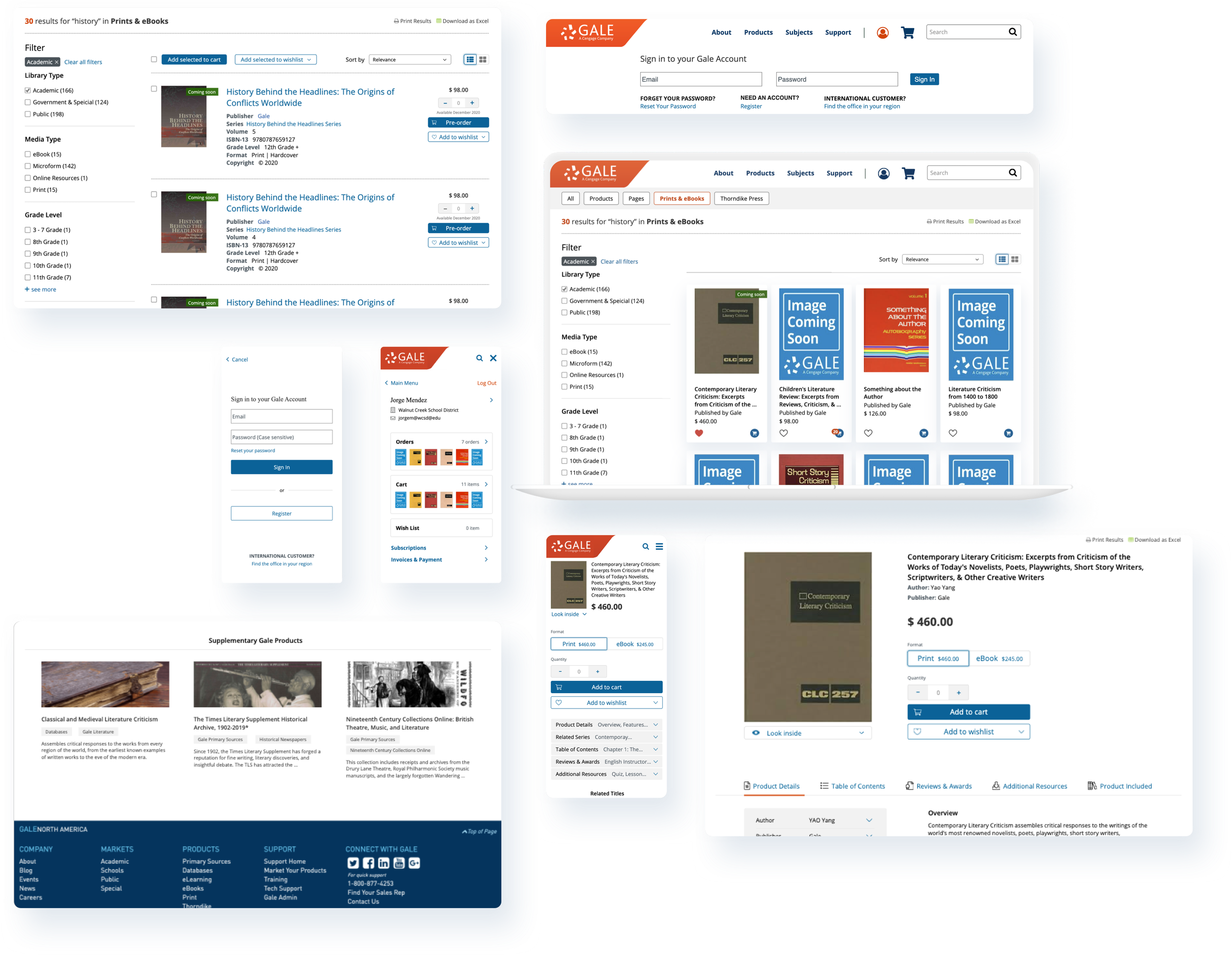
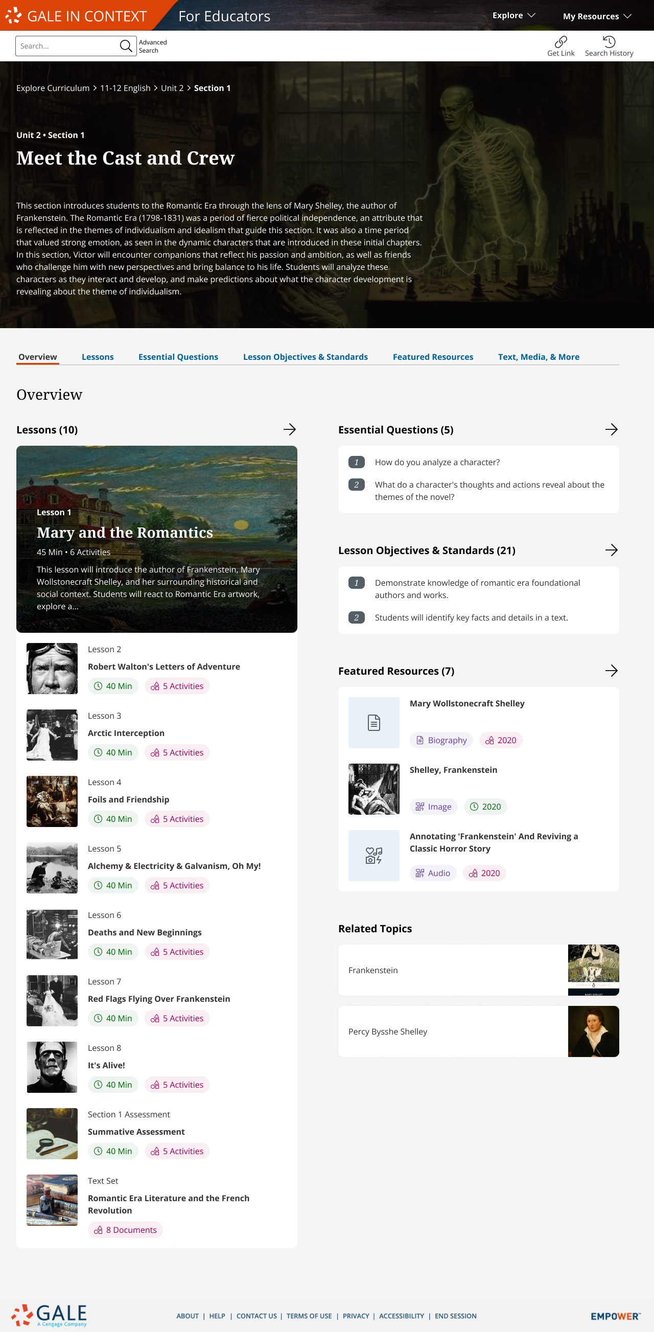
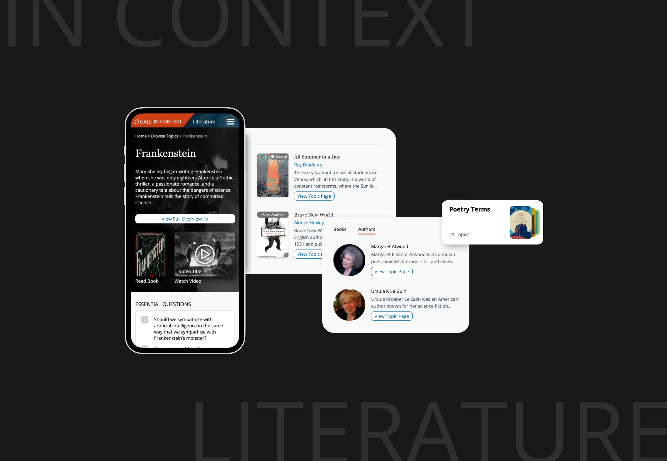
Administrator / Teacher dashboards
Class management and assignment creation
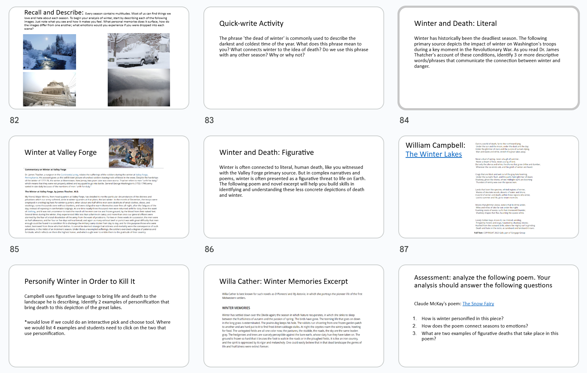
Student dashboards
Accessing sequential learning paths and viewing completion status
Content curation workflows
Transform research databases into classroom curriculum with integrated activities and assessments
Administrative controls
Class management, bulk assignments, and user permission settings within institutional environments
Platform Research Pivot
Six months in, corporate mandated we build on MindTap, a complex, old platform with its own update roadmap. My heuristic evaluation revealed critical gaps, saved 6+ months of adaptation work, and prevented user adoption failure.
5s page load time
Slow loading creates frustration and poor learning experience for students

Not responsive
Main content section is not responsive for mobile devices

Not readable
Smallest font size is 10px, falling below WCAG accessibility standards

Navigation issues
Table of contents hidden behind icon, confusing user flow

High adoption risk
Complex onboarding and poor UX likely to cause adoption failure

6+ assignment steps
Teachers expect 3 simple steps, but MindTap requires 6+ complex actions

I helped my project managers present findings to leadership showing adaptation would take longer than building custom. The leadership agreed to abandon MindTap and build new, custom features on Gale’s own platform optimized for K-12 classroom needs.
Design Process
I navigated design direction and stakeholder alignment by grounding decisions in data collected with my manager through 5 rounds of usability testing with 30+ users. This testing helped us choose among design concepts while revealing the next questions to address and their priorities.
Challenge 1:
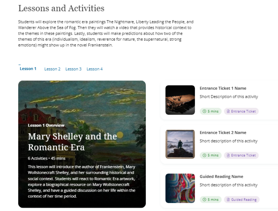
Working with content strategists on sequential learning paths, we needed to ensure content built logically lesson-to-lesson while accommodating their new authoring tool constraints.
Solution 1:
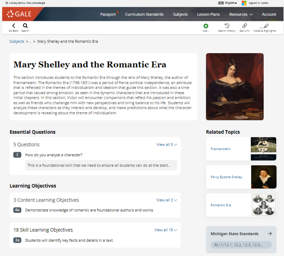
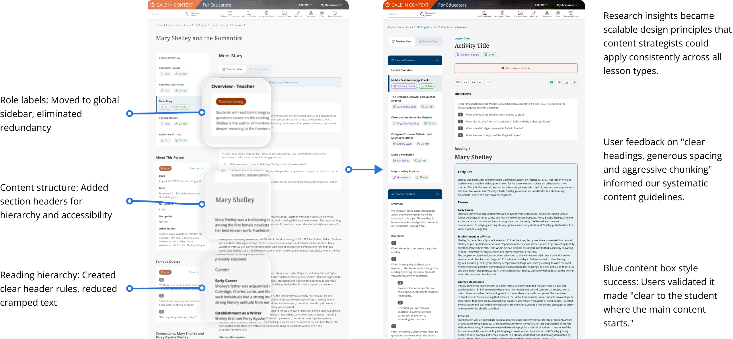
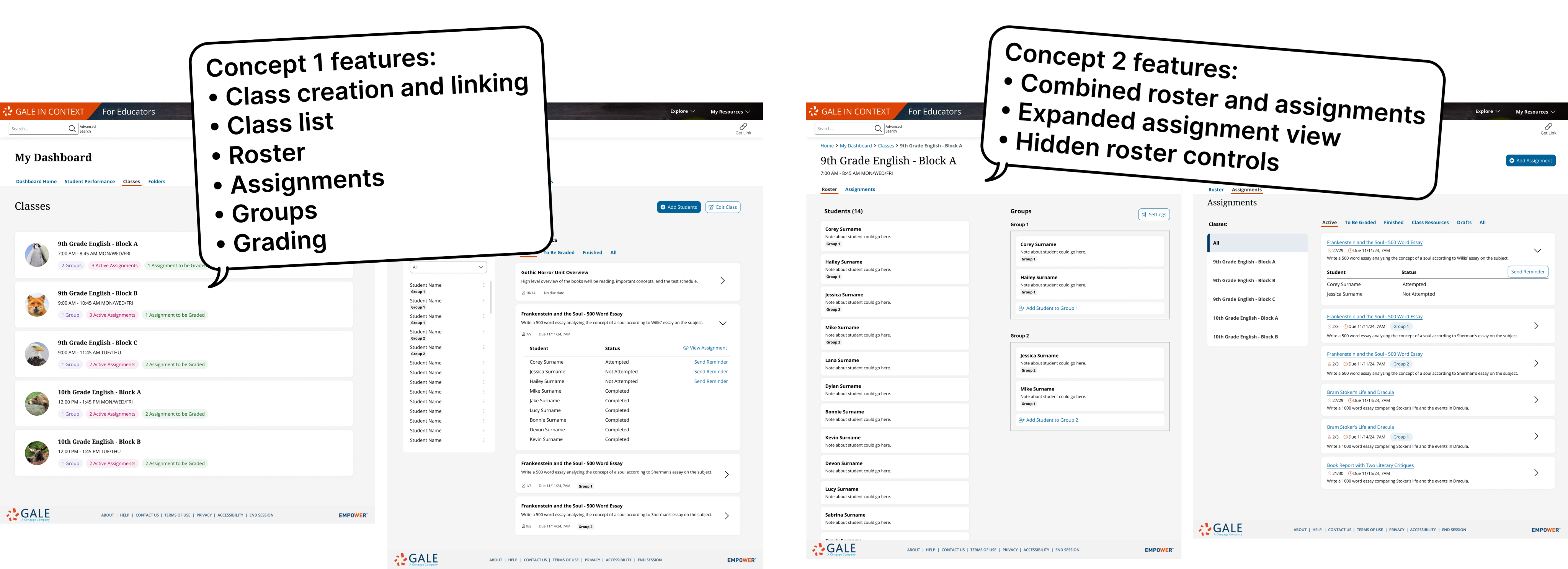
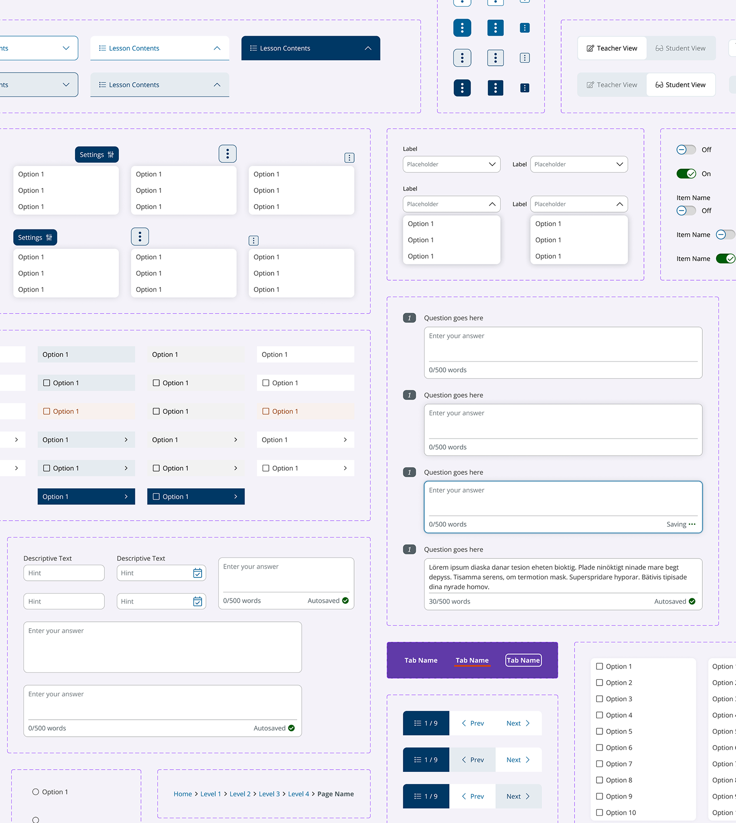
I established a collaborative design framework with content strategists, creating visual guidelines that enabled structured decision-making across teams. Below is an example that the 3nd round iteration:
Example 1: Cross-functional content iteration from Round 3 testing

In progress: Round 1 mockup
Before: content drafts

After: Cross-functional content iteration from Round 3 testing with clear instruction for content template
Challenge 2:
Our student persona would abandon wall-of-text content and we needed to visualize content. Stock images were expensive, and there were a lot of abstract concepts hard to visualize.
Solution 2:
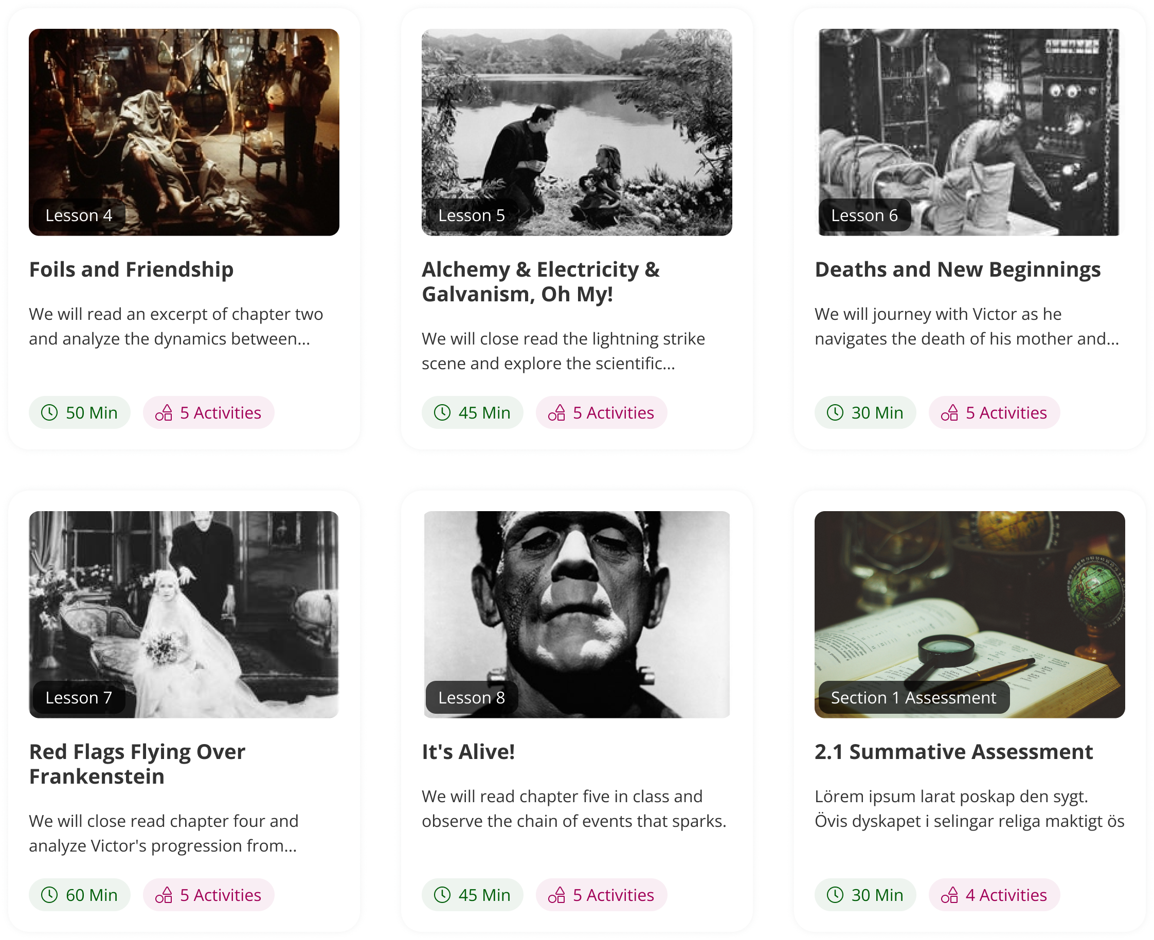
I designed 20+ reusable components that made any lesson and activity engaging with or without images. Below is an example from the 2nd round testing:
Example: How and why certain concepts were chosen from Round 2 testing
Based on user feedback, we implemented the 'Card View' concept with thumbnail tiles for the Lesson Tab area. Time constraints prevented us from building the 'Checklist View' as an alternative mode, so we adapted that concept for a separate assignment page where lesson overview is an assignable activity within the activity list.
If adapted the Lesson Tab ‘Checklist View ’Concept:
Need to decide if lesson overview is an assignable activity within the activity list
The thumbnail tiles worked better overall
While not as visually appealing, users called out how easy they were to scan for critical information
Implemented
The large tiles were visually interesting but...
Some users found them busy, difficult to scan and overly large
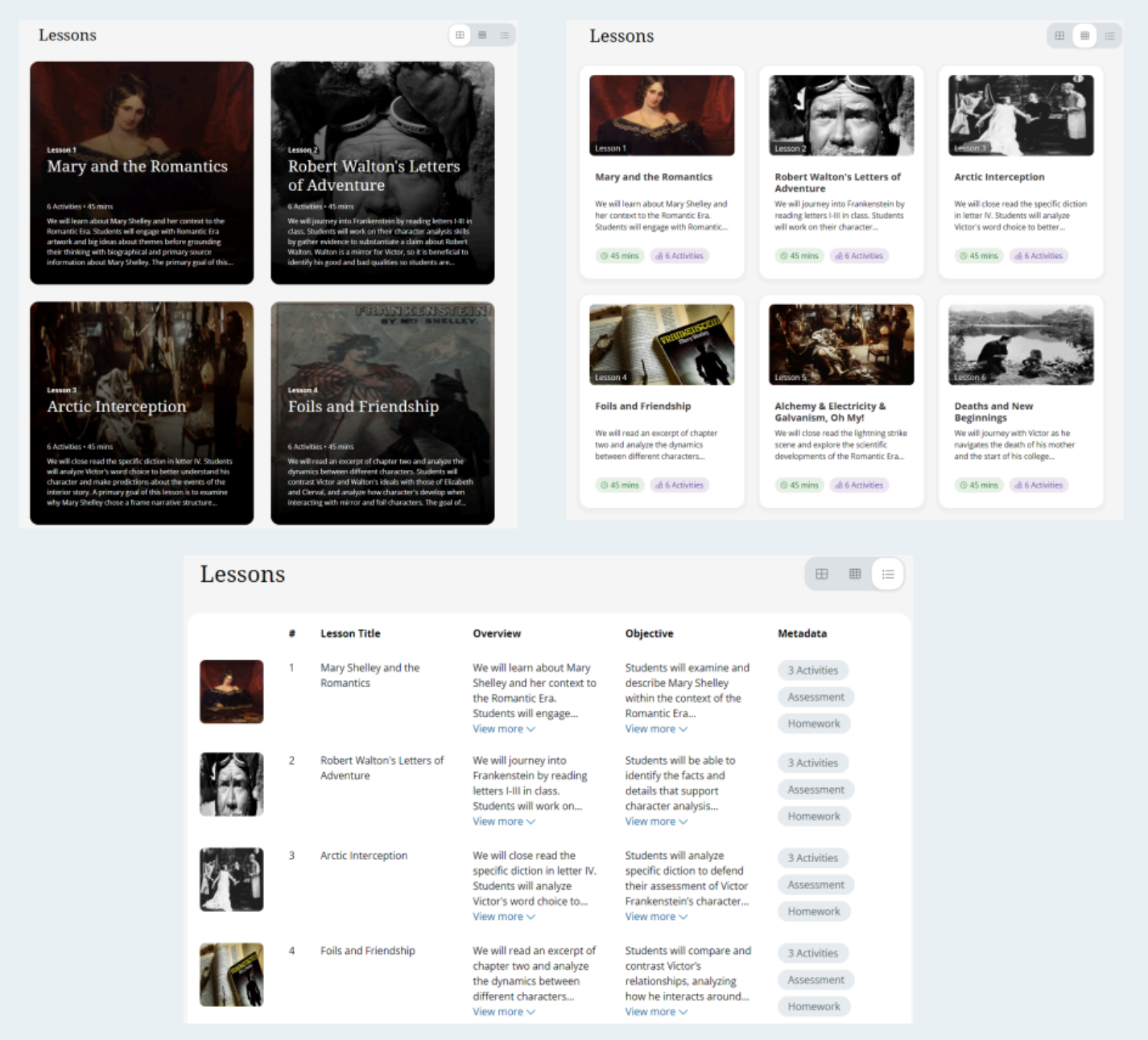
Discarded
Everyone disliked the table
We wanted to test the max info density in this concept and the feedback were “Boring”, “Too much information”
Discarded
Emphasize the ‘Ala Carte’
User liked knowing they could pick and choose within a lesson and found the metadata displayed to be just right
Modified
The ToC made sense but...
Lesson titles are not enough context to create an ‘informed click’
Modified
Poor segue between Tab and Lesson Overview
Could be remedied by moving the lesson overview into the activity list
Discarded
Challenge 3:
Content density overwhelmed users and I needed to convince stakeholders that restructuring was necessary.
Solution 3:
I used mobile-first design as a strategic constraint and stakeholder communication tool. Mobile limitations forced content optimization that improved all devices while demonstrating to stakeholders why dense text needed restructuring. This approach turned technical constraints into content strategy advantages.
Strategic Descoping
Engineering delivered sobering news: MVP features would take 2+ years to build. However, leadership needed launch by next school year or miss the market window.
I worked with PMs and my manager using research and 3 rounds of usability testing data to prioritize features by user impact versus development cost. Cut about 43% dev story points (from 700 to 400 points), which was painful but preserved everything essential for classroom success. Fourth round testing validated our feature selections.
Example: Trade-offs: Descoping Admin Dashboard saved story points
- Removed student group features and sending reminders feature
- Dropped dashboard landing page due to technical complexity
- Assignment completion details were removed from the class page
- Made due/publish dates optional, impacting data tracking
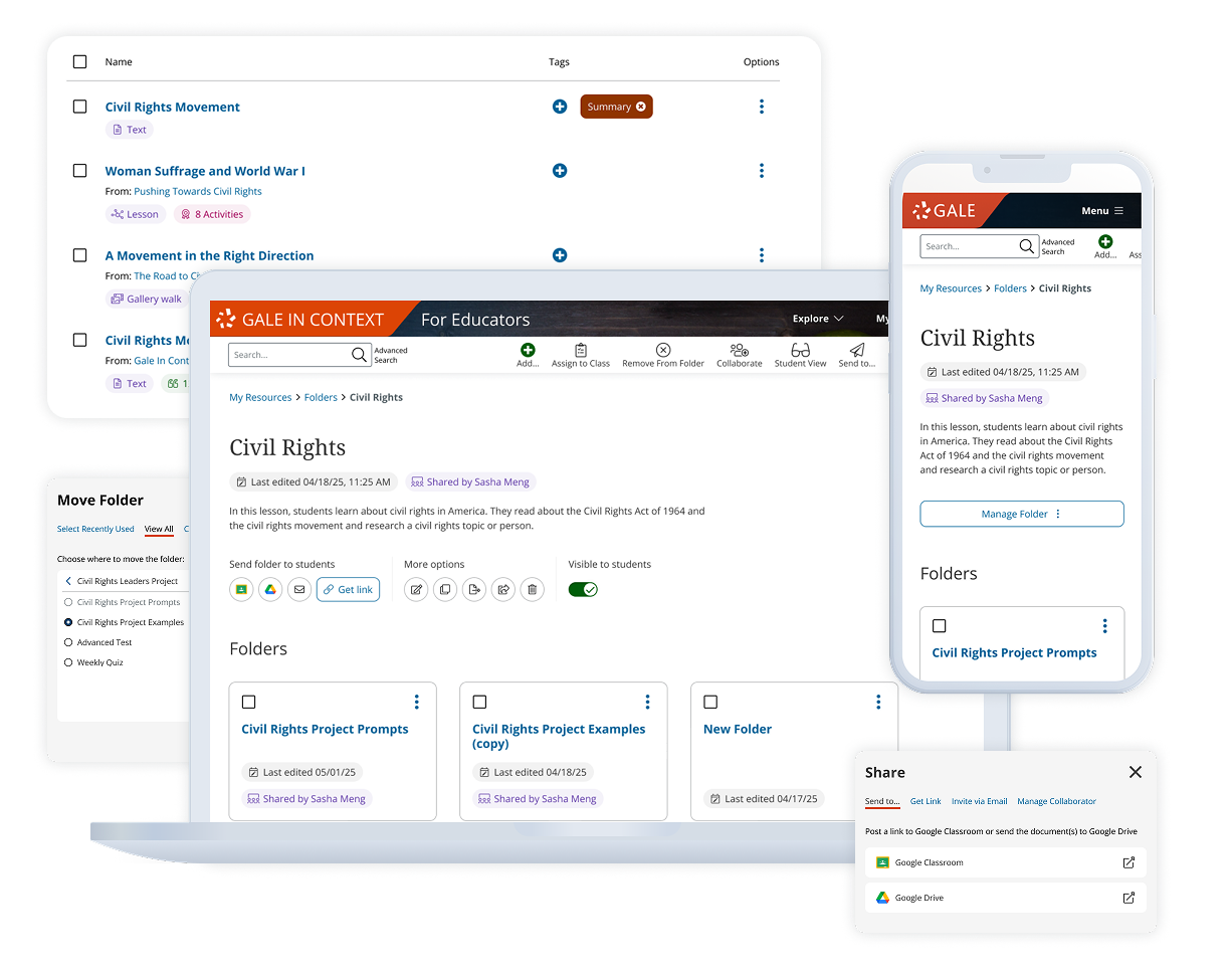
Admin dashboard “Classes” page final design
- Combined positively-tested concepts
- Restructured around assignments rather than rosters
- Integrated folders into teacher dashboard for centralized resource management
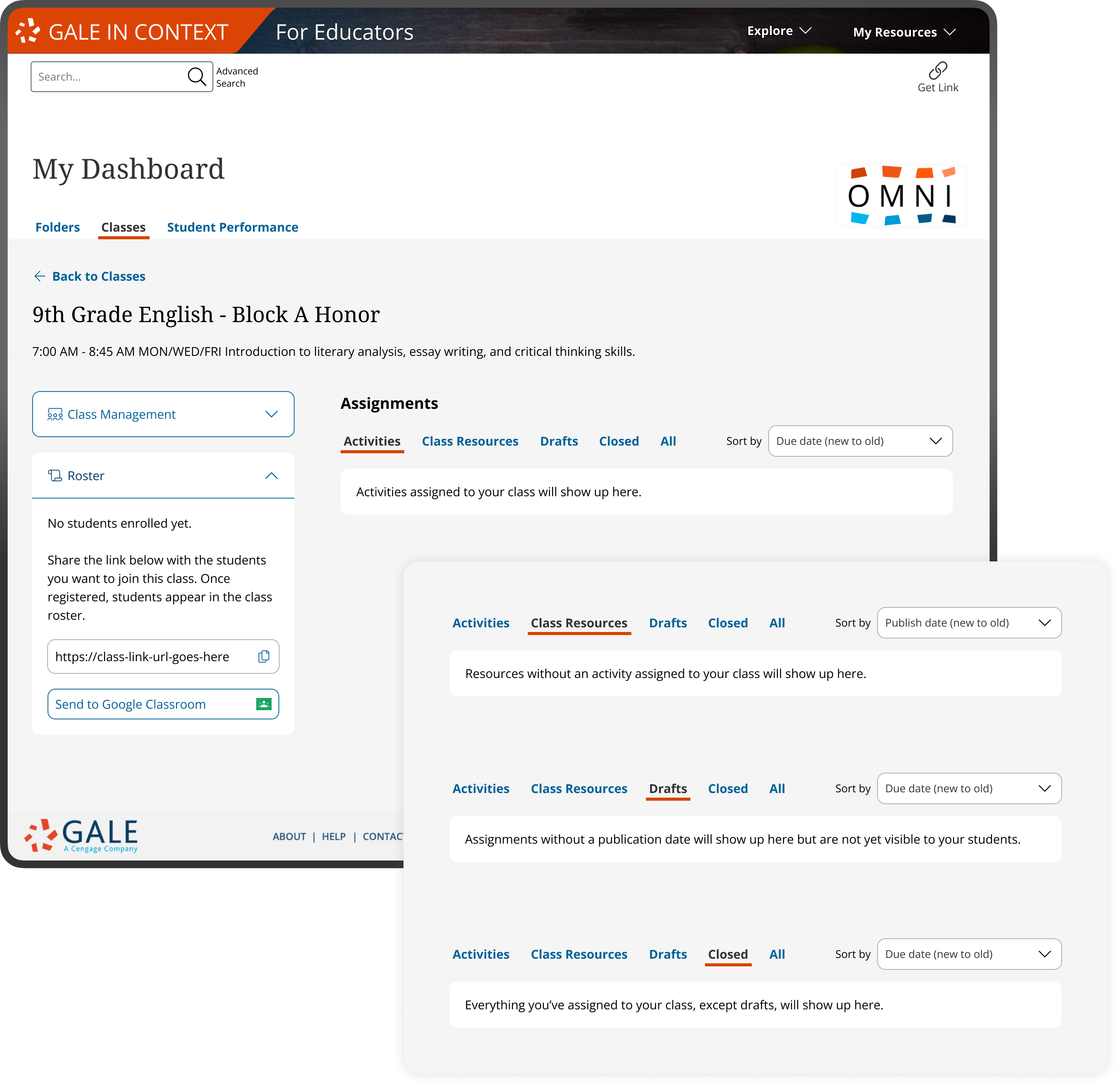
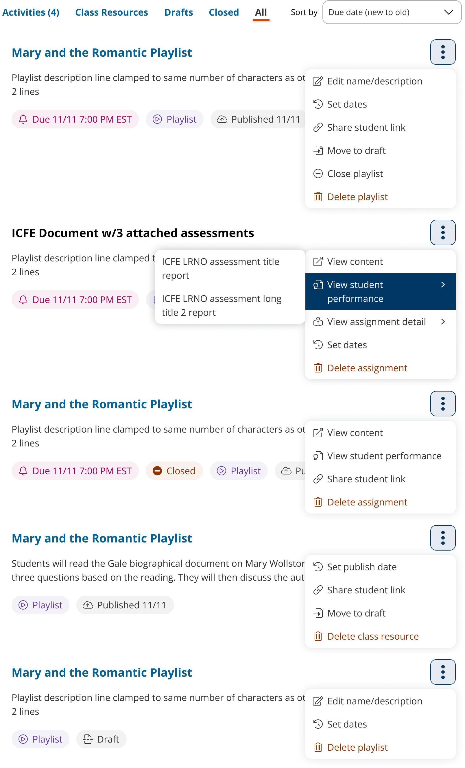
Assignment panel variants final design
Descoping made due/publish dates optional, generating multiple assignment panel variants and empty states.
Platform-Wide Impact
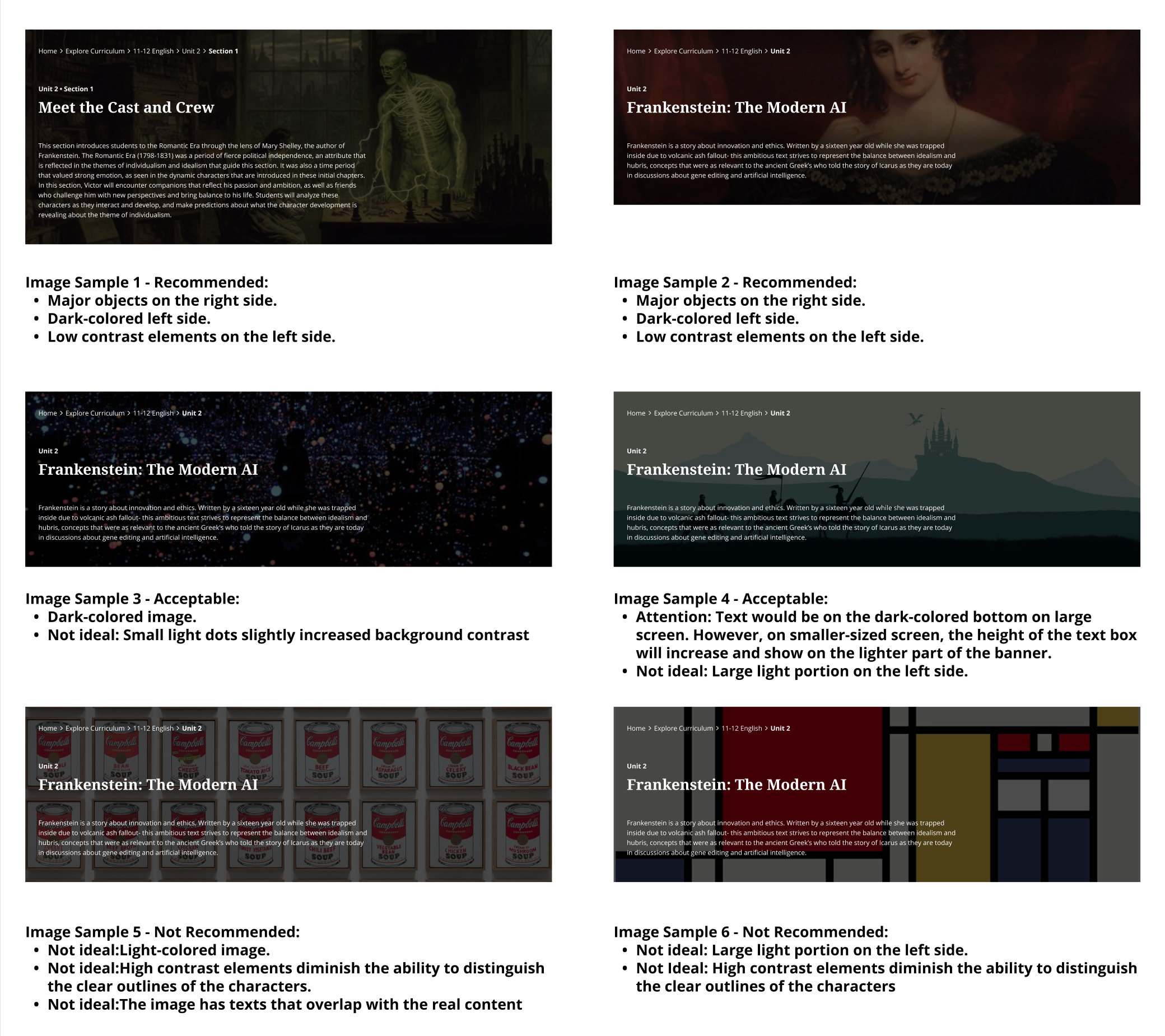
Post-launch impact: The design system components I created for this project were integrated across the platform. When a subsequent product launch revealed banner filter readability issues, I leveraged the established design patterns to quickly iterate solutions and coordinate implementation with cross-functional teams.
Example: I strategically created and socialized an image selection guideline for the content team. This addressed the root cause to prevent future issues.
What I Would Do Differently
Broader device testing in early rounds
While mobile-first design worked well as a content strategy tool, I would test mobile experiences with actual users earlier rather than focusing primarily on desktop testing. This might have revealed mobile-specific insights sooner.
Clearer scope boundaries upfront
The 43% descoping, while successful, suggests the initial scope lacked sync with the dev. I would push for more initial estimates and clearer prioritization frameworks to avoid late-stage cuts that create timeline stress.
More projects
UX Design
A Design System from Scratch
Explore
UX Design
B2B Folder Enhancement
Explore
UX Design
Online Learning Portal
Explore
UX Design
E-commerce Websites Migration
Explore
UX Design
Dashboard and Progress Management
Coming Soon
UX Design
New Product on a Mature Platform
Explore
© Sasha Meng 2025 All Rights Reserved
Constraint Navigation in Product Design
Step-by-step workflows for guided content with dashboards and admin controls
Time Frame
22 months from problem discovery to design-dev delivery (July 2023-May 2025)
Our Team
1 UX Design Lead (me) |1 UX Designer | 1 UX Researcher | 4 Product Managers | 10+ Engineers | 3 Content Strategists
My Contribution
Ideation | Requirement definition | Research | Design | Testing | Documentation | Dev support | Scoping | Vender guideline design
The Challenge & Opportunity
The business goal of this project was to expand by creating a curriculum delivery platform to capture the $9B curriculum market. Cengage, Gale wanted to be a top 10 K-12 core curriculum brand with it’s existing product suite.
I led end-to-end design of teacher and student dashboards with streamlined workflows for assigning lessons with digital activities and class management. These workflows guided students through structured learning sequences from accessing assigned content to completing activities to receiving feedback, while giving teachers visibility into individual and class-wide progress.
Business Impact & User Impact
User satisfaction in testing
83%
Task completion rates
70%
Project Highlights
60+ responsive web pages, 15 new components compliant across 20+ products. We proved library databases could work in classrooms with the right user experience, and cross-functional collaboration could overcome massive technical constraints.
Administrator / Teacher dashboards
Class management and assignment creation
Student dashboards
Accessing sequential learning paths and viewing completion status
Content curation workflows
Transform research databases into classroom curriculum with integrated activities and assessments
Administrative controls
Class management, bulk assignments, and user permission settings within institutional environments
Platform Research Pivot
Six months in, corporate mandated we build on MindTap, a complex, old platform with its own update roadmap. My heuristic evaluation revealed critical gaps, saved 6+ months of adaptation work, and prevented user adoption failure.
5s page load time
Slow loading creates frustration and poor learning experience for students
Not responsive
Main content section is not responsive for mobile devices
Not readable
Smallest font size is 10px, falling below WCAG accessibility standards
Navigation issues
Table of contents hidden behind icon, confusing user flow
High adoption risk
Complex onboarding and poor UX likely to cause adoption failure
6+ assignment steps
Teachers expect 3 simple steps, but MindTap requires 6+ complex actions
I helped my project managers present findings to leadership showing adaptation would take longer than building custom. The leadership agreed to abandon MindTap and build new, custom features on Gale’s own platform optimized for K-12 classroom needs.
Design Process
I navigated design direction and stakeholder alignment by grounding decisions in data collected with my manager through 5 rounds of usability testing with 30+ users. This testing helped us choose among design concepts while revealing the next questions to address and their priorities.
Challenge 1:
Working with content strategists on sequential learning paths, we needed to ensure content built logically lesson-to-lesson while accommodating their new authoring tool constraints.
Solution 1:
I established a collaborative design framework with content strategists, creating visual guidelines that enabled structured decision-making across teams. Below is an example that the 3nd round iteration:
Example 1: Cross-functional content iteration from Round 3 testing
Before: content drafts

In progress: Round 1 mockup

After: Cross-functional content iteration from Round 3 testing with clear instruction for content template
Challenge 2:
Our student persona would abandon wall-of-text content and we needed to visualize content. Stock images were expensive, and there were a lot of abstract concepts hard to visualize.
Solution 2:
I designed 20+ reusable components that made any lesson and activity engaging with or without images. Below is an example from the 2nd round testing:
Example: How and why certain concepts were chosen from Round 2 testing
Based on user feedback, we implemented the 'Card View' concept with thumbnail tiles for the Lesson Tab area. Time constraints prevented us from building the 'Checklist View' as an alternative mode, so we adapted that concept for a separate assignment page where lesson overview is an assignable activity within the activity list.
If adapted the Lesson Tab ‘Checklist View ’Concept:
Need to decide if lesson overview is an assignable activity within the activity list
The thumbnail tiles worked better overall
While not as visually appealing, users called out how easy they were to scan for critical information
Implemented
The large tiles were visually interesting but...
Some users found them busy, difficult to scan and overly large
Discarded
Everyone disliked the table
We wanted to test the max info density in this concept and the feedback were “Boring”, “Too much information”
Discarded
Emphasize the ‘Ala Carte’
User liked knowing they could pick and choose within a lesson and found the metadata displayed to be just right
Modified
The ToC made sense but...
Lesson titles are not enough context to create an ‘informed click’
Modified
Poor segue between Tab and Lesson Overview
Could be remedied by moving the lesson overview into the activity list
Discarded
Challenge 3:
Content density overwhelmed users and I needed to convince stakeholders that restructuring was necessary.
Solution 3:
I used mobile-first design as a strategic constraint and stakeholder communication tool. Mobile limitations forced content optimization that improved all devices while demonstrating to stakeholders why dense text needed restructuring. This approach turned technical constraints into content strategy advantages.
Strategic Descoping
Engineering delivered sobering news: MVP features would take 2+ years to build. However, leadership needed launch by next school year or miss the market window.
I worked with PMs and my manager using research and 3 rounds of usability testing data to prioritize features by user impact versus development cost. Cut about 43% dev story points (from 700 to 400 points), which was painful but preserved everything essential for classroom success. Fourth round testing validated our feature selections.
Example: Trade-offs: Descoping Admin Dashboard saved story points
- Removed student group features and sending reminders feature
- Dropped dashboard landing page due to technical complexity
- Assignment completion details were removed from the class page
- Made due/publish dates optional, impacting data tracking
Admin dashboard “Classes” page final design
- Combined positively-tested concepts
- Restructured around assignments rather than rosters
- Integrated folders into teacher dashboard for centralized resource management
Assignment panel variants final design
Descoping made due/publish dates optional, generating multiple assignment panel variants and empty states.
Platform-Wide Impact
Post-launch impact: The design system components I created for this project were integrated across the platform. When a subsequent product launch revealed banner filter readability issues, I leveraged the established design patterns to quickly iterate solutions and coordinate implementation with cross-functional teams.
Example: I strategically created and socialized an image selection guideline for the content team. This addressed the root cause to prevent future issues.
What I Would Do Differently
Broader device testing in early rounds
While mobile-first design worked well as a content strategy tool, I would test mobile experiences with actual users earlier rather than focusing primarily on desktop testing. This might have revealed mobile-specific insights sooner.
Clearer scope boundaries upfront
The 43% descoping, while successful, suggests the initial scope lacked sync with the dev. I would push for more initial estimates and clearer prioritization frameworks to avoid late-stage cuts that create timeline stress.
More projects
UX Design
A Design System from Scratch
Explore
UX Design
B2B Folder Enhancement
Explore
UX Design
Online Learning Portal
Explore
UX Design
E-commerce Websites Migration
Explore
UX Design
Dashboard and Progress Management
Coming Soon
UX Design
New Product on a Mature Platform
Explore
© Sasha Meng 2025 All Rights Reserved
Constraint Navigation in Product Design
Step-by-step workflows for guided content with dashboards and admin controls
Time Frame
22 months from problem discovery to design-dev delivery (July 2023-May 2025)
Our Team
1 UX Design Lead (me) |1 UX Designer | 1 UX Researcher | 4 Product Managers | 10+ Engineers | 3 Content Strategists
My Contribution
Ideation | Requirement definition | Research | Design | Testing | Documentation | Dev support | Scoping | Vender guideline design
The Challenge & Opportunity
The business goal of this project was to expand by creating a curriculum delivery platform to capture the $9B curriculum market. Cengage, Gale wanted to be a top 10 K-12 core curriculum brand with it’s existing product suite.
I led end-to-end design of teacher and student dashboards with streamlined workflows for assigning lessons with digital activities and class management. These workflows guided students through structured learning sequences from accessing assigned content to completing activities to receiving feedback, while giving teachers visibility into individual and class-wide progress.
Business Impact & User Impact
User satisfaction in testing
83%
Task completion rates
70%
Project Highlights
60+ responsive web pages tested with 30+ users. 15 new components compliant across 20+ products. We proved library databases could work in classrooms with the right user experience, and cross-functional collaboration could overcome massive technical constraints.
Administrator / Teacher dashboards
Class management and assignment creation
Student dashboards
Accessing sequential learning paths and viewing completion status
Content curation workflows
Transform research databases into classroom curriculum with integrated activities and assessments
Administrative controls
Class management, bulk assignments, and user permission settings within institutional environments
Platform Research Pivot
Six months in, corporate mandated we build on MindTap, a complex, old platform with its own update roadmap. My heuristic evaluation revealed critical gaps, saved 6+ months of adaptation work, and prevented user adoption failure.
5s page load time
Slow loading creates frustration and poor learning experience for students
Not responsive
Main content section is not responsive for mobile devices
Not readable
Smallest font size is 10px, falling below WCAG accessibility standards
Navigation issues
Table of contents hidden behind icon, confusing user flow
High adoption risk
Complex onboarding and poor UX likely to cause adoption failure
6+ assignment steps
Teachers expect 3 simple steps, but MindTap requires 6+ complex actions
I helped my project managers present findings to leadership showing adaptation would take longer than building custom. The leadership agreed to abandon MindTap and build new, custom features on Gale’s own platform optimized for K-12 classroom needs.
Design Process
I navigated design direction and stakeholder alignment by grounding decisions in data collected with my manager through 5 rounds of usability testing with 30+ users. This testing helped us choose among design concepts while revealing the next questions to address and their priorities.
Challenge 1:
Working with content strategists on sequential learning paths, we needed to ensure content built logically lesson-to-lesson while accommodating their new authoring tool constraints.
Solution 1:
I established a collaborative design framework with content strategists, creating visual guidelines that enabled structured decision-making across teams.
Example 1: Cross-functional content iteration from Round 3 testing
Before: content drafts

In progress: Round 1 mockup

After Round 3 testing: Cross-functional content iteration generated content templates
Challenge 2:
Our student persona would abandon wall-of-text content and we needed to visualize content. Stock images were expensive, and there were a lot of abstract concepts hard to visualize.
Solution 2:
I designed 20+ reusable components that made any lesson and activity engaging with or without images.
Example 2: How and why certain concepts were chosen from Round 2 testing
Based on user feedback, we implemented the 'Card View' concept with thumbnail tiles for the Lesson Tab area. Time constraints prevented us from building the 'Checklist View' as an alternative mode, so we adapted that concept for a separate assignment page where lesson overview is an assignable activity within the activity list.
The thumbnail tiles worked better overall
While not as visually appealing, users called out how easy they were to scan for critical information
Implemented
The large tiles were visually interesting but...
Some users found them busy, difficult to scan and overly large
Discarded
Everyone disliked the table
We wanted to test the max info density in this concept and the feedback were “Boring”, “Too much information”
Discarded
Emphasize the ‘Ala Carte’
User liked knowing they could pick and choose within a lesson and found the metadata displayed to be just right
Modified
The ToC made sense
but...
Lesson titles are not enough context to create an ‘informed click’
Modified
Poor segue between Tab and Lesson Overview
Could be remedied by moving the lesson overview into the activity list
Discarded
Challenge 3:
Content density overwhelmed users and I needed to convince stakeholders that restructuring was necessary.
Solution 3:
I used mobile-first design as a strategic constraint and stakeholder communication tool. Mobile limitations forced content optimization that improved all devices while demonstrating to stakeholders why dense text needed restructuring. This approach turned technical constraints into content strategy advantages.
Strategic Descoping
Engineering delivered sobering news: MVP features would take 2+ years to build. However, leadership needed launch by next school year or miss the market window.
I worked with PMs and my manager using research and 3 rounds of usability testing data to prioritize features by user impact versus development cost. Cut about 43% dev story points (from 700 to 400 points), which was painful but preserved everything essential for classroom success. Fourth round testing validated our feature selections.
Example: Trade-offs: Descoping Admin Dashboard saved story points
- Removed student group features and sending reminders feature
- Dropped dashboard landing page due to technical complexity
- Assignment completion details were removed from the class page
- Made due/publish dates optional, impacting data tracking
Admin dashboard “Classes” page final design
- Combined positively-tested concepts
- Restructured around assignments rather than rosters
- Integrated folders into teacher dashboard for centralized resource management
Assignment panel variants final design
Descoping made due/publish dates optional, generating multiple assignment panel variants and empty states.
Platform-Wide Impact
Post-launch impact: The design system components I created for this project were integrated across the platform. When a subsequent product launch revealed banner filter readability issues, I leveraged the established design patterns to quickly iterate solutions and coordinate implementation with cross-functional teams.
Example: I strategically created and socialized an image selection guideline for the content team. This addressed the root cause to prevent future issues.
What I Would Do Differently
Broader device testing in early rounds
While mobile-first design worked well as a content strategy tool, I would test mobile experiences with actual users earlier rather than focusing primarily on desktop testing. This might have revealed mobile-specific insights sooner.
Clearer scope boundaries upfront
The 43% descoping, while successful, suggests the initial scope lacked sync with the dev. I would push for more initial estimates and clearer prioritization frameworks to avoid late-stage cuts that create timeline stress.
More projects
UX Design
A Design System from Scratch
Explore
UX Design
B2B Folder Enhancement
Explore
UX Design
Online Learning Portal
Explore
UX Design
E-commerce Websites Migration
Explore
UX Design
Dashboard and Progress Management
Coming Soon
UX Design
New Product on a Mature Platform
Explore
© Sasha Meng 2025 All Rights Reserved