
B2B Folder Enhancement
Switch from single level structure to nested folders
Time Frame
14 months from problem discovery to launch (05/21 - 07/22)
Our Team
1 UX Design Lead (me) |1 UX Designer | 1 UX Researcher | 4 Product Managers | 8 Engineers
My Contribution
Problem definition | Research | Usability testing | Design |Documentation

Project Overview
In Context: For Educators (ICFE) is an enterprise content management platform that enables educational institutions to curate, distribute, and collaborate on Gale, Cengage databases across departments and user groups. Completed in 2022, this product enhancement led to new customer acquisition, an increase in revenue, and helped ICFE win the Modern Library Awards Product of the Year.
Enterprise Challenges Addressed:
Scalability: Single-level architecture couldn't support enterprise-scale content organization
Administrative Control: Limited bulk management capabilities hindered organizational efficiency
Access Governance: Complex permission structures created collaboration bottlenecks
Business Impact & User Impact
User total sessions in 12 months
+30.6%
Satisfaction score
29.9 NPS
Project Highlights
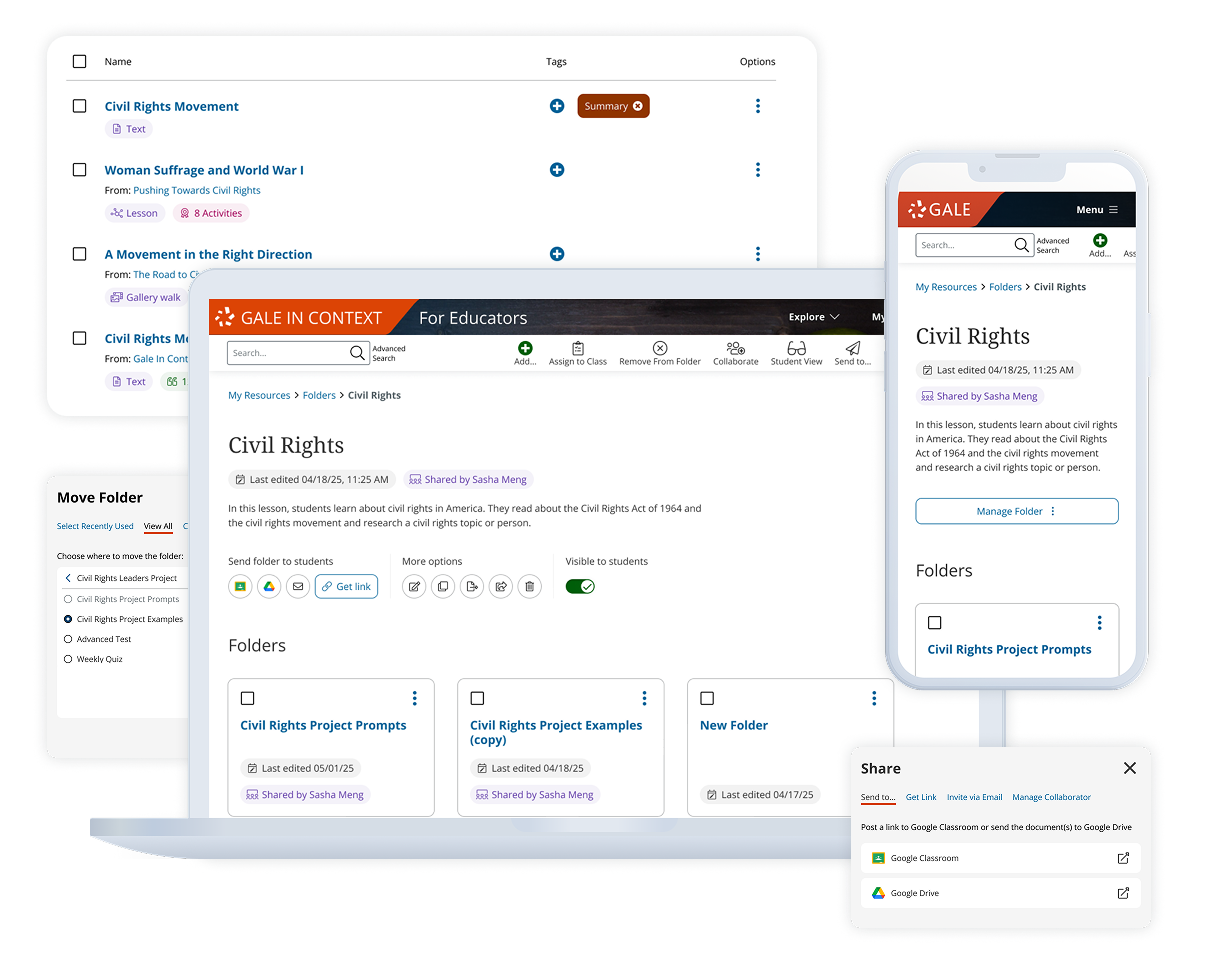
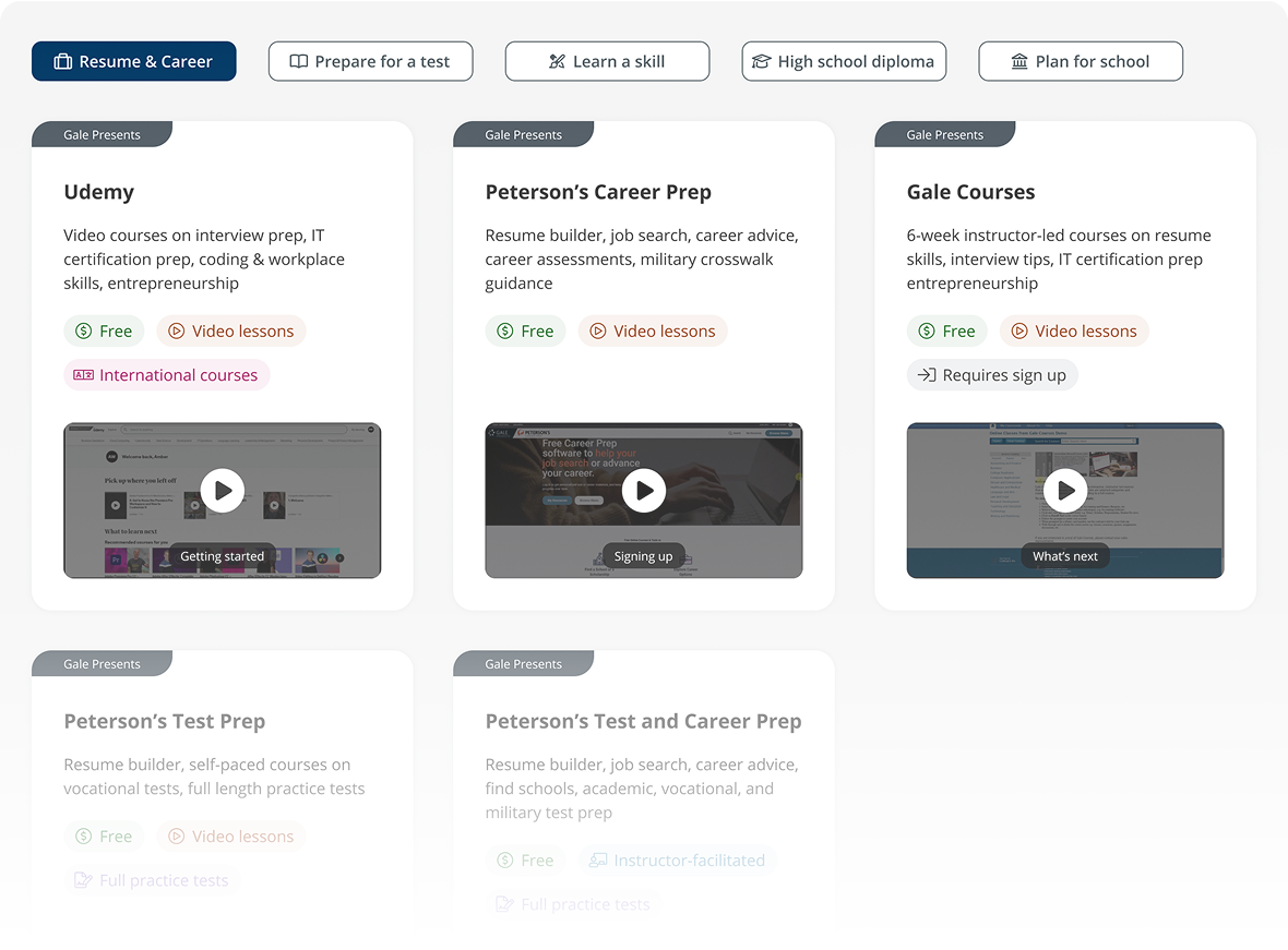
Build folders tailored to your needs
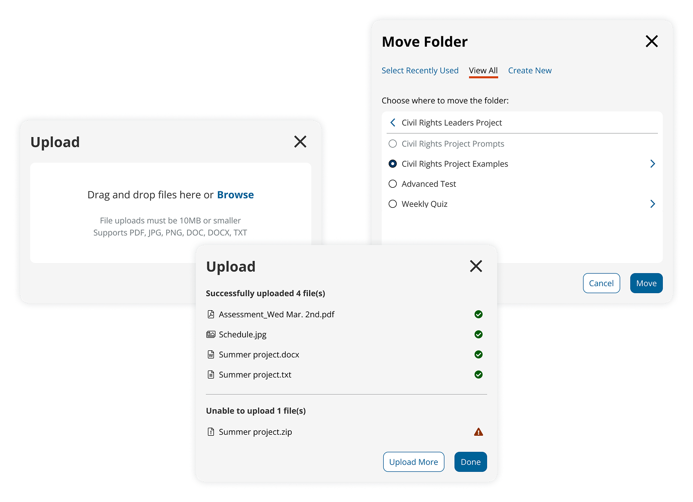
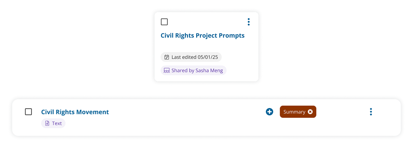
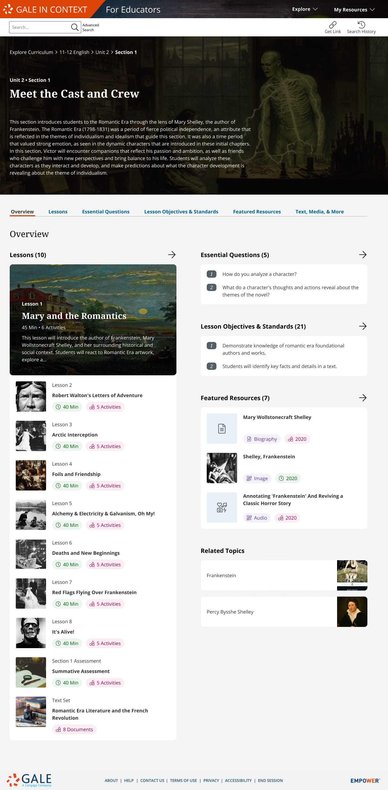
Nested Folders are now available: Create folders with hierarchies that fit your lessons. You can now upload files, move files and folders between levels.
Save time and stay organized
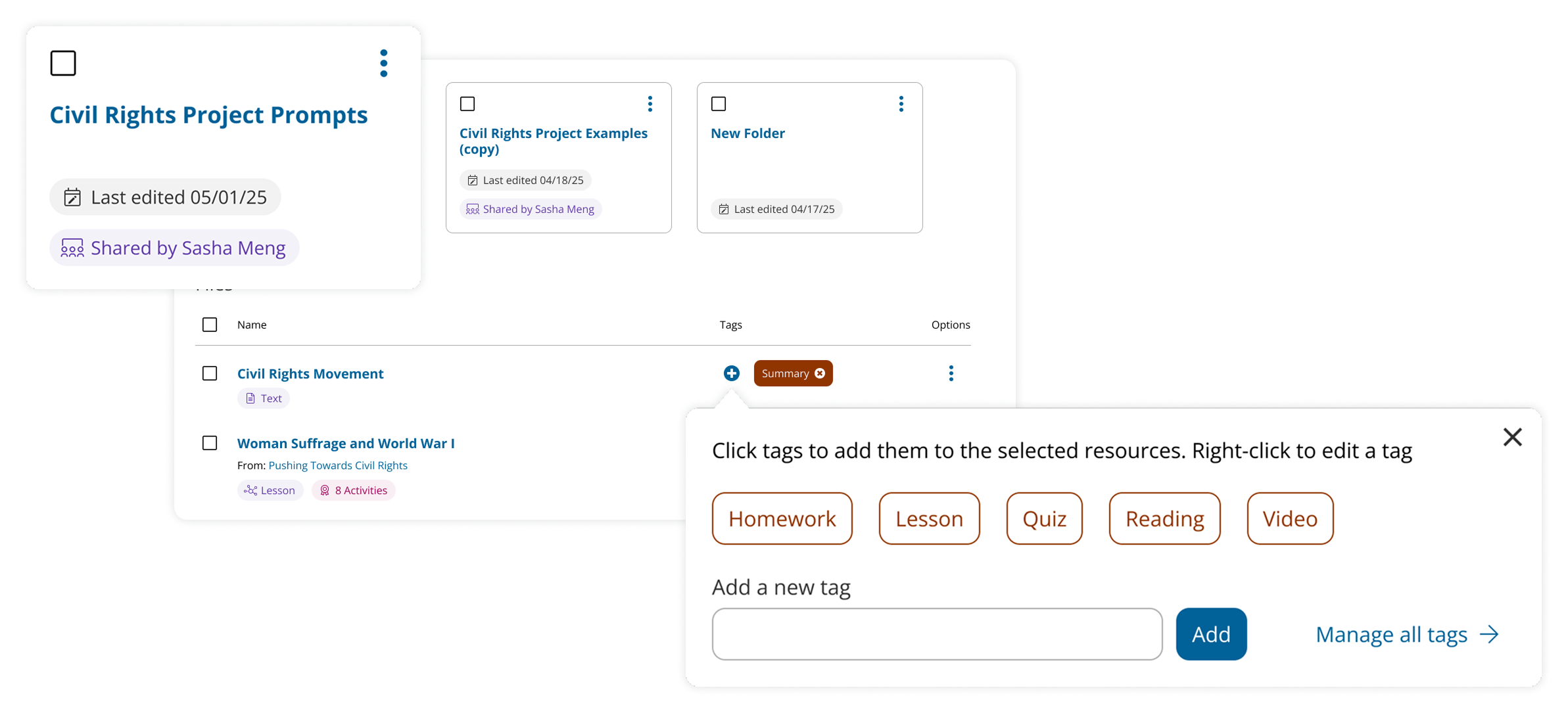
Updated filters help you find what you need. You can also tag files or use Folder Description to communicate with team members and end users (students).
Collaborate across teams and keep end users engaged
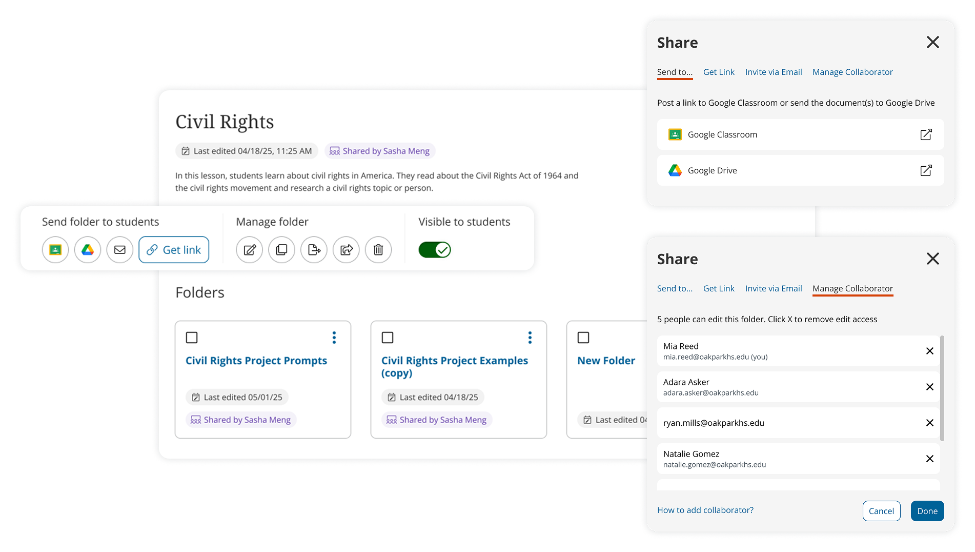
Improved share tools help teachers manage multiple levels of access for students and colleagues
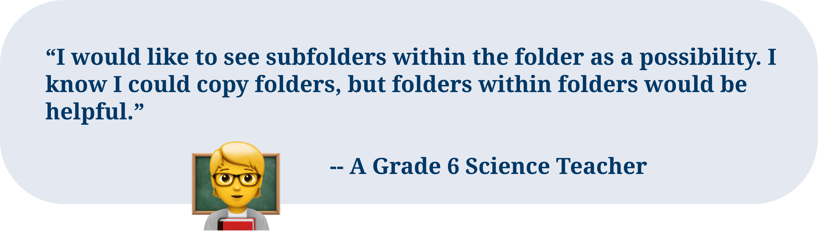
Define Problems
I identified 6 main pain points in the research process. With approximately 20 different issues and potential new features competing for attention, I worked closely with stakeholders to make informed decisions on feature prioritization. I collaborated with a UX Manager and 3 Product Managers to vote on personas that best reflect the key needs of the project.
I generated “How Might We” questions to guide the design:
- How might we improve users’ sharing experience?
- How might we give teachers control over lesson planning?
- How might we help users locate resources in folders?
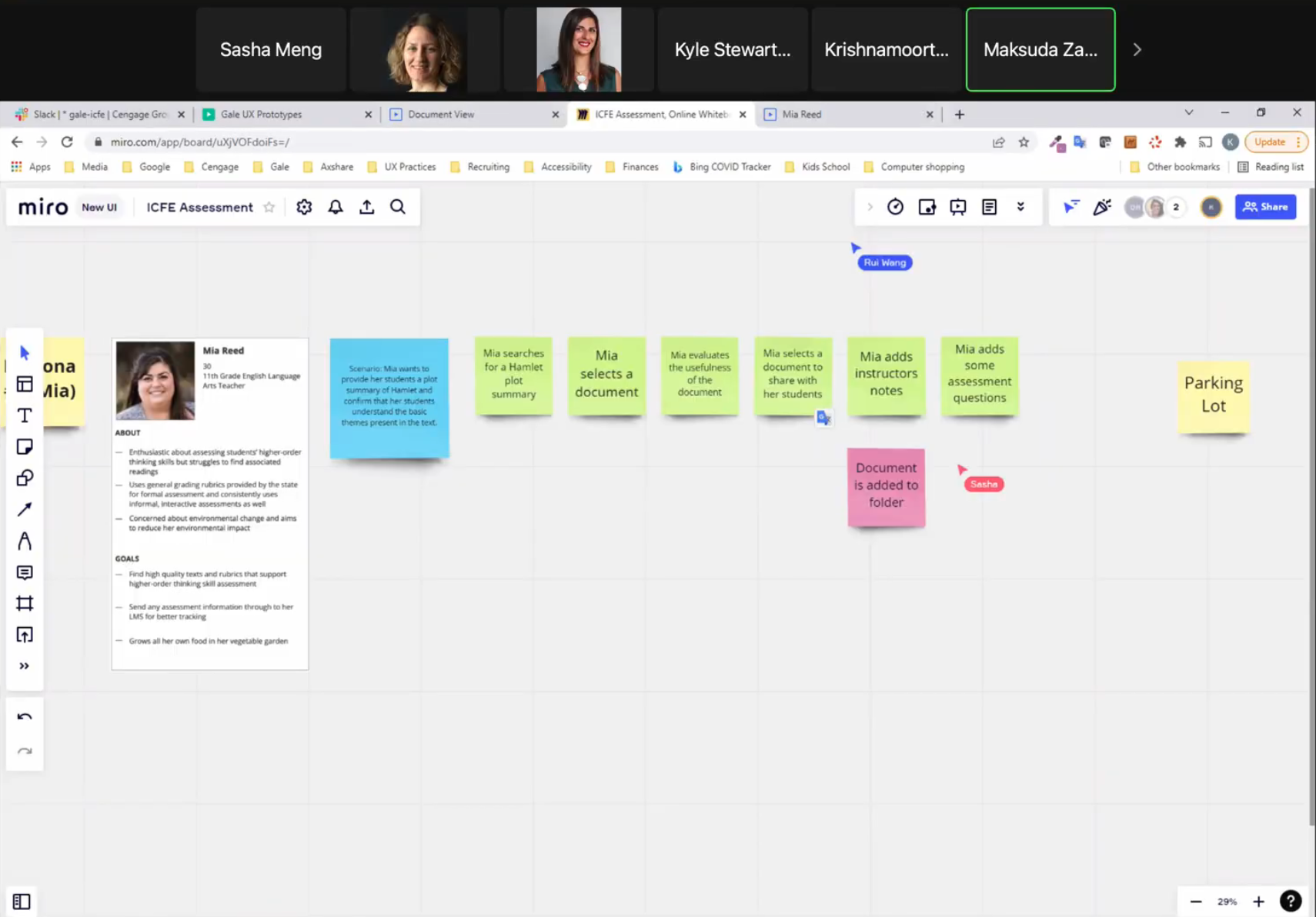
I conducted extensive user research with 19 participants, including background interviews and diary studies with pre- and post-survey.
17 personas were created and used to evaluate options and make decisions. 6 were prioritized to drive the project.
Design Scoping
I redefined the design scope with my team, PMs, and Dev, to solve edge cases we discovered from journey mapping and story mapping. The scope expanded from only updating the folder organization structure to including the Document Page and the process of curating resources from databases.
Recognizing the homepage's inherited card carousel hindered engagement with poor readability and low CTA clicks, I proactively redesigned it.
Concept Validating
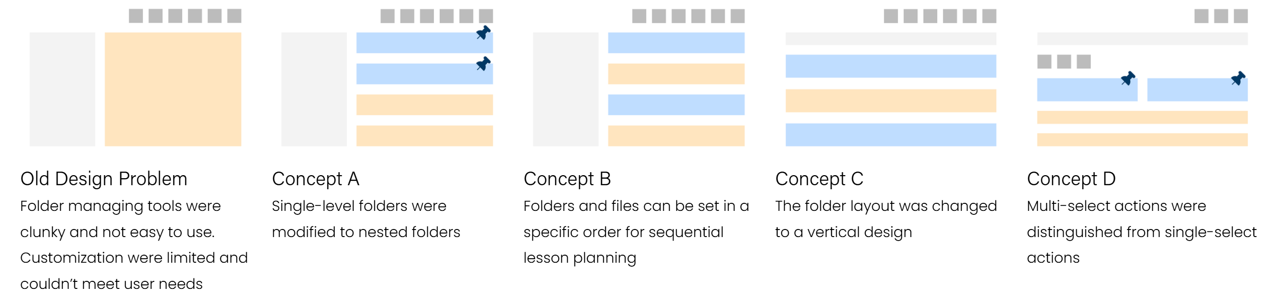
My team and I convinced stakeholders to prioritize usability testing over a MVP design, to ensure the design resonates with existing ICFE users and to stay competitive.
I designed 4 Folder Page concepts. After 2 rounds of usability testing, in which users compared concepts and completed 40 tasks, resulting in feedback on preferred features and concepts, the stakeholders and I selected Concept D as the final design direction for the Folder Page.
Management Tools
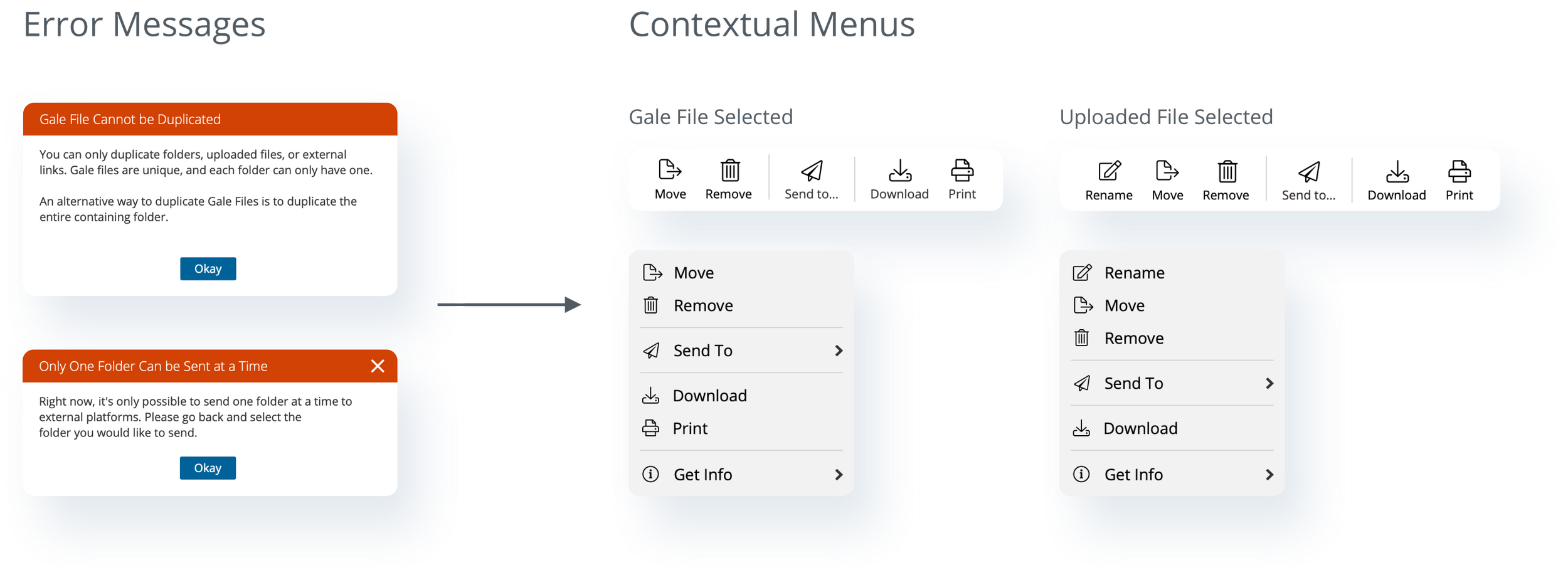
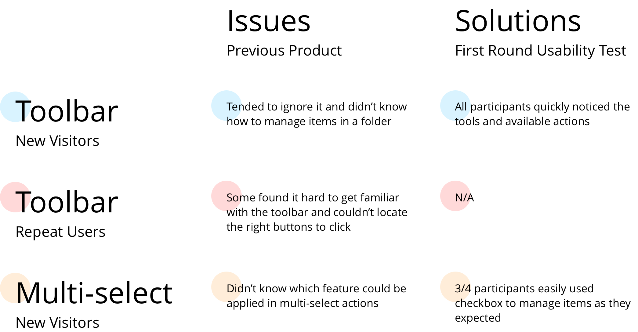
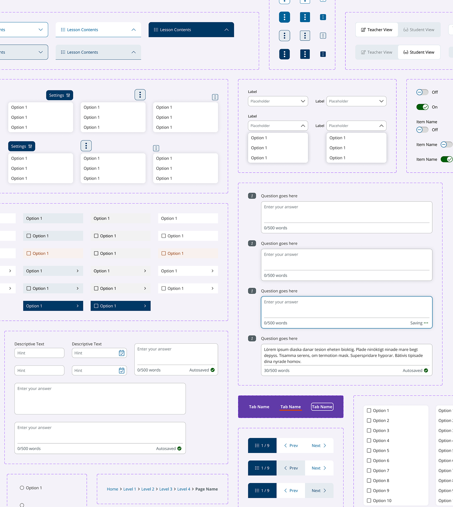
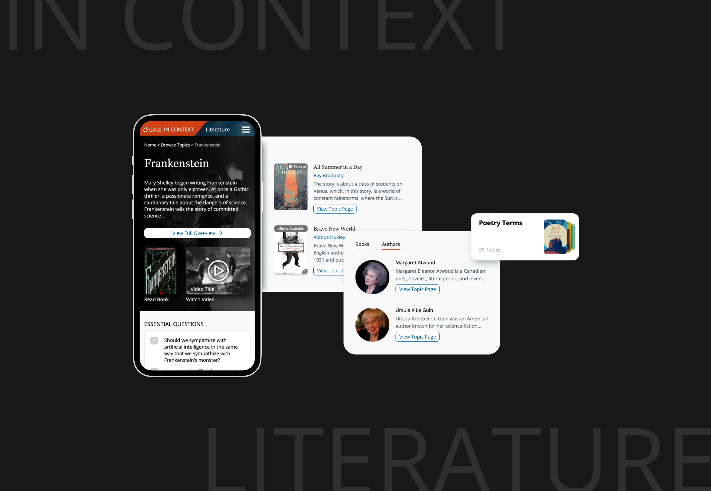
In addition to offering view setting functions like Student View, List View, and Grid View, I designed new features like Upload File and Move. The challenge was to link various management options to different types of folders or files, and to differentiate between multi-select and single-select options.For instance, I improved the design to make folder management buttons more conspicuous and user-friendly by presenting item-specific contextual menus and a contextual tool bar. This way it reduced the need for error messages and unnecessary commands.
Enhance Folder Sharing
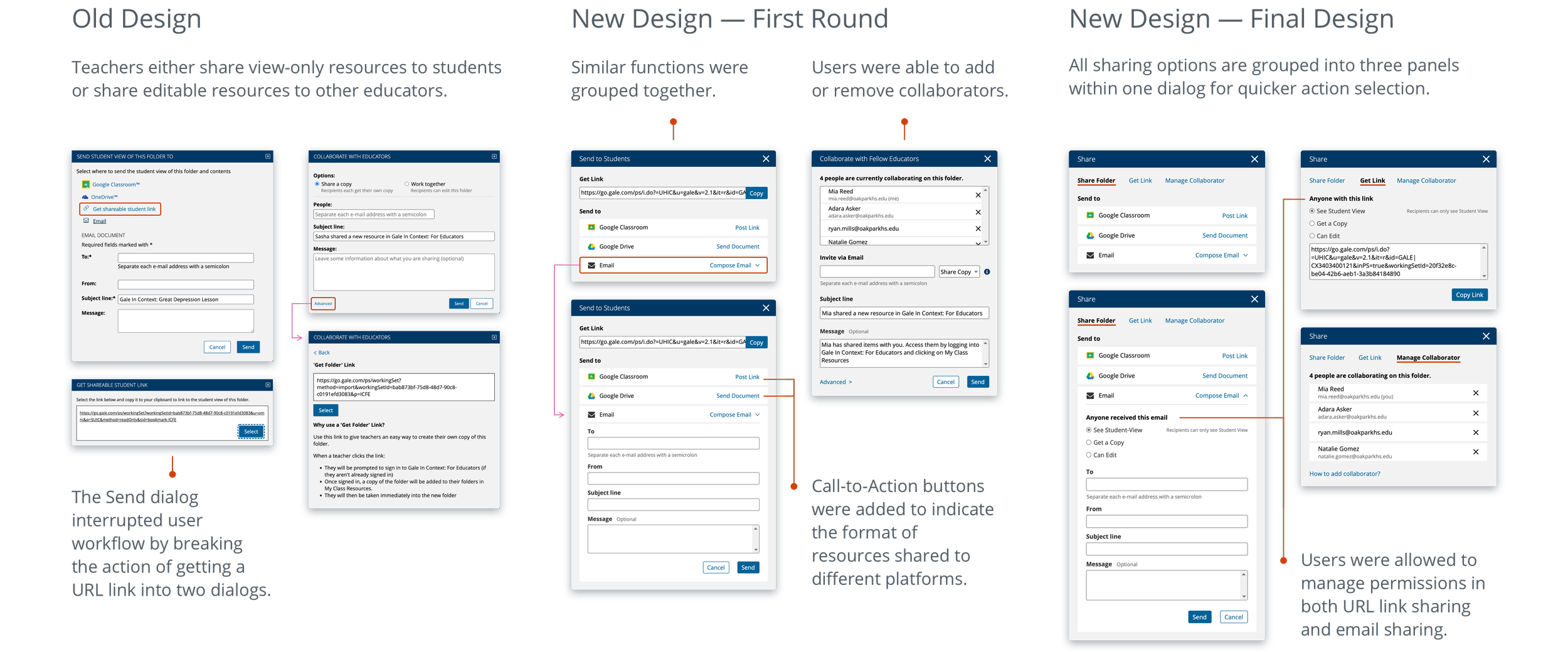
I modified the workflow to improve resource sharing, which had caused confusion for new users. The first round of usability testing showed that explicit call-to-action buttons were helpful, but users still struggled with distinguishing "Share" and "Collaborate" options. Consolidating options and linking share permissions to both email and link sharing reduced task completion time in the second round of testing.
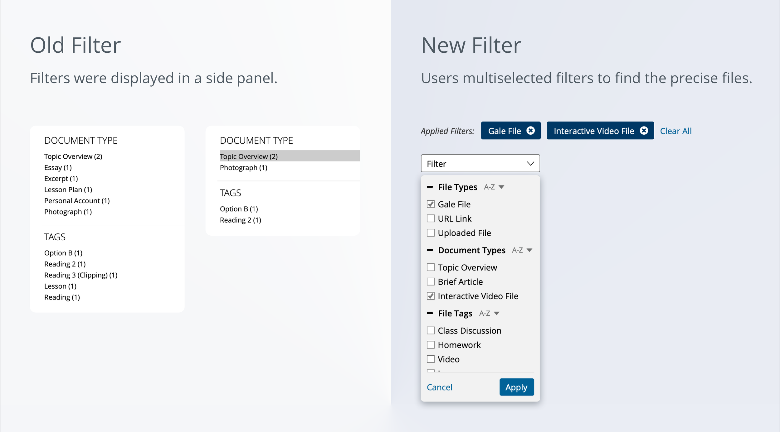
Speed Resource Locating
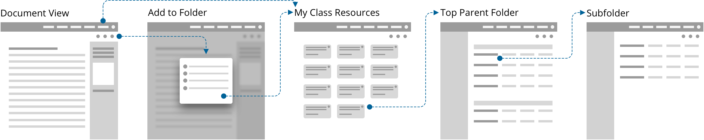
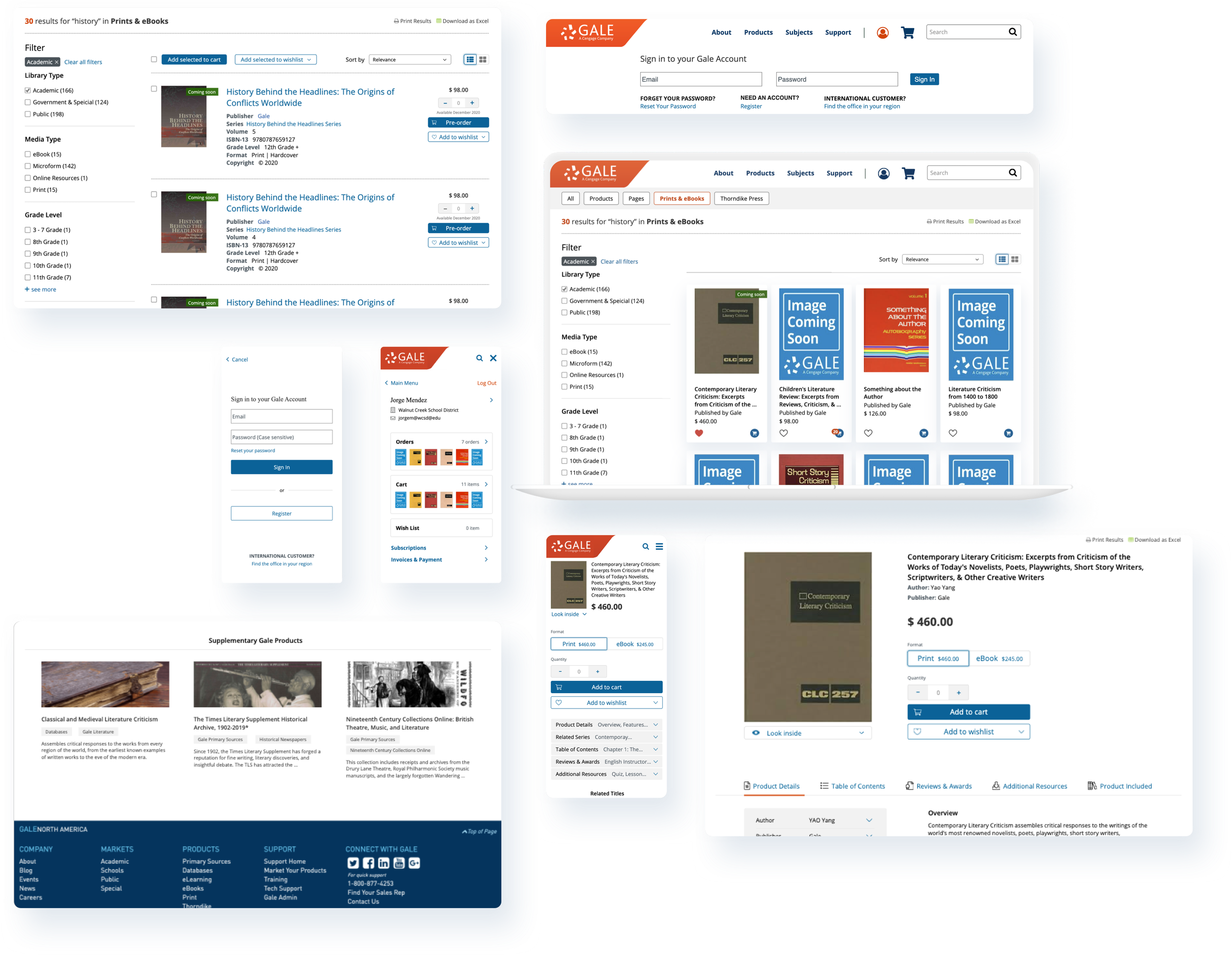
I reassessed the folder metadata to identify areas for improvement. The research indicated that CFE users mainly use metadata for folder navigation and prefer filtering resources over reviewing metadata individually.
Before: Metadata that did not receive user attention during folder navigation was relocated to either the list view or a "Get Info" list in the contextual menu.
After: The folder description was displayed in both views, as it was deemed the most important information for students to review before reading anything by the teachers.
The filters were made contextual by displaying the user-created tags and folder resource types. I enhanced the filters to include multi-select functionality, making them highly effective in narrowing down files.
Why Collapsible List View Didn’t Work Out
Previous research showed that teachers typically organized resources by disciplines and courses, resulting in an average of 8 layers. To aid navigation and resource bulk management, I created a Collapsible List View of folders for user convenience.
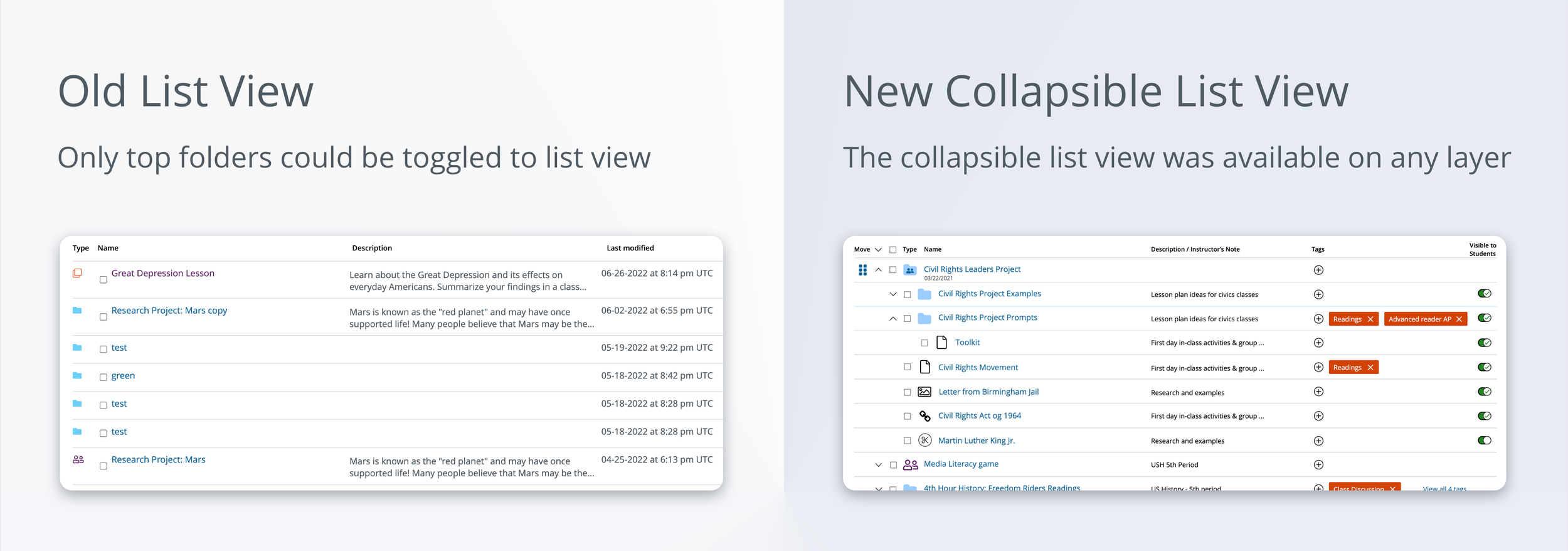
However, testing results showed that half of the users found the arrows next to the folder name insufficiently noticeable and the drag-and-drop icon unfamiliar. Should we retain the Collapsible List View if ways to increase affordance can be found? The team discussed and sought feedback. Communication with the development team revealed some edge cases that posed challenges for both user experience and technical issues, so it was decided to remove the collapse function and only display a regular list view.
Reflections
The most important things I’ve learned from designing ICFE was to actively involve stakeholders, such as developers, into the early conversations to keep moving the project forward. Take the Collapsible List View as an example, early consultation with dev team helped me to identify edge cases and pivot the design accordingly.
If I were able to wave a magic wand and change one thing in the design process – just like the research question that I always asked users – it would be to dedicate more time to assisting product managers in setting UX metrics. Currently, I am collaborating with a data product manager to plan for future data collection and metric establishment.
More projects
UX Design
A Design System from Scratch
Explore
UX Design
B2B Folder Enhancement
Explore
UX Design
Online Learning Portal
Explore
UX Design
E-commerce Websites Migration
Explore
UX Design
Dashboard and Progress Management
Coming Soon
UX Design
New Product on a Mature Platform
Explore
© Sasha Meng 2025 All Rights Reserved
B2B Folder Enhancement
Switch from single level structure to nested folders
Time Frame
14 months from problem discovery to launch (05/21 - 07/22)
Our Team
1 UX Design Lead (me) |1 UX Designer | 1 UX Researcher | 4 Product Managers | 8 Engineers
My Contribution
Problem definition | Research | Usability testing | Design |Documentation
Project Overview
In Context: For Educators (ICFE) is an enterprise content management platform that enables educational institutions to curate, distribute, and collaborate on Gale, Cengage databases across departments and user groups. Completed in 2022, this product enhancement led to new customer acquisition, an increase in revenue, and helped ICFE win the Modern Library Awards Product of the Year.
Enterprise Challenges Addressed:
Scalability: Single-level architecture couldn't support enterprise-scale content organization
Administrative Control: Limited bulk management capabilities hindered organizational efficiency
Access Governance: Complex permission structures created collaboration bottlenecks
Business Impact & User Impact
User total sessions in 12 months
+30.6%
Satisfaction score
29.9 NPS
Project Highlights
Build folders tailored to your needs
Nested Folders are now available: Create folders with hierarchies that fit your lessons. You can now upload files, move files and folders between levels.
Save time and stay organized
Updated filters help you find what you need. You can also tag files or use Folder Description to communicate with team members and end users (students).
Collaborate across teams and keep end users engaged
Improved share tools help teachers manage multiple levels of access for students and colleagues
Define Problems
I identified 6 main pain points in the research process. With approximately 20 different issues and potential new features competing for attention, I worked closely with stakeholders to make informed decisions on feature prioritization. I collaborated with a UX Manager and 3 Product Managers to vote on personas that best reflect the key needs of the project.
I generated “How Might We” questions to guide the design:
- How might we improve users’ sharing experience?
- How might we give teachers control over lesson planning?
- How might we help users locate resources in folders?
I conducted extensive user research with 19 participants, including background interviews and diary studies with pre- and post-survey.
17 personas were created and used to evaluate options and make decisions. 6 were prioritized to drive the project.
Design Scoping
I redefined the design scope with my team, PMs, and Dev, to solve edge cases we discovered from journey mapping and story mapping. The scope expanded from only updating the folder organization structure to including the Document Page and the process of curating resources from databases.
Concept Validating
My team and I convinced stakeholders to prioritize usability testing over a MVP design, to ensure the design resonates with existing ICFE users and to stay competitive.
I designed 4 Folder Page concepts. After 2 rounds of usability testing, in which users compared concepts and completed 40 tasks, resulting in feedback on preferred features and concepts, the stakeholders and I selected Concept D as the final design direction for the Folder Page.
Management Tools
In addition to offering view setting functions like Student View, List View, and Grid View, I designed new features like Upload File and Move. The challenge was to link various management options to different types of folders or files, and to differentiate between multi-select and single-select options.For instance, I improved the design to make folder management buttons more conspicuous and user-friendly by presenting item-specific contextual menus and a contextual tool bar. This way it reduced the need for error messages and unnecessary commands.
Enhance Folder Sharing
I modified the workflow to improve resource sharing, which had caused confusion for new users. The first round of usability testing showed that explicit call-to-action buttons were helpful, but users still struggled with distinguishing "Share" and "Collaborate" options. Consolidating options and linking share permissions to both email and link sharing reduced task completion time in the second round of testing.
Speed Resource Locating
I reassessed the folder metadata to identify areas for improvement. The research indicated that CFE users mainly use metadata for folder navigation and prefer filtering resources over reviewing metadata individually.
Before: Metadata that did not receive user attention during folder navigation was relocated to either the list view or a "Get Info" list in the contextual menu.
After: The folder description was displayed in both views, as it was deemed the most important information for students to review before reading anything by the teachers.
The filters were made contextual by displaying the user-created tags and folder resource types. I enhanced the filters to include multi-select functionality, making them highly effective in narrowing down files.
Why Collapsible List View Didn’t Work Out
Previous research showed that teachers typically organized resources by disciplines and courses, resulting in an average of 8 layers. To aid navigation and resource bulk management, I created a Collapsible List View of folders for user convenience.
However, testing results showed that half of the users found the arrows next to the folder name insufficiently noticeable and the drag-and-drop icon unfamiliar. Should we retain the Collapsible List View if ways to increase affordance can be found? The team discussed and sought feedback. Communication with the development team revealed some edge cases that posed challenges for both user experience and technical issues, so it was decided to remove the collapse function and only display a regular list view.
Reflections
The most important things I’ve learned from designing ICFE was to actively involve stakeholders, such as developers, into the early conversations to keep moving the project forward. Take the Collapsible List View as an example, early consultation with dev team helped me to identify edge cases and pivot the design accordingly.
If I were able to wave a magic wand and change one thing in the design process – just like the research question that I always asked users – it would be to dedicate more time to assisting product managers in setting UX metrics. Currently, I am collaborating with a data product manager to plan for future data collection and metric establishment.
More projects
UX Design
A Design System from Scratch
Explore
UX Design
B2B Folder Enhancement
Explore
UX Design
Online Learning Portal
Explore
UX Design
E-commerce Websites Migration
Explore
UX Design
Dashboard and Progress Management
Coming Soon
UX Design
New Product on a Mature Platform
Explore
© Sasha Meng 2025 All Rights Reserved