
E-Commerce Web Migration
Improve customers’ journey and product merchandising
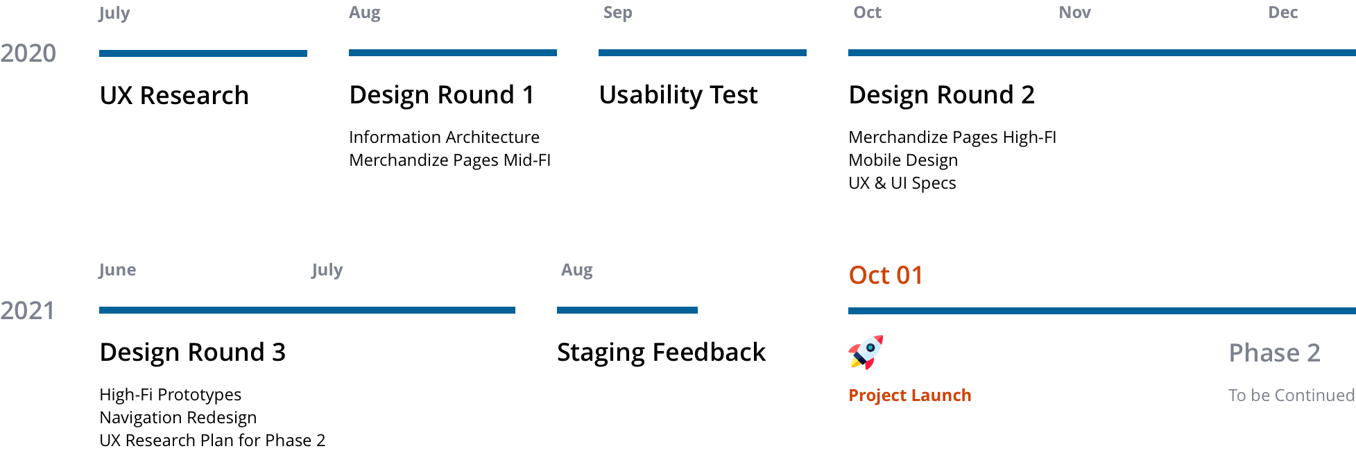
Time Frame
10 months from early stage research to launch (07/20 - 09/21)
Our Team
1 UX Designer (me) | 1 UX Researcher | 2 Product Managers |5+ Engineers
My Contribution
Problem definition | Research | Usability testing | Design |Documentation
Project Overview
This project is Phase 1 of the initial implementation, inspired by goals to better serve our customers and manage the Thorndike website and Gale online catalog. It was critical to offer more unified and relevant experiences across Gale and Thorndike as we had enhanced search capabilities and gotten more accurate analytics and insights into customer’s eCommerce journey.
Some of the first initiatives address the following:
- A universal search experience improvement (UX & UI)
- Making additional product details available
- Responsive Design improvements
Business Impact & User Impact
Contributed to preserve and grow in 1 year
$3.5M
Satisfaction score
+10%
Project Highlights
Define Problems
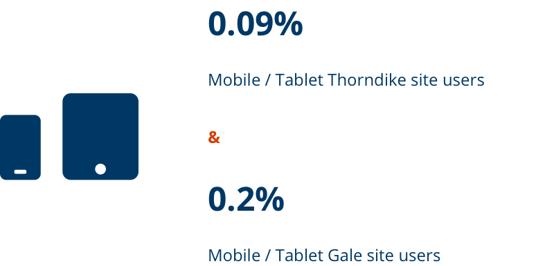
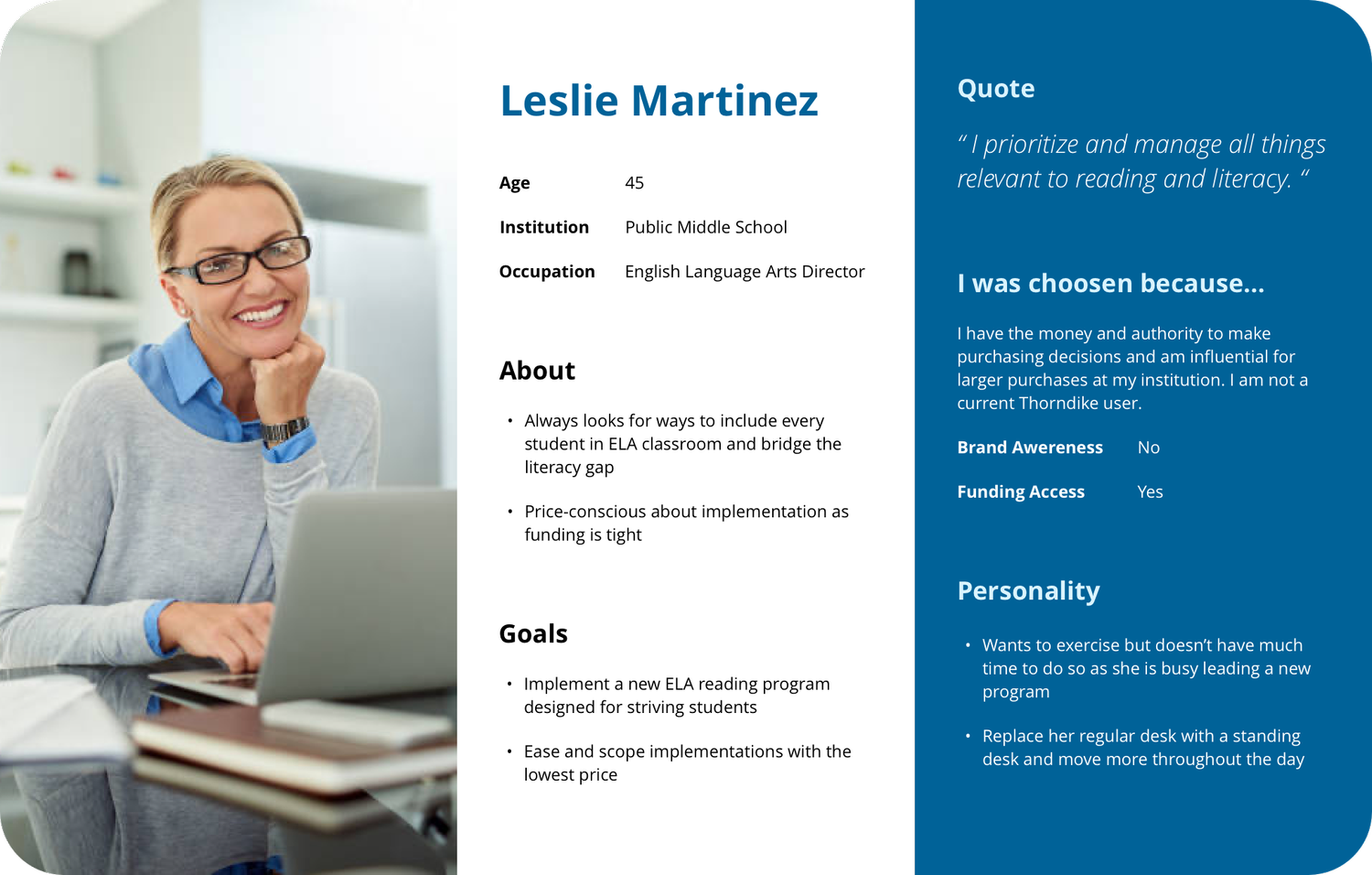
Need: As the migrated catalog pages serves both eBook users and large print users, it was critical to identify their shared interests and differentiations.
Challenge: Due to limited time, my team decided to use user data collected in the past few years for ideation and wireframing. We tried to reach out to our core users, hoping that we could refresh our personas, but failed to recruit anyone in pandemic.
Solution: We collected analyzed data from Google Analytic, HotJar, previous UX research about Gale catalog users, and marketing research about Thorndike users.
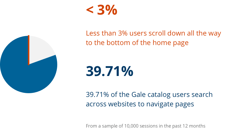
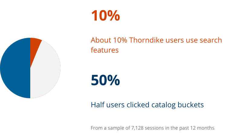
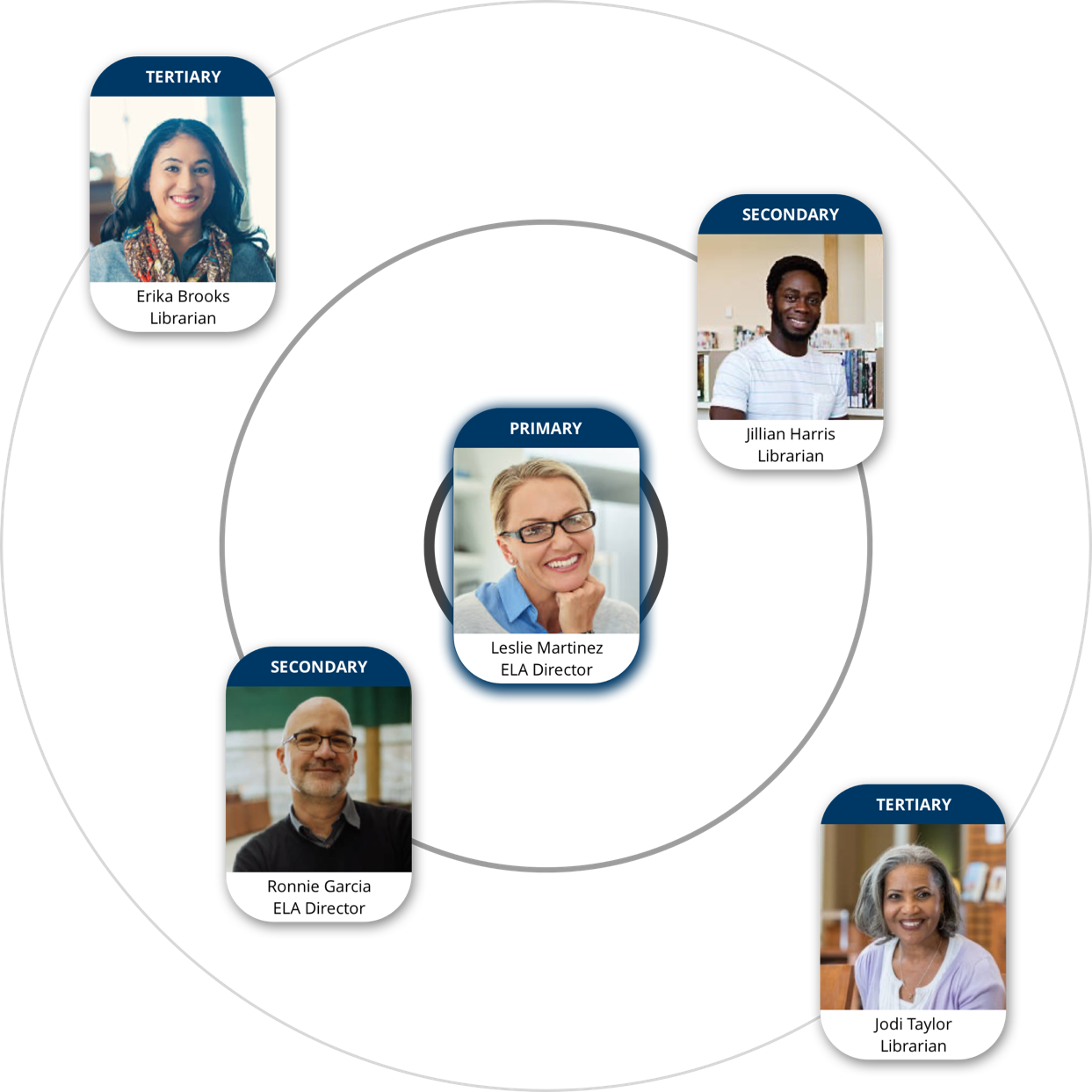
9 Personas were updated to reflect the dynamics of our users and how each customer segment used the websites. 5 personas were prioritized as their needs directed the design in the first stage.
Prioritized issues:
- Lack of responsive design, not mobile-friendly
- Broken E-Commerce experience
- Unclear path to get information
- Information overload
- Confusing UI design as Thorndike site was not in line with Gale brands
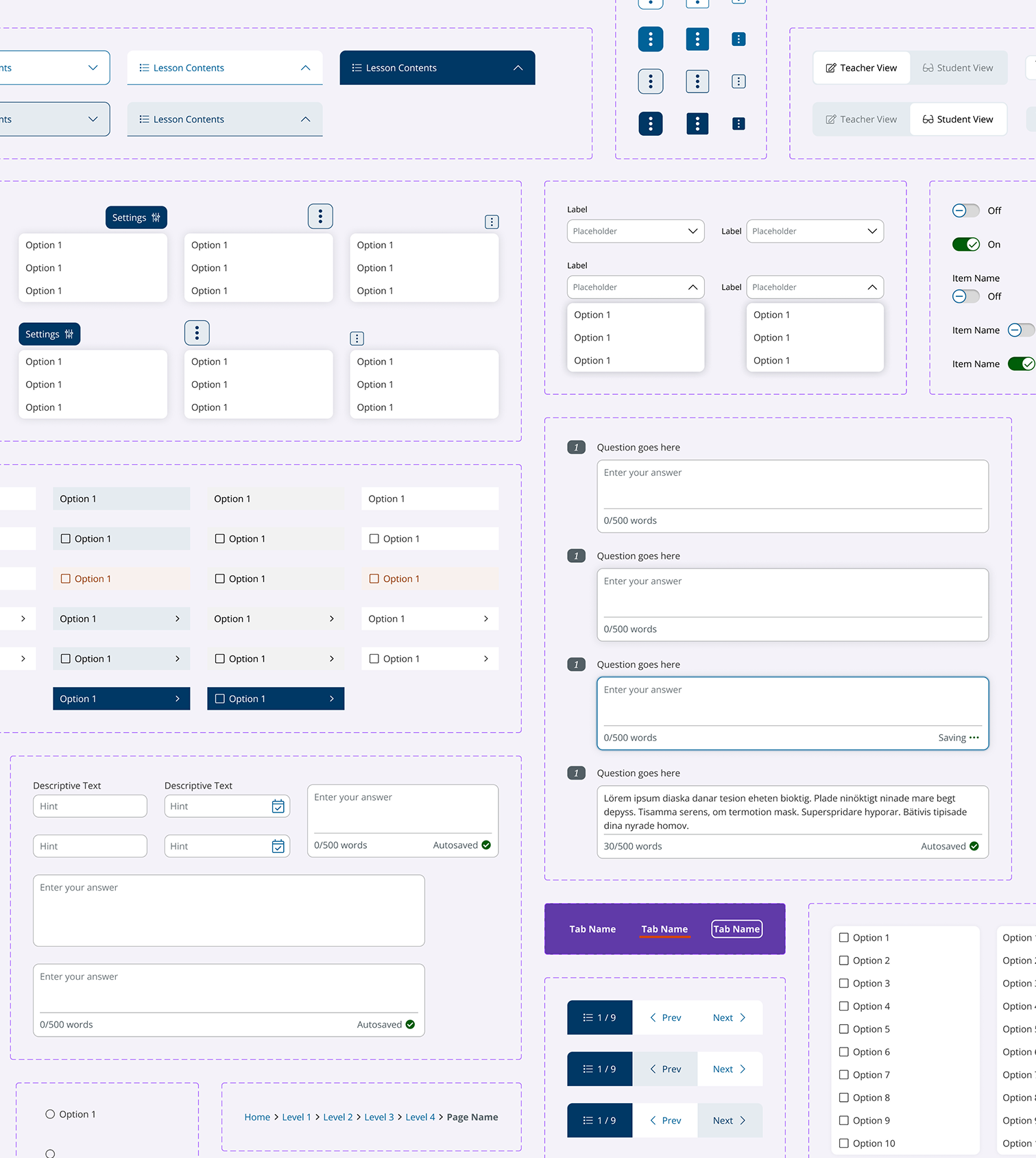
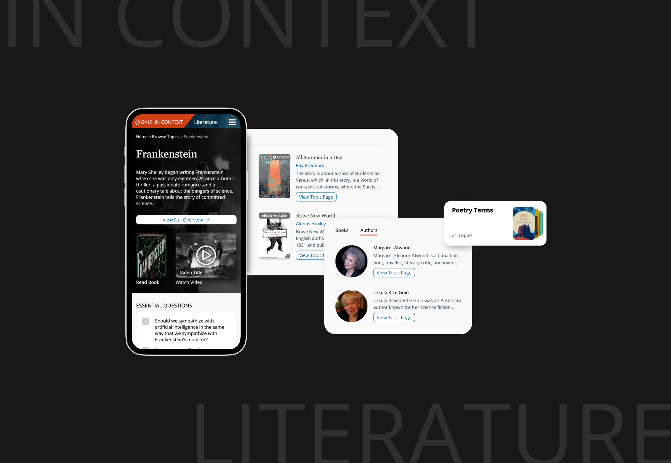
Improve Search Experience
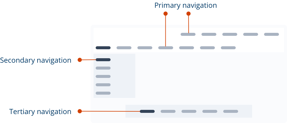
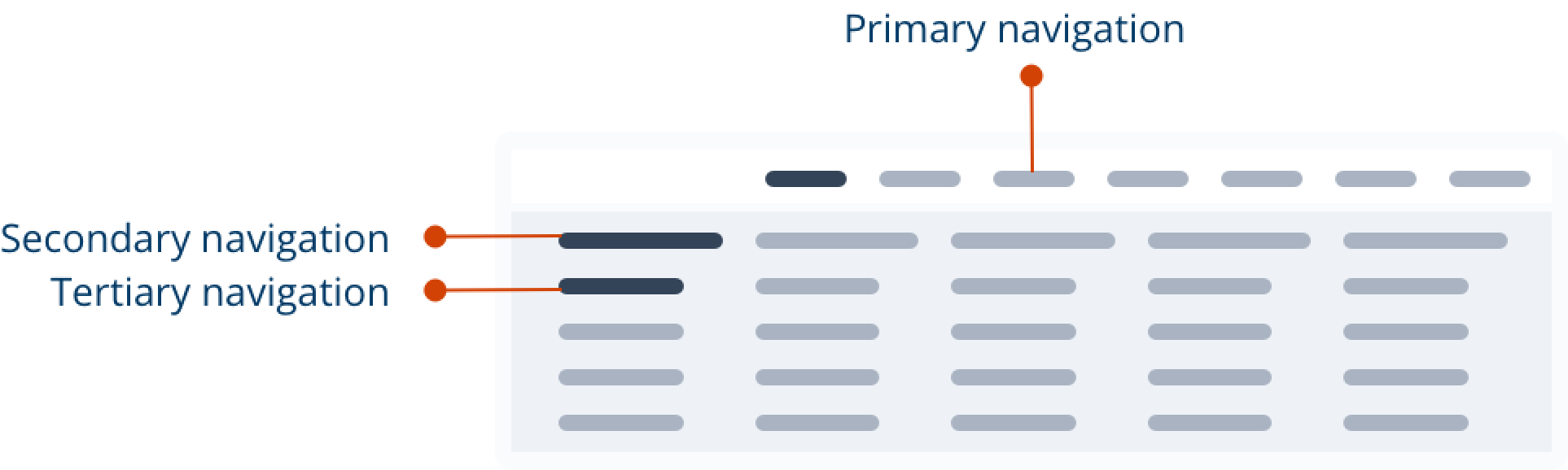
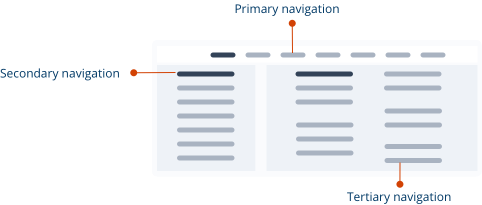
Navigation & Header
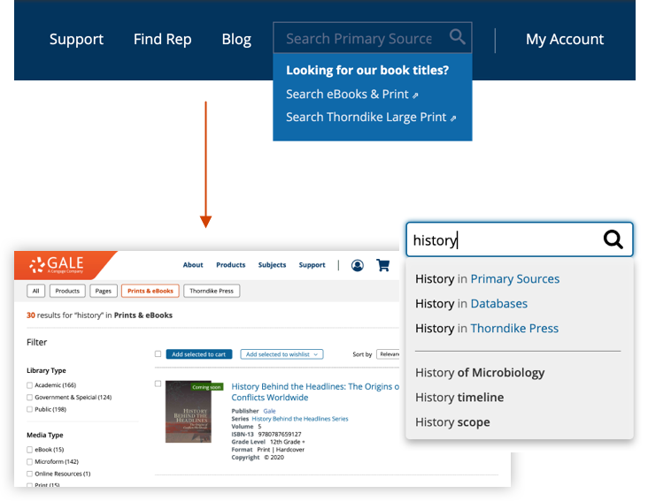
Pain Point: The link titles weren’t effectively labeled to provide users good information scent. The tertiary navigation wasn’t noticeable as it was far away from the main navigation bar.
Solution - Cascading Design: Reorder and mingle navigation links to make them clear and self-explanatory. Align the secondary tabs in a row and include the tertiary links in a dropdown
Solution - Mega Menu Design: Display featured links in the tertiary navigation section to grab user’s attention
Before
Cascading Design
Mega Menu Design
The cascading design was implemented as an MVP. We kept using a unified discovery design pattern for federated searches, as we wanted to allow users to search the query on all databases we provided. Other changes included autocomplete category scope suggestions and UI modifications to help users differentiate information.
Navigation Before & After
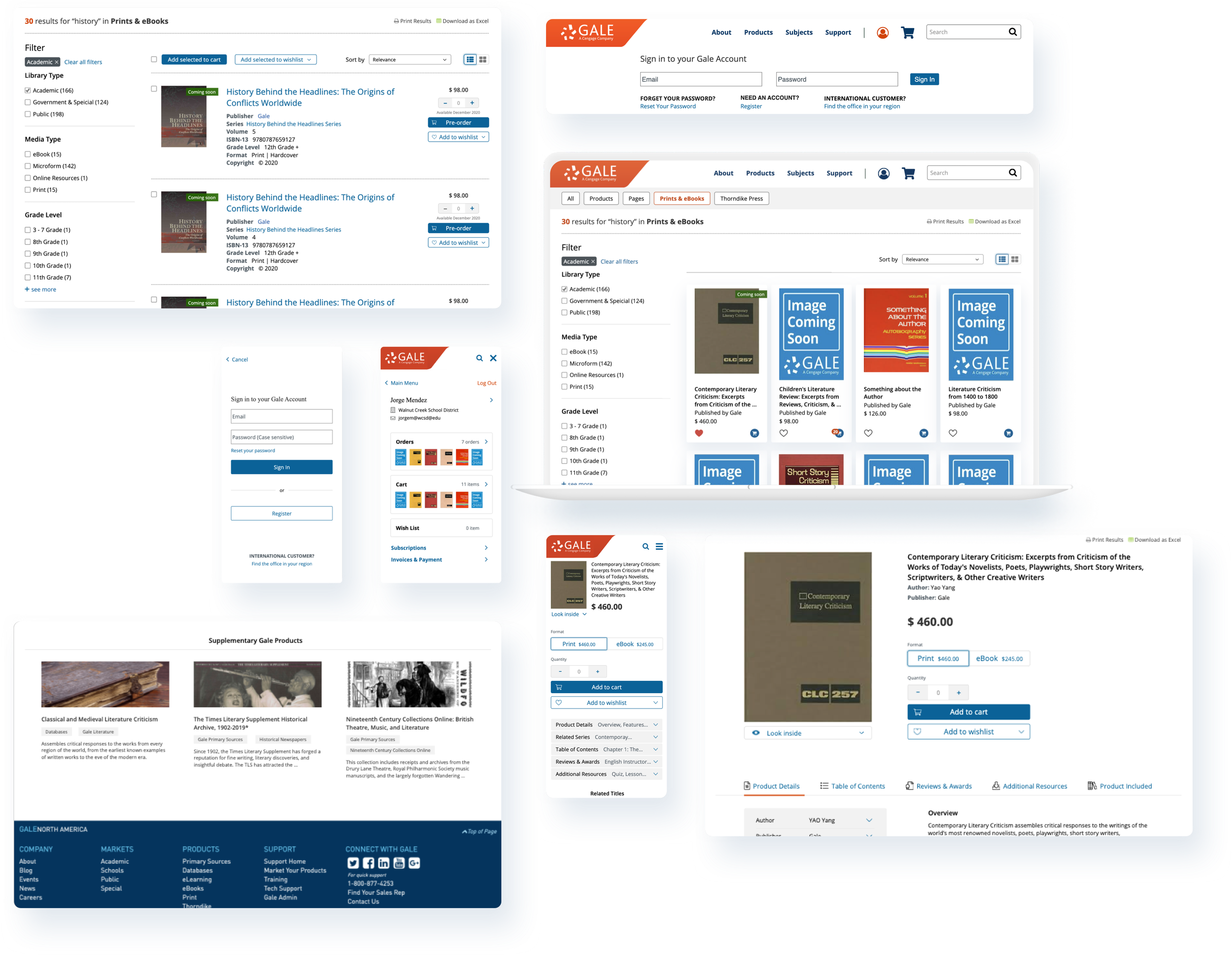
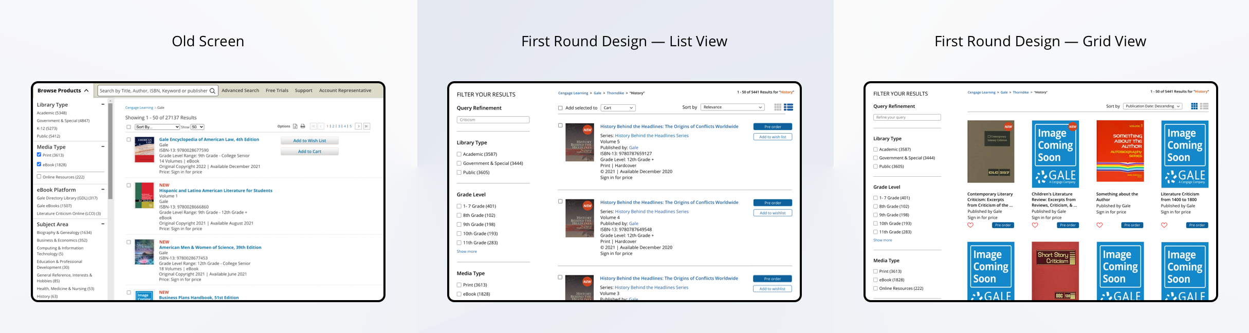
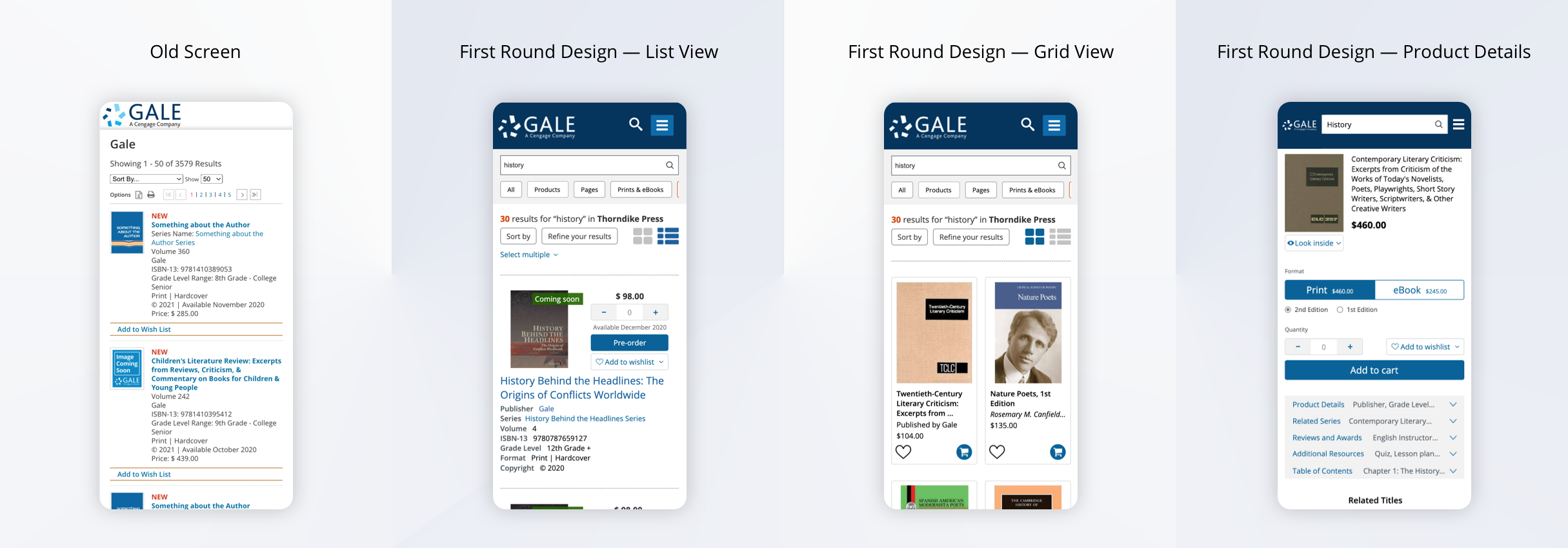
Search Results Page
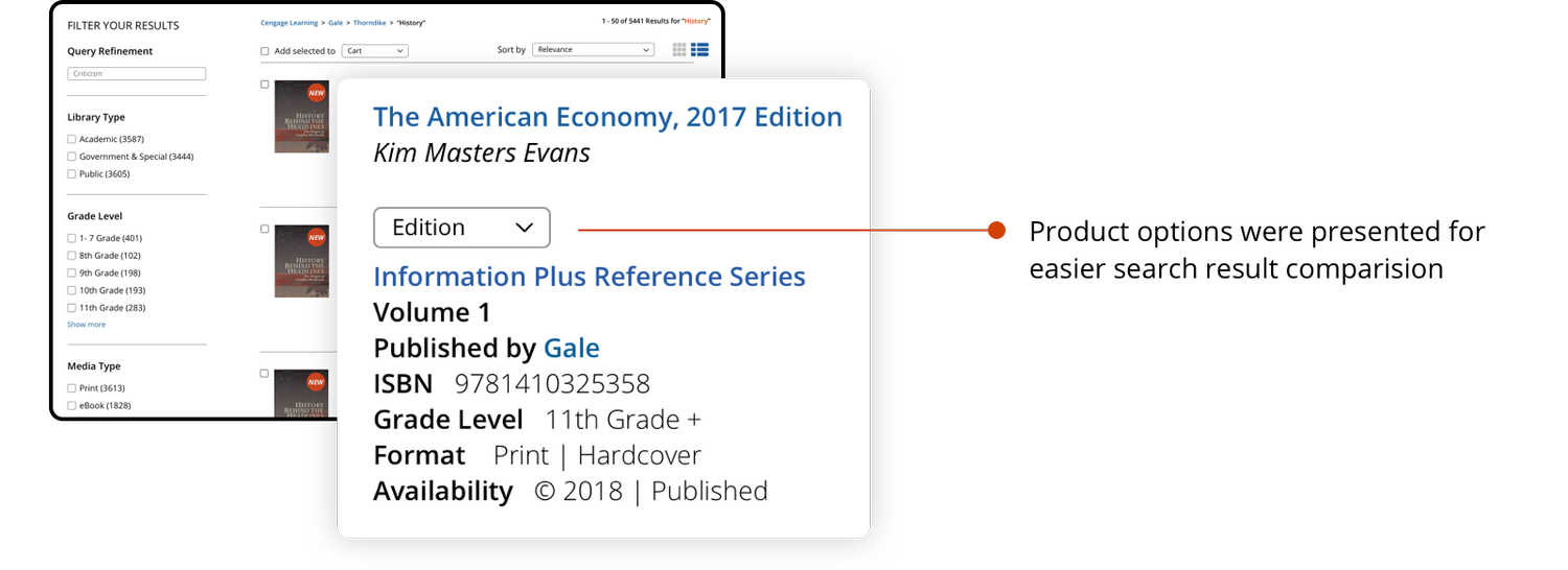
Addressing “Product Description”
Pain point: Users often searched for a specific book and need to access the metadata of the products before committing to a product detail page.
Goal: Help users find and compare the product they want
Solution: Reorder metadata and adjust fonts to highlight contents
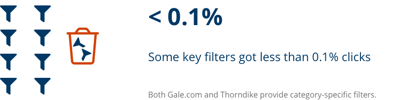
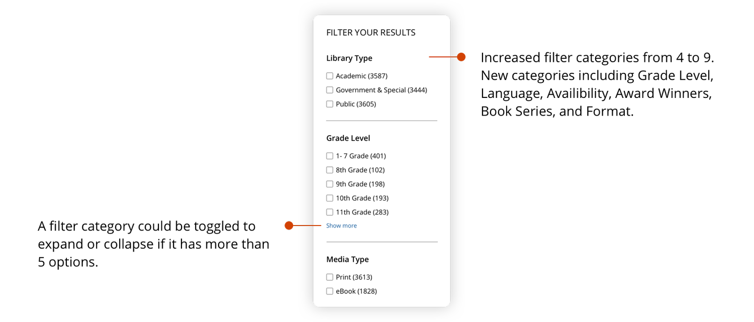
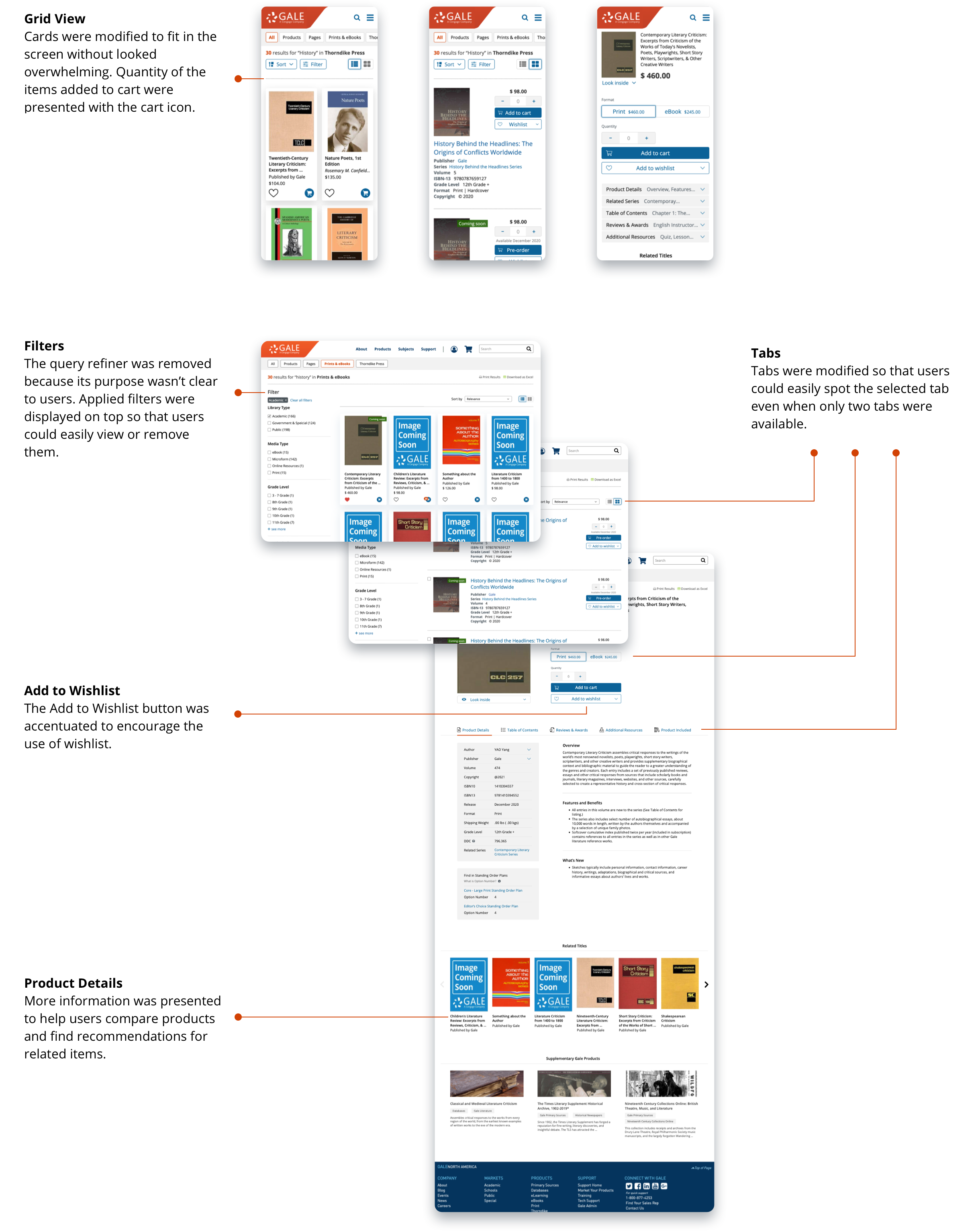
Addressing "Filters"
Pain point: Filters were hidden on page load and put in a scrollbar. Multiselect weren’t allowed.
Goal: Always display filters in a structured and comprehensive way
Solution: Work with the Content Team to modify the filters
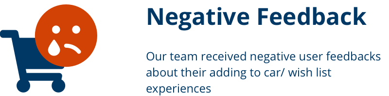
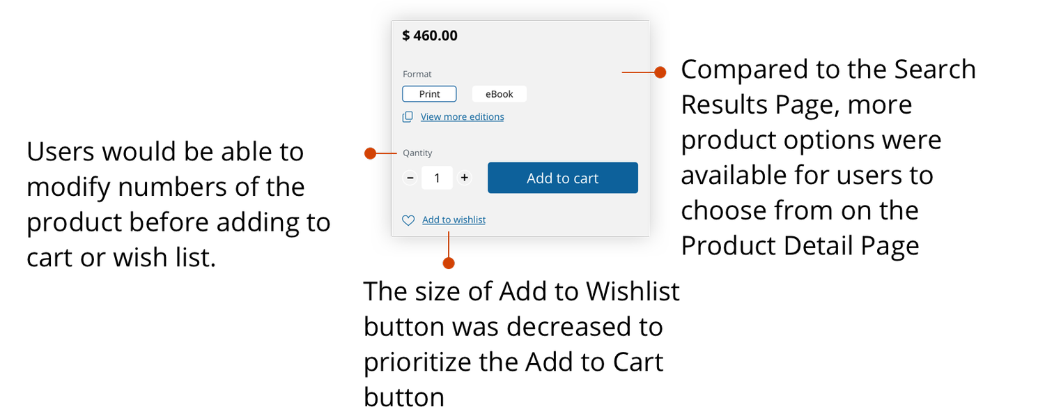
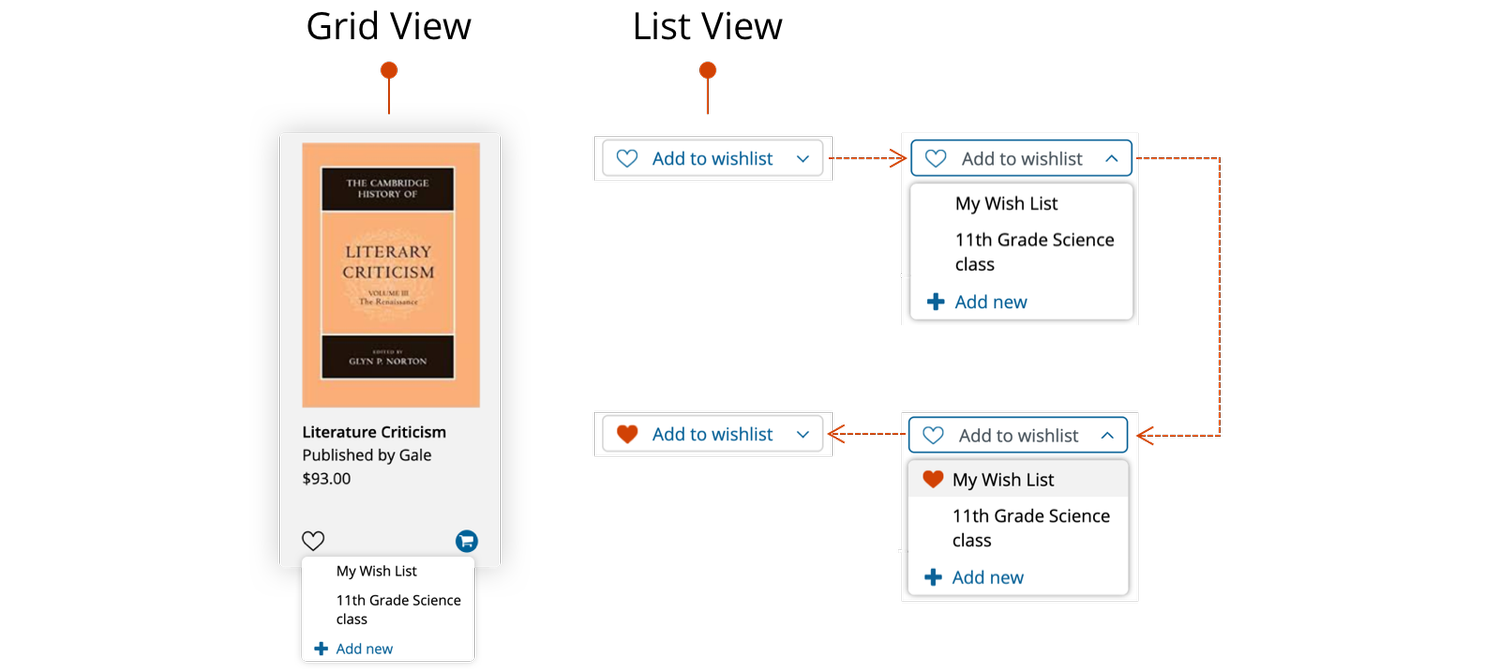
Addressing "Cart & Wishlist"
Pain Point: The call-to-action buttons were fixed and could only be triggered by selecting checkboxes.
Goal: Enable decision-making in the add to cart/wish-list-action
Solution: Redesign the add to cart/wish-list-action, add number input, and support building multiple wish lists

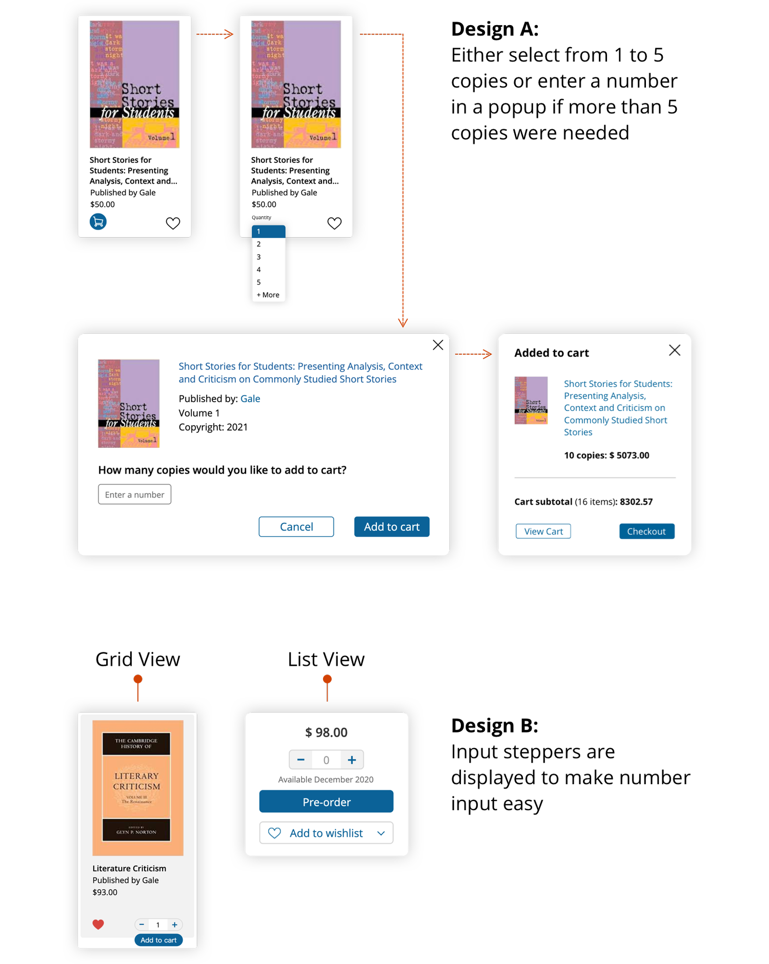
Addressing "Grid View"
Goal: Display multiple products next to each other for users who require less product information
Solution: Create the Grid View page as an alternative view for the existing List View page

Improve E-commerce Experience
Product Detail Page Before & After
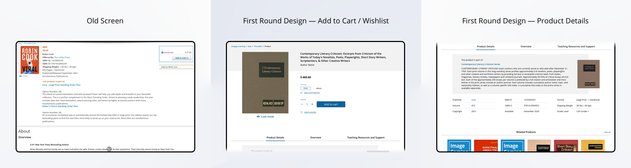
Addressing “Cart” & “Wish List”
Pain point: The widgets were far away from other content, and the buttons weren’t inviting people to take action.
Goal: Refine the Add to Cart/Wishlist actions to match the design on the Search Result Page
Solution: Modify the layout of the page and the Add to Cart/Wishlist design
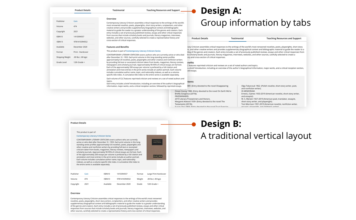
Addressing “Metadata” & “Blurbs”
Pain point: Information was displayed as a wall of text
Goal: Provide clear and informative product description
Solution: Design 2 mockups to build hierarchy and improve UI
Modifying "Input Stepper"
User feedback: Users liked the newly added input stepper on the Product Detail Page. They also wanted to adjust the numbers right away on the Search Results Page.
Iteration: Add input steppers to both Grid View and Tile View of the Search Results Page
Modifying "Wish List Management"
User feedback: Being able to create multiple wish lists is important because different users often work from one institution account and build their own wish list.
Iteration: Users would be able to create new wish lists or choose from the existing wish lists in a dropdown.
Responsive Design
In the mean time of iterating mid-fi design for desktop, we started the responsive design for different sized screens, including mobile design and large screen design.
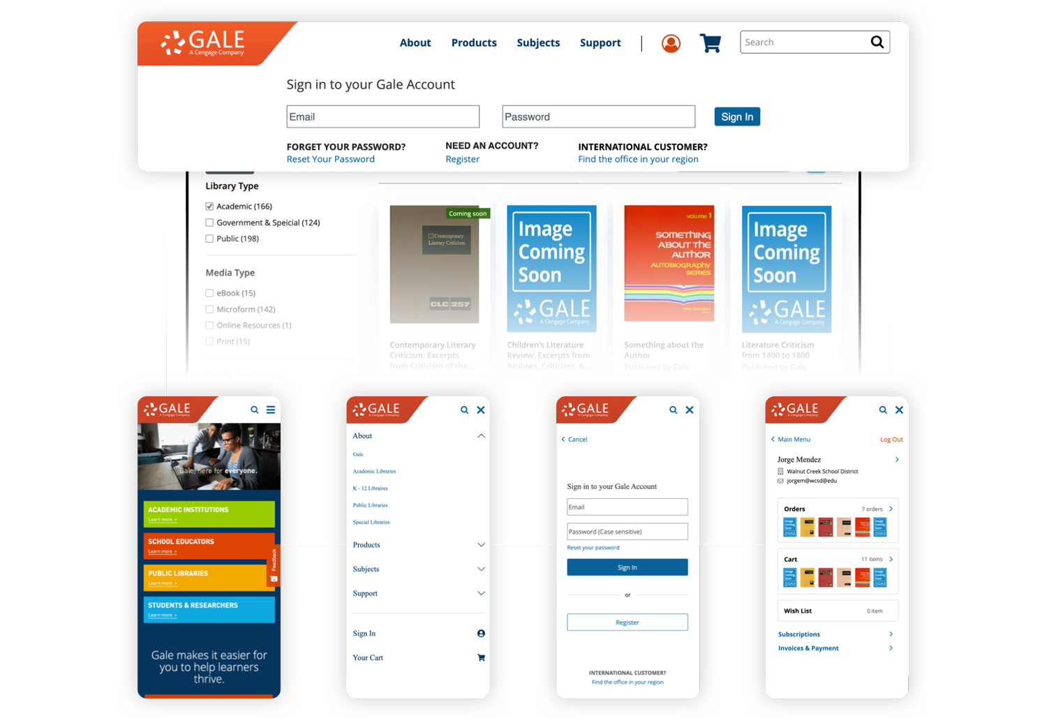
Modifying "Account Login"
User feedback: It was hard for users to find support and understand how to login when switching among different types of accounts
Iteration: Providing alternative ways to sign in on the same panel and add call-to-action links for users to retrieve accounts. Logged-in users may view their account information such as previous orders, cart, and wish list.
Final Design
Reflections
In the next phase, I’d need to be prepared to talk the Product Managers out of the MVP design as it might distort the actual planned UI and reach short-term goal only.
Unsolved UX problems will be addressed in the next phase:
- Users who don’t need multiple wish lists prefer adding items to the wish list with only one click rather than clicking on the “Add to Wishlist” button only to select from a drop-down list.
- The add to cart/wishlist design on the Grid View page is awkward as the expanded widgets would exceed the card (i.e., wishlists drop-down, expanded input stepper)
- The accessibility need to be improved (e.g., Some widgets don’t have any tooltip or label for screen reader)
- The mobile design of the product detail elements doesn’t match the desktop design (i.e., product details are presented as tabs on desktop vs. accordions on mobile)
More projects
UX Design
A Design System from Scratch
Explore
UX Design
B2B Folder Enhancement
Explore
UX Design
Online Learning Portal
Explore
UX Design
E-commerce Websites Migration
Explore
UX Design
Dashboard and Progress Management
Coming Soon
UX Design
New Product on a Mature Platform
Explore
© Sasha Meng 2025 All Rights Reserved
E-Commerce Web Migration
Improve customers’ journey and product merchandising
Time Frame
10 months from early stage research to launch (07/20 - 09/21)
Our Team
1 UX Designer (me) | 1 UX Researcher | 2 Product Managers |5+ Engineers
My Contribution
Problem definition | Research | Usability testing | Design |Documentation
Project Overview
This project is Phase 1 of the initial implementation, inspired by goals to better serve our customers and manage the Thorndike website and Gale online catalog. It was critical to offer more unified and relevant experiences across Gale and Thorndike as we had enhanced search capabilities and gotten more accurate analytics and insights into customer’s eCommerce journey.
Some of the first initiatives address the following:
- A universal search experience improvement (UX & UI)
- Making additional product details available
- Responsive Design improvements
Business Impact & User Impact
Contributed to preserve and grow in 1 year
$3.5M
Satisfaction score
+10%
Project Highlights
Define Problems
Need: As the migrated catalog pages serves both eBook users and large print users, it was critical to identify their shared interests and differentiations.
Challenge: Due to limited time, my team decided to use user data collected in the past few years for ideation and wireframing. We tried to reach out to our core users, hoping that we could refresh our personas, but failed to recruit anyone in pandemic.
Solution: We collected analyzed data from Google Analytic, HotJar, previous UX research about Gale catalog users, and marketing research about Thorndike users.
9 Personas were updated to reflect the dynamics of our users and how each customer segment used the websites. 5 personas were prioritized as their needs directed the design in the first stage.
Prioritized issues:
- Lack of responsive design, not mobile-friendly
- Broken E-Commerce experience
- Unclear path to get information
- Information overload
- Confusing UI design as Thorndike site was not in line with Gale brands
Improve Search Experience
Navigation & Header
Pain Point: The link titles weren’t effectively labeled to provide users good information scent. The tertiary navigation wasn’t noticeable as it was far away from the main navigation bar.
Solution - Cascading Design: Reorder and mingle navigation links to make them clear and self-explanatory. Align the secondary tabs in a row and include the tertiary links in a dropdown
Solution - Mega Menu Design: Display featured links in the tertiary navigation section to grab user’s attention
Before
Cascading Design
Mega Menu Design
The cascading design was implemented as an MVP. We kept using a unified discovery design pattern for federated searches, as we wanted to allow users to search the query on all databases we provided. Other changes included autocomplete category scope suggestions and UI modifications to help users differentiate information.
Navigation Before & After
Search Results Page
Addressing “Product Description”
Pain point: Users often searched for a specific book and need to access the metadata of the products before committing to a product detail page.
Goal: Help users find and compare the product they want
Solution: Reorder metadata and adjust fonts to highlight contents
Addressing "Filters"
Pain point: Filters were hidden on page load and put in a scrollbar. Multiselect weren’t allowed.
Goal: Always display filters in a structured and comprehensive way
Solution: Work with the Content Team to modify the filters
Addressing "Cart & Wishlist"
Pain Point: The call-to-action buttons were fixed and could only be triggered by selecting checkboxes.
Goal: Enable decision-making in the add to cart/wish-list-action
Solution: Redesign the add to cart/wish-list-action, add number input, and support building multiple wish lists
Addressing "Grid View"
Goal: Display multiple products next to each other for users who require less product information
Solution: Create the Grid View page as an alternative view for the existing List View page
Improve E-commerce Experience
Product Detail Page Before & After
Addressing “Cart” & “Wish List”
Pain point: The widgets were far away from other content, and the buttons weren’t inviting people to take action.
Goal: Refine the Add to Cart/Wishlist actions to match the design on the Search Result Page
Solution: Modify the layout of the page and the Add to Cart/Wishlist design
Addressing “Metadata” & “Blurbs”
Pain point: Information was displayed as a wall of text
Goal: Provide clear and informative product description
Solution: Design 2 mockups to build hierarchy and improve UI
Modifying "Input Stepper"
User feedback: Users liked the newly added input stepper on the Product Detail Page. They also wanted to adjust the numbers right away on the Search Results Page.
Iteration: Add input steppers to both Grid View and Tile View of the Search Results Page
Modifying "Wish List Management"
User feedback: Being able to create multiple wish lists is important because different users often work from one institution account and build their own wish list.
Iteration: Users would be able to create new wish lists or choose from the existing wish lists in a dropdown.
Responsive Design
In the mean time of iterating mid-fi design for desktop, we started the responsive design for different sized screens, including mobile design and large screen design.
Modifying "Account Login"
User feedback: It was hard for users to find support and understand how to login when switching among different types of accounts
Iteration: Providing alternative ways to sign in on the same panel and add call-to-action links for users to retrieve accounts. Logged-in users may view their account information such as previous orders, cart, and wish list.
Final Design
Reflections
In the next phase, I’d need to be prepared to talk the Product Managers out of the MVP design as it might distort the actual planned UI and reach short-term goal only.
Unsolved UX problems will be addressed in the next phase:
- Users who don’t need multiple wish lists prefer adding items to the wish list with only one click rather than clicking on the “Add to Wishlist” button only to select from a drop-down list.
- The add to cart/wishlist design on the Grid View page is awkward as the expanded widgets would exceed the card (i.e., wishlists drop-down, expanded input stepper)
- The accessibility need to be improved (e.g., Some widgets don’t have any tooltip or label for screen reader)
- The mobile design of the product detail elements doesn’t match the desktop design (i.e., product details are presented as tabs on desktop vs. accordions on mobile)
More projects
UX Design
A Design System from Scratch
Explore
UX Design
B2B Folder Enhancement
Explore
UX Design
Online Learning Portal
Explore
UX Design
E-commerce Websites Migration
Explore
UX Design
Dashboard and Progress Management
Coming Soon
UX Design
New Product on a Mature Platform
Explore
© Sasha Meng 2025 All Rights Reserved